Activity
-

-
Richard A stjean added a Photo 2 years, 8 months ago
-

Richard, I love how much practice you are getting! One thing that I’m noticing is that the left and right sides of this fruit are the same value. You want your left side to be lighter than your right side. Keep practicing slow careful toning with lots of light layers. Try not to press too hard with colored pencils. I find it helpful to hold my…[Read more]
-
-
Ethel commented on Ethel's Photo 2 years, 8 months ago
@pgthompson… per the discussion during the last zoom class, is the shadow in a better position?
-
Ethel added a Photo 2 years, 8 months ago
-
@pgthompson… per the discussion during the last zoom class, is the shadow in a better position?
-
@pgthompson… per the discussion during the last zoom class, is the shadow in a better position?
-
You got it Ethel!!
-
-

Sam McWilliams commented on Sam McWilliams's Photo 2 years, 8 months ago
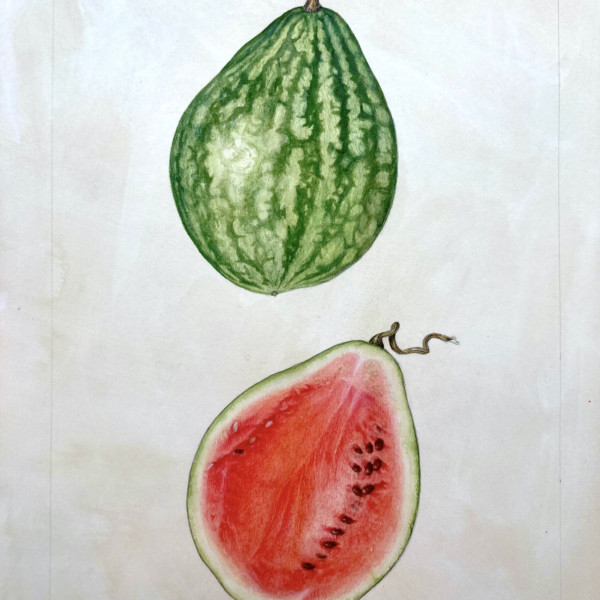
Grew and drew this one last year. Harvested 4 from this year’s planting!
-
Sam McWilliams added a Photo 2 years, 8 months ago
-
Grew and drew this one last year. Harvested 4 from this year’s planting!
-
Wonderful. You got that watermelon texture just right!
-
Sam- I love how the the subjects are tilted a little and not at the same angle, yet the positions compliment each other so well! The clarity of the colors is amazing and those textures – sublime!!!
-
Ooooh, Sam! This is gorgeous! May I please have a slice?
-
-
-
Love this Sam!
-
Gorgeous Sam! The colors are spot on and it has such beautiful form!
-
-
-
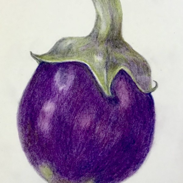
Cathy, this is a nice eggplant. I really like your drawing of the sepals and stem. You rendered those sections beautifully, and you can feel the thickness of those sepals. I wonder whether the color of the eggplant was this bright of a purple? I also think you could tone more slowly with a really sharp colored pencil to get your toning a bit more…[Read more]
-
Sorry, Cathie. I just saw I misspelled your name!
-
hi Pam, yes I agree the color of the eggplant – I thin the color of the actual drawing look different -I’lll try your shading suggestions and post it again
-
-
Renata added a Photo 2 years, 8 months ago
-
OOOOOOHHH Renata! Perfection.
-
Beautiful landscape, Renata!
-
Thank you, ladies!!
-
-
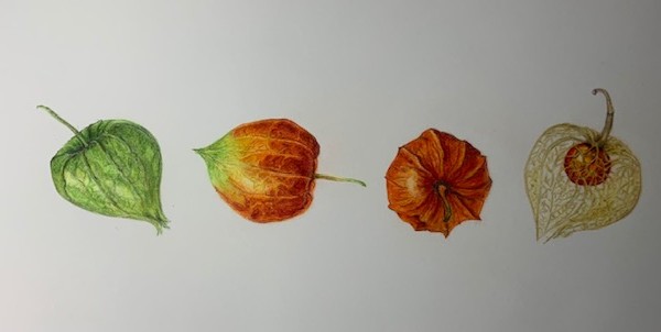
Theresia Schuba added a Photo 2 years, 8 months ago
-
Ooooh! Theresia! Love this! My favorite is the 3rd from the left. It feels so 3D! I think you could get a touch darker in the shadow areas of the 2 on the left. But they are really wonderful. Great composition.
-
Thank you very much, Pam!
-
-
Becky Bruno commented on Margaret Hahn's Photo 2 years, 8 months ago
I just love this! Both are beautiful but the cut one just blows my mind!
-
Becky Bruno commented on Becky Bruno's Photo 2 years, 8 months ago
Great points, thank you. I realize that I lost the highlights on this one – the petals were so narrow!!!
-
Becky Bruno commented on Becky Bruno's Photo 2 years, 8 months ago
Thank you Doug! Leaves are really hard for me for some reason, as is yellow and I have never done a bee before so you can see why this one ended up being challenging. Earlier, I added more tone to the lemon and will keep plugging away. Thanks again!
-
Lee commented on Lee's Photo 2 years, 8 months ago
Doug, This is my work on lesson 22. This is not a juried art show, it is something I do to relax. If I will be subjected to extreme criticism on every download, I will cancel my subscription.
-
Doug Milne commented on Joann DiLego's Photo 2 years, 8 months ago
You are off to a good start Joann! Amaryllis bulbs are one of my favorite subjects! There are a couple of them in my ArtFeed portfolio if you want to check them out. I see a range of tones on some areas of the bulb, but it is missing from the upper, papery part. You also need the highlight and range of tones there to emphasize the bulbs form. I…[Read more]
-
Doug Milne commented on Becky Bruno's Photo 2 years, 8 months ago
Hi Becky- I think your composition is really pleasing and I don’t think you need to worry about your lemon! The beautiful vibrant yellows are not going to let the viewer miss it! I think you could have a little more dark toning on the lower right and bottom of the lemon to emphasize it’s form. The leaves are also wonderful! Leaves are usually a v…[Read more]
-
Doug Milne commented on Becky Bruno's Photo 2 years, 8 months ago
Gorgeous Becky!!! Beautiful colors and I love how graphic the drawing is!!! The one thing I would point out is that there is no difference of highlights or tones on the flower. We would expect that the area closest to the light source would be lighter and have highlights, while the area furthest from the light source would be darker. For example I…[Read more]
-
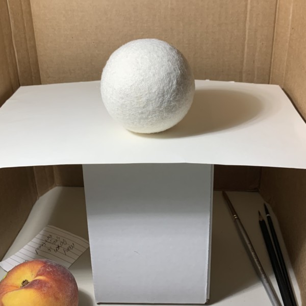
Doug Milne commented on Douglass Reitter's Photo 2 years, 8 months ago
Hi Douglass- this is beautifully rendered!!! Great color selections too!!!! The cast shadow on the peach is too small. The cast shadow is the same size as the smaller subjects and I would expect a bigger subject to have a bigger cast shadow. Remember to have it fade as it moves away from the peach. I think of peaches as having a variety of colors,…[Read more]
-
Doug Milne commented on Margaret Hahn's Photo 2 years, 8 months ago
Wow Margaret!!!! The cut section is amazing!!! You really captured the juicy quality!!! It even elevates your wonderful depiction of the original whole tomato!!! I love the strong graphic aspect of the drawing the way it is and I personally would leave it as is!!! Gorgeous!!!
-
Douglass Reitter commented on Douglass Reitter's Photo 2 years, 8 months ago
2nd try at the peach.
- Load More
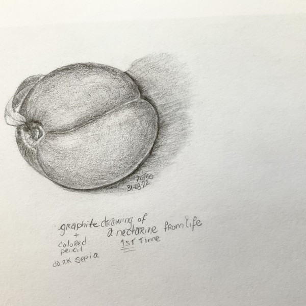


I wanted to do this in colour, but I realized I did a lot of shading with my graphite pencil.. not sure i feel like drawing another just yet. I found it challenging. I know there’s a lot left to be desired in this drawing. But I wanted to do it so much, because in my basket of nectarines ooh! there was a tiny leaf on one of them! 😃. Thanks for h…[Read more]
This is a lovely drawing of an adorable nectarine. I especially like the left side and the area where the leaf is attached. You are getting lovely 3D form in that area. I think you have lost a bit of your main highlights, and you could take your kneaded erase and see if you can lift a bit of the highlight back out. And then I think you could get a…[Read more]