Activity
-

-
Becky Bruno commented on Becky Bruno's Photo 2 years, 8 months ago
I appreciate the suggestions that I received on my radish and have tried to incorporate them. Here is what I think is my finished radish!
-
-
I appreciate the suggestions that I received on my radish and have tried to incorporate them. Here is what I think is my finished radish!
-

Becky, This looking fantastic!!! I think you can get a little darker in the core shadow area of the radish. Such a wonderful drawing, Becky. Great work!
-
-
Margaret Hahn commented on Margaret Hahn's Photo 2 years, 8 months ago
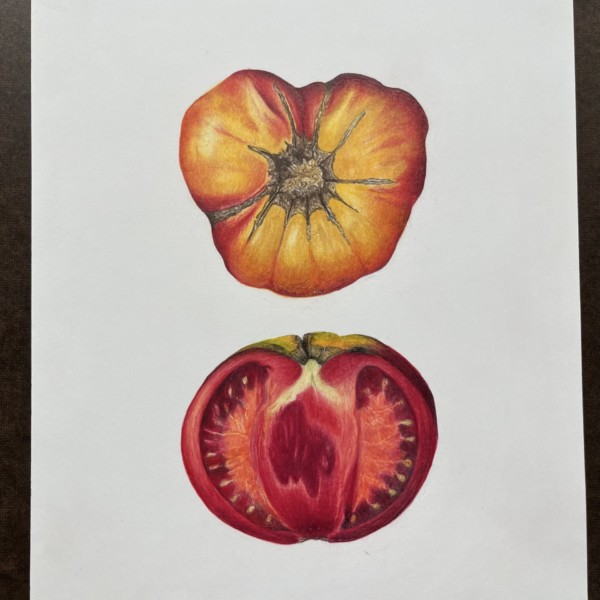
Drew this heirloom tomato and trying to decide whether to add anything – was thinking of some red/yellow/green cherry tomatoes on the middle left and right sides but would it be too crowded? Thoughts?
-
Margaret Hahn added a Photo 2 years, 8 months ago
-
Drew this heirloom tomato and trying to decide whether to add anything – was thinking of some red/yellow/green cherry tomatoes on the middle left and right sides but would it be too crowded? Thoughts?
-
Wow Margaret!!!! The cut section is amazing!!! You really captured the juicy quality!!! It even elevates your wonderful depiction of the original whole tomato!!! I love the strong graphic aspect of the drawing the way it is and I personally would leave it as is!!! Gorgeous!!!
-
I just love this! Both are beautiful but the cut one just blows my mind!
-
Gah! Don’t change a thing. It’s perfect!
-
-
Margaret Hahn commented on Margaret Hahn's Photo 2 years, 8 months ago
Thank you all! The moth was found under a pile of leaves, perfectly preserved but less vibrant than when alive. I drew him from the top and underneath (flipped over) then decided to add the other two stages of his life.
-
Doug Milne commented on Richard A stjean's Photo 2 years, 8 months ago
Hi Richard- great photo! You can really see the spiral pattern on this seed head. In Wendy’s book “The Joy of Botanical Drawing” Chapter 8 covers this topic. She illustrates the spiral pattern on conifer cones and also strawberries in detail. You would use those same principles on the cone flower’s seed head.
-
Doug Milne commented on Lee's Photo 2 years, 8 months ago
Hi Lee- you are off to a good start! The colors seem good! What is missing for me is the texture. In Botanical Basics Wendy demonstrates drawing a feather on Lesson 22. That would be a good reference in capturing the texture. The cast shadow is a little too dark. I would also expect the edge of the cast shadow to follow the irregular edge of the feather.
-
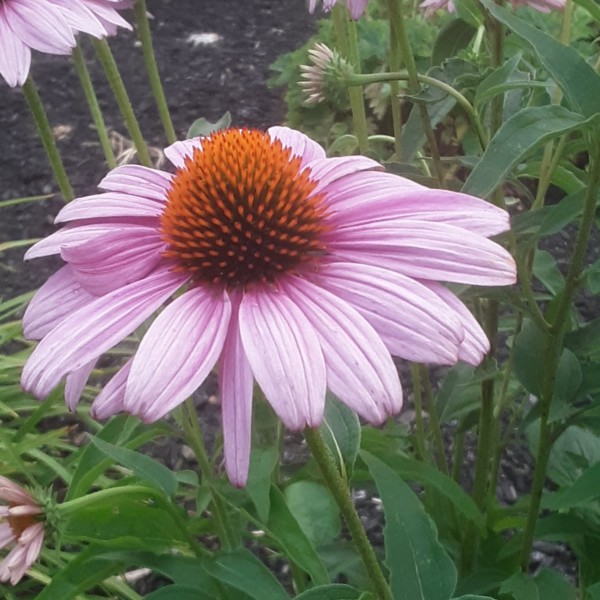
Pam commented on Sharon CasapullA's Photo 2 years, 8 months ago
(When I said “flower head” I meant that center tuft of little tiny flowers that makes up that round shape in the center)
-
Richard A stjean commented on Richard A stjean's Photo 2 years, 8 months ago
Any suggestions on how to do the center?
-
Pam commented on Sharon CasapullA's Photo 2 years, 8 months ago
Sharon, this is a really good start to getting that center area. It already feels like echinacea to me. Now think about the 3D form of that flower head, and shade that center area sort of like a sphere. If the light is coming from the upper right, you would get dark on the bottom left of that center, and leave a highlight where in the upper right…[Read more]
-
Richard A stjean added a Photo 2 years, 8 months ago
-
Any suggestions on how to do the center?
-
Hi Richard- great photo! You can really see the spiral pattern on this seed head. In Wendy’s book “The Joy of Botanical Drawing” Chapter 8 covers this topic. She illustrates the spiral pattern on conifer cones and also strawberries in detail. You would use those same principles on the cone flower’s seed head.
-
-
Richard A stjean added a Photo 2 years, 8 months ago
-
Richard, Nice bright colors. I like that you are starting to get some shadow color into your drawing with that purple. I think you could go even darker in those shadow areas. Maybe try some red-violet?
-
-
Pam commented on Margaret Hahn's Photo 2 years, 8 months ago
Margaret, this is just gorgeous!
-
Pam commented on Richard A stjean's Photo 2 years, 8 months ago
Richard, it looks like you may be trying to work too quickly. Try keeping your colored pencils very sharp, and really take your time building layers lightly and slowly. I think you’ll get smoother gradients and crisper edges that way.
-
Deborah Watton commented on Deborah Watton's Photo 2 years, 8 months ago
Thank you so much Pam for your feedback. Lighting and toning are such a challenge!!
-
Pam commented on Deborah Watton's Photo 2 years, 8 months ago
Oh Deborah, these are great! And it looks like you are lighting them correctly from the upper left. Yay! I am especially impressed with your toning on the mulberry leaf. It looks nice and smooth, and you are getting nice 3D form. You may want to narrow up those secondary veins a bit. They seem a bit too wide. On the lower right side of that leaf,…[Read more]
-
Pam commented on Deborah Watton's Photo 2 years, 8 months ago
You are getting some really nice smooth toning on that green acorn. And your highlight looks really nice and natural. Great job. I’m a little confused about the light source. On the green acorn, the position of your highlight makes it appear like the light is coming from the upper right, but the cast shadow makes it appear like the light is coming…[Read more]
-
Pam commented on Joann DiLego's Photo 2 years, 8 months ago
Better, Joann. Now that you’ve practiced using Wendy’s drawing as a guide, try to find a subject of your own that you can draw from life.
-
Renata commented on Renata's Photo 2 years, 8 months ago
Thank you so much again. I enjoyed doing this and it does sort of look like the forests I visited. Yes, I need to add something to the white rectangle. And good point about the sky, I will add some ultramarine blue on the right – I think I started with cobalt blue (or was it phtalo? Gosh, can’t remember now) on the left and then gradually changed…[Read more]
- Load More


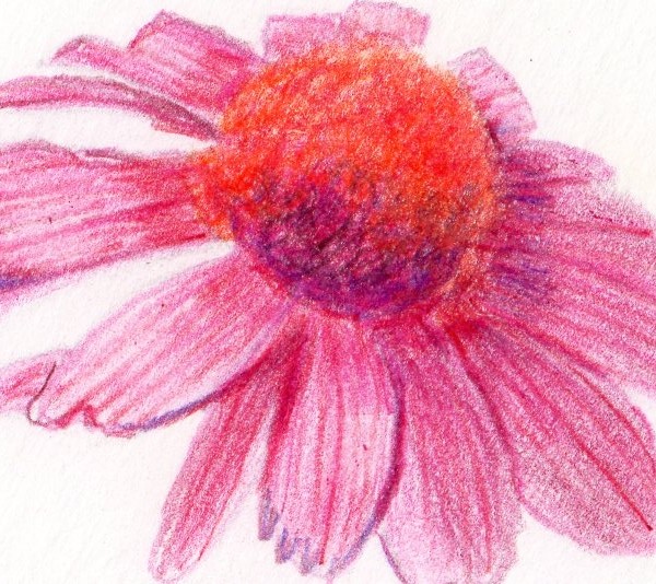
Gorgeous Becky!!! Beautiful colors and I love how graphic the drawing is!!! The one thing I would point out is that there is no difference of highlights or tones on the flower. We would expect that the area closest to the light source would be lighter and have highlights, while the area furthest from the light source would be darker. For example I…[Read more]
Great points, thank you. I realize that I lost the highlights on this one – the petals were so narrow!!!
Wow! What a gorgeous drawing of a really challenging subject. I really love it just how it is, but I think if you add in those shadows and highlights, it might be even better 🙂