Activity
-

Pam commented on Becky Bruno's Photo 3 years ago
115! Yikes. Really lovely. It’s a beautiful composition, and you did a great job getting nice and saturated with the colored. I love those shiny seeds in the lower right corner. The secondary veins on your leaves seem a little too uniform and a little too wide to me. You may want to go in, and make those veins wiggle a little, and narrow them up a…[Read more]
-
Renata commented on Maureen Clare Murphy's Photo 3 years ago
Really nice page!
-
Renata commented on Renata's Photo 3 years ago
Thank you, ladies!!
-
Renata commented on Sam McWilliams's Photo 3 years ago
Ooooh, Sam! This is gorgeous! May I please have a slice?
-

Becky Bruno commented on Ishbel Galloway's Photo 3 years ago
I love this – Beautiful!
-
Becky Bruno commented on Maureen Clare Murphy's Photo 3 years ago
This is just lovely!
-
Richard A stjean commented on Richard A stjean's Photo 3 years ago
Pam ,since grapes are simi- transparent the light comimg out of the grape is orange . Taught to me by a painting teacher
-
Pam commented on Becky Bruno's Photo 3 years ago
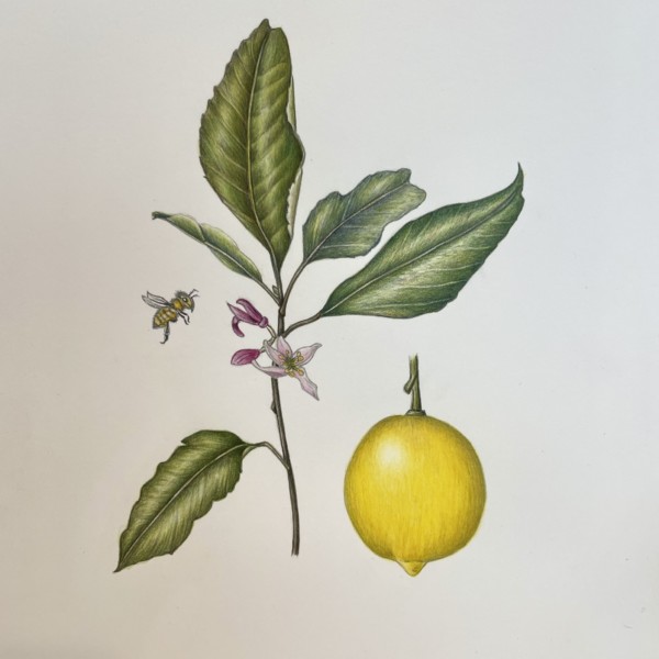
Becky, This is looking really good. You did a wonderful job saturating those colors. Really lovely. If I had to find something to comment on, and this is digging deep, and getting into the weeds – on your beautiful flowers, you could vary the line around the edges of your petals a bit more. We call this “sensitive line”, where you vary the…[Read more]
-
Pam commented on Maureen Clare Murphy's Photo 3 years ago
Great idea, Maureen. See you then.
-
Doug Milne commented on Susan Wright's Photo 3 years ago
Wow Susan! You jumped right in and captured those reflected highlights! Great job!!! One small point – the cast shadows are a little too dark. They are darkest at the base of the subject as you have shown, but then they should fade lighter as they move away from the subject. The shadows should be more a suggestion to ground the subject on the…[Read more]
-
Doug Milne commented on Becky Bruno's Photo 3 years ago
Hi Becky- you do such a wonderful job with composition! I love this! You would never know that you were “making do” with your supplies on this drawing. The color selection and saturation are great!!! I would point out 2 things – the highlight seems a little too bright to me and I would tone it down a little. The left side of the pomegranate loo…[Read more]
-
Doug Milne commented on Becky Bruno's Photo 3 years ago
Congratulations Becky! This is so beautiful! The form on the lemon is wonderful and you did not lose the vibrant colors! And those leaves! Soooo good!!!
-
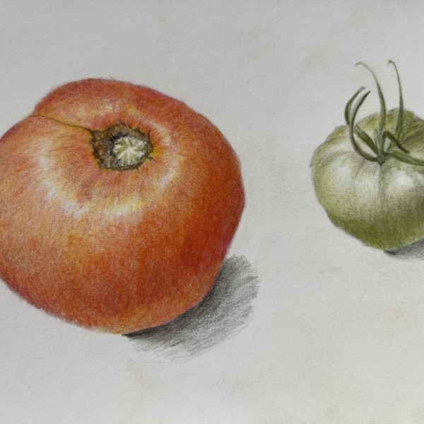
Maureen Clare Murphy commented on Maureen Clare Murphy's Photo 3 years ago
Thank you, @pgthompson and @wendy! As for the tomato, I think the texture is off. It looks almost fuzzy instead of smooth. I’ll bring it (the drawing, not the tomato) with me to the workshop.
-

Wendy Hollender commented on Maureen Clare Murphy's Photo 3 years ago
I love this Maureen and I think your tomato is awesome! What don’t you like about it?
-
Susan Wright added a Photo 3 years ago
-
Wow Susan! You jumped right in and captured those reflected highlights! Great job!!! One small point – the cast shadows are a little too dark. They are darkest at the base of the subject as you have shown, but then they should fade lighter as they move away from the subject. The shadows should be more a suggestion to ground the subject on the…[Read more]
-
Nice Susan! You really captured the feel of the tomato skin on these. Lovely.
-
-
Becky Bruno commented on Becky Bruno's Photo 3 years ago
We went away this weekend and the hotel had a beautiful pomegranate tree. It was 115 out so I only used colored pencil (and a lighter paper that I had travelled with). I found it much more difficult with just colored pencil. I welcome any feedback – thank you.
-
Becky Bruno commented on Becky Bruno's Photo 3 years ago
Thank you for your previous comments @pgthompson and @doug-milne – I think this one is one. I welcome any other thoughts! I’m working hard to improve, especially my leaves. Thank you!
-
Becky Bruno added a Photo 3 years ago
-
We went away this weekend and the hotel had a beautiful pomegranate tree. It was 115 out so I only used colored pencil (and a lighter paper that I had travelled with). I found it much more difficult with just colored pencil. I welcome any feedback – thank you.
-
Hi Becky- you do such a wonderful job with composition! I love this! You would never know that you were “making do” with your supplies on this drawing. The color selection and saturation are great!!! I would point out 2 things – the highlight seems a little too bright to me and I would tone it down a little. The left side of the pomegranate loo…[Read more]
-
115! Yikes. Really lovely. It’s a beautiful composition, and you did a great job getting nice and saturated with the colored. I love those shiny seeds in the lower right corner. The secondary veins on your leaves seem a little too uniform and a little too wide to me. You may want to go in, and make those veins wiggle a little, and narrow them up a…[Read more]
-
-
Becky Bruno added a Photo 3 years ago
-
Thank you for your previous comments @pgthompson and @doug-milne – I think this one is one. I welcome any other thoughts! I’m working hard to improve, especially my leaves. Thank you!
-
Congratulations Becky! This is so beautiful! The form on the lemon is wonderful and you did not lose the vibrant colors! And those leaves! Soooo good!!!
-
Becky, This is looking really good. You did a wonderful job saturating those colors. Really lovely. If I had to find something to comment on, and this is digging deep, and getting into the weeds – on your beautiful flowers, you could vary the line around the edges of your petals a bit more. We call this “sensitive line”, where you vary the…[Read more]
-
-
Marie Nault commented on Marie Nault's Photo 3 years ago
Pam, thank you so much for your motivating feedback! I feel I’ve got some great coaching from you, to help me reach my goals!
- Load More