Activity
-

Ishbel Galloway commented on Ishbel Galloway's Photo 3 years ago
Thank you so much!
-

Maureen Clare Murphy commented on Renata's Photo 3 years ago
Beautiful landscape, Renata!
-
Maureen Clare Murphy commented on Ishbel Galloway's Photo 3 years ago
I love this — it’s so elegant and striking on the toned paper
-
Susan Wright commented on Susan Wright's Photo 3 years ago
Thank you Doug!
-
Susan Wright commented on Ishbel Galloway's Photo 3 years ago
these are amazing – beautiful composition
-
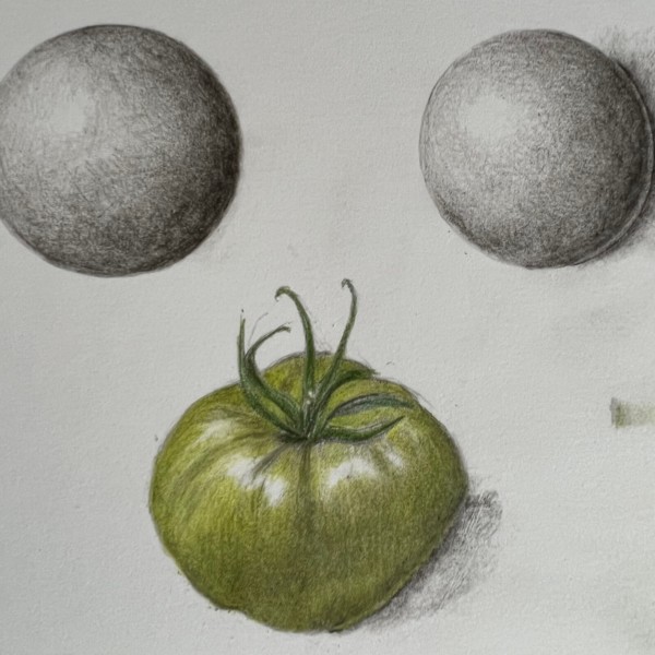
Susan Wright added a Photo 3 years ago
-
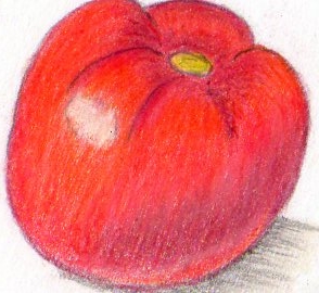
Nice job Susan! You have a really good range of tones on the two spheres. I would lighten the area around the main highlight a little. There is too much of a jump from the highlight to the area surrounding it. The tomato also looks really good! The top area especially has really good form. I would add more dark and mid-range tones (use your…[Read more]
-
Thank you Doug – I agree with all your suggestions – the highlight area needs to more gradual and the reflective highlight is awkward. Good things to practice…..
-
-
Ishbel Galloway added a Photo 3 years ago
-
these are amazing – beautiful composition
-
I love this — it’s so elegant and striking on the toned paper
-
Thank you so much!
-
Outstanding Ishbel!!!! Bravo!!!!
-

Oh Ishbel. I LOVE this! Gorgeous.
-
I love this – Beautiful!
-

This is gorgeous! The whites are so great. Everything!!
-

Ooh Ishbel! It’s positively breathtaking!!!!!
-
Beautiful!!
-
-
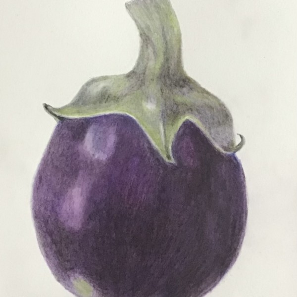
Cathie Hunter commented on Cathie Hunter's Photo 3 years ago
Sigh…the texture and color elude me
-
Cathie Hunter added a Photo 3 years ago
-
Sigh…the texture and color elude me
-
Hi Cathie- I feel your frustration in your post! The revised color looks really good to me! I think purples are hard to do because there rarely is one purple that works on its own. You have to mix a few colors to get the right one. I see that you followed Pam’s advice and the form is better now too! Don’t get too discouraged, your work just kee…[Read more]
-
thank you Doug
-
This is looking great, Cathie! The color looks sooooo much more natural now. Way to go!!
-
-
Richard A stjean added a Photo 3 years ago
-
Richard, you are really good at getting bright saturated colors. I’m a little confused by the orange color of the reflected highlight. Is it sitting on an orange surface maybe?
-
Pam ,since grapes are simi- transparent the light comimg out of the grape is orange . Taught to me by a painting teacher
-
-
Richard A stjean added a Photo 3 years ago
-
Richard, I really like the bright graphic quality of your drawings. And you are getting a nice core shadow here. I’m seeing a dark outline around your pepper and around your highlight. You may want to try to fade your colors into your edges instead of outlining shapes. Your toning is getting better with each drawing. Keep it up 🙂
-
-
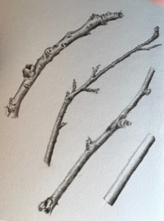
Doug Milne commented on Susan Wright's Photo 3 years ago
You’ve got it Susan! The range of tones on the branches give them great form! Looking forward to seeing more of your work!
-
Doug Milne commented on Sam McWilliams's Photo 3 years ago
Sam- I love how the the subjects are tilted a little and not at the same angle, yet the positions compliment each other so well! The clarity of the colors is amazing and those textures – sublime!!!
-
Doug Milne commented on Sam McWilliams's Photo 3 years ago
Gorgeous Sam! The colors are spot on and it has such beautiful form!
-
Cathie Hunter commented on Cathie Hunter's Photo 3 years ago
hi Pam, yes I agree the color of the eggplant – I thin the color of the actual drawing look different -I’lll try your shading suggestions and post it again
-
Theresia Schuba commented on Theresia Schuba's Photo 3 years ago
Thank you very much, Pam!
-
Susan Wright added a Photo 3 years ago
-
You’ve got it Susan! The range of tones on the branches give them great form! Looking forward to seeing more of your work!
-
Thank you Doug!
-
Great!
-
Yes, Susan, this is a wonderful page of twig portraits. 🙂
-
-
Sam McWilliams commented on Katy Lyness's Photo 3 years ago
Brava
-
Sam McWilliams commented on Pam's Photo 3 years ago
Truly this looks like something I would ogle at in a book. 🙂 Gorgeous
-
Sam McWilliams commented on Ishbel Galloway's Photo 3 years ago
I missed this one somehow, Ishbel. It’s just lovely.
- Load More