Activity
-
Renata commented on Renata's Photo 2 years, 10 months ago
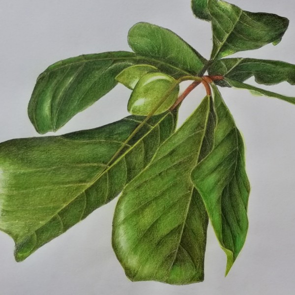
I am a bit bothered by the fruit and the leaves at the top, please do suggest anything you think would improve that are! Thanks!
-
Renata commented on Renata's Photo 2 years, 10 months ago
Thanks, Zara! And thanks, Pam! I don’t know the name of that thing but I always see them among the fruit. It is indeed a kind of stem but am not sure about the function. There are some pics here https://ahfragomeni.wixsite.com/jardinagem/copia-3-arvores-buriti
-

Pam commented on Renata's Photo 2 years, 10 months ago
WOW! This is such a beautiful bold composition. I love the perspective, and depth. There is one area that I’m not quite getting. There’s something that looks kind of like a stem that crosses over that bud and then ends at the midrib of the big leaf on the left. What’s going on there?
-
Pam commented on Richard A stjean's Photo 2 years, 10 months ago
it’s a rough example, but can you see how getting those darks on the right, and keeping your highlight very light helps to show that 3D form? -
Pam commented on Richard A stjean's Photo 2 years, 10 months ago
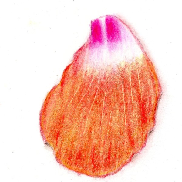
Hi Robert, Your drawing of this petal is very nice. I can tell that you are very carefully observing the edges of the petal. And I like how you are using contour lines to help with the 3D form. I think you still need to get some more values in there (without considering color at all). I’m really only seeing midtones (except for the white area).… -

Zara Harraden commented on Renata's Photo 2 years, 10 months ago
Amazing vivid colours, love it!
-
Renata added a Photo 2 years, 10 months ago
-
Amazing vivid colours, love it!
-
WOW! This is such a beautiful bold composition. I love the perspective, and depth. There is one area that I’m not quite getting. There’s something that looks kind of like a stem that crosses over that bud and then ends at the midrib of the big leaf on the left. What’s going on there?
-
Thanks, Zara! And thanks, Pam! I don’t know the name of that thing but I always see them among the fruit. It is indeed a kind of stem but am not sure about the function. There are some pics here https://ahfragomeni.wixsite.com/jardinagem/copia-3-arvores-buriti
-
I am a bit bothered by the fruit and the leaves at the top, please do suggest anything you think would improve that are! Thanks!
-
Renata, I do think that those fruits are looking a little flat, and you could push that 3D dimensional form a bit more. The light source isn’t clear to me. Is it coming from the upper left? If it is, you could try toning the lower right side of the large fruit darker on the lower right, and make the position of the main highlight more clear, by…[Read more]
-
Thank you so much, Pam. This is really helpful, I so appreciate your feedback! I will work on the fruit and the light source and will post again. Thank you!
-
-
Margaret Hahn commented on Margaret Hahn's Photo 2 years, 10 months ago
Good point – will keep that in mind next drawing.
-
Margaret Hahn commented on Margaret Hahn's Photo 2 years, 10 months ago
Thanks,Pam. I was experimenting with mostly watercolor as I bought these cold press cards which don’t work well with pencils. But I agree about the flatness. Not sure what will work on this paper. Any suggestions?
-
Hélène Chiasson commented on Hélène Chiasson's Photo 2 years, 10 months ago
Hi Pam, your comments help very much. For your information, the item on the left is a very white turnip – Japanese variety. They are pure white when small. I could add some green though for contrast and colour.
-
Richard A stjean added a Photo 2 years, 10 months ago
-
Hi Robert, Your drawing of this petal is very nice. I can tell that you are very carefully observing the edges of the petal. And I like how you are using contour lines to help with the 3D form. I think you still need to get some more values in there (without considering color at all). I’m really only seeing midtones (except for the white area).…
-
it’s a rough example, but can you see how getting those darks on the right, and keeping your highlight very light helps to show that 3D form?
-
-
Pam commented on Richard A stjean's Photo 2 years, 10 months ago
You are getting nice vibrant colors on this sphere, and I like how you are making your highlight nice and shimmery. You could get much darker on the right side of the sphere. Did you start with a grisaille layer first?
-
Pam commented on Richard A stjean's Photo 2 years, 10 months ago
I really like the added colors, richard. I think you still need to get darker on that right side of the branch. Remember that you are trying to get 9 values. Right now your branch is mostly midtones. Keep the ideally toned cylinder in your head, and try to erase out some highlight about a 1/4 of the way in from the left. And build up some darker…[Read more]
-

sheila y. commented on sheila y.'s Photo 2 years, 10 months ago
Thanks, Pam. The textures were varied depending on their environment. The stickiest is the blue-purple plumbago. The seaweed dried out. The sea holly has treacherous spikes! -
Pam commented on Margaret Hahn's Photo 2 years, 10 months ago
Gorgeous colors, and you captured the form of all those flowers so well. Great job. I think what this drawing could use, is some more 3 dimensional form overall. That cluster of flowers as a whole should be toned like a cylinder. That would help it look less flat, and give it some nice 3D form. It’s so hard with something with so many details and…[Read more]
-
Pam commented on Margaret Hahn's Photo 2 years, 10 months ago
This is gorgeous, Margaret. The drawing is absolutely beautiful. Compositionally, I may have left a little more paper in that upper left corner, to give that flower a little more space. Also, in general, we try to avoid pointing the viewer to a corner. See how if you follow the line of that stem it takes your eye right to the corner, and then off…[Read more]
-
Pam commented on Margaret Hahn's Photo 2 years, 10 months ago
Lovely Margaret.That branch is so cool, and you dod a great job of observing and rendering it’s texture and form. Your cherries are adorable. I like how you used size to help show which cherries are in front and which are in back. That worked really well. I might lighten up the highlight on that main cherry a bit to really give it some shine. Nice work.
-
Pam commented on Ishbel Galloway's Photo 2 years, 10 months ago
Ishbel, wow! Those vibrant blues are so beautiful. You drew all of those different views so beautifully. I think this is at the stage where you just need to add some really dark darks in those little area’s that receive the least light to give this nice contrast. Wonderful work, Ishbel.
-
Richard A stjean commented on Richard A stjean's Photo 2 years, 10 months ago
OK thanks
-
Pam commented on Richard A stjean's Photo 2 years, 10 months ago
Richard, this is such a great improvement from your first sphere! Take Doug’s advice and it will be even better.
- Load More