Activity
-

Pam commented on sheila y.'s Photo 2 years, 10 months ago
Yes! I 100% agree with Doug. I also love all the different shapes and textures. It’s fantastic.
-
Pam commented on Richard A stjean's Photo 2 years, 10 months ago
Richard, you are getting some nice rich color. I think what your missing is the 3D form. Try doing a grisaille layer with one dark neutral color first, before even thinking about color. I think that red-violet (#194) would work well for your grisaille with this petal. You could post an image of your grisaille first before you add any more color.…[Read more]
-
Pam commented on Hélène Chiasson's Photo 2 years, 10 months ago
There are a couple of suggestions that I can make.
– You may want to be careful about trying not to outline your forms. This does have a certain nice style to it that works with the outlining, but if you want it to look more realistic, try to avoid those dark outlines at your edges. If there is an area that has a dark edge, be sure to feather…[Read more]
-
Pam commented on Richard A stjean's Photo 2 years, 10 months ago
It’s funny. I find that I always see my mistakes more clearly after I post my work too 🙂
-

Margaret Hahn commented on Margaret Hahn's Photo 2 years, 10 months ago
Thanks! They are such interesting leaves to draw.
-
Renata commented on Margaret Hahn's Photo 2 years, 10 months ago
Wow! Wonderful flowers but those leaves are just superb!
-
Renata commented on Margaret Hahn's Photo 2 years, 10 months ago
I love how you captured the colours of those petals, Margaret!
-

sheila y. commented on sheila y.'s Photo 2 years, 10 months ago
Thanks, Doug. I had fun making this picture. I like blue and orange together, too. -
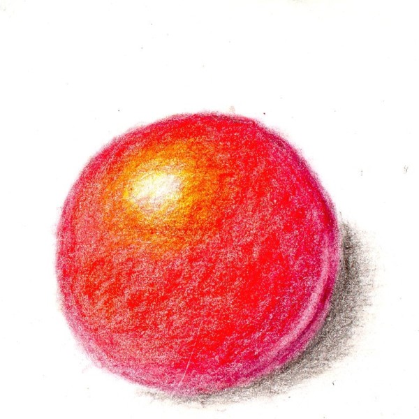
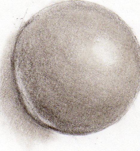
Richard A stjean added a Photo 2 years, 10 months ago
-
You are getting nice vibrant colors on this sphere, and I like how you are making your highlight nice and shimmery. You could get much darker on the right side of the sphere. Did you start with a grisaille layer first?
-
-
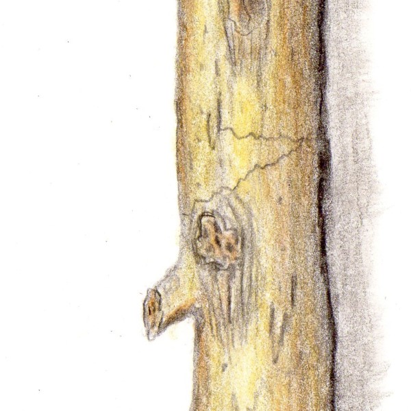
Richard A stjean added a Photo 2 years, 10 months ago
-
I really like the added colors, richard. I think you still need to get darker on that right side of the branch. Remember that you are trying to get 9 values. Right now your branch is mostly midtones. Keep the ideally toned cylinder in your head, and try to erase out some highlight about a 1/4 of the way in from the left. And build up some darker…[Read more]
-
-
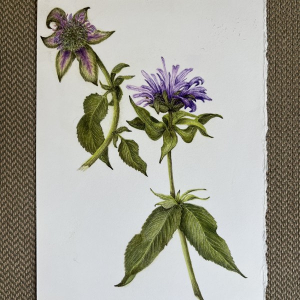
Zara Harraden commented on Margaret Hahn's Photo 2 years, 10 months ago
Really beautiful, bee balm is a lovely plant 🪴
-
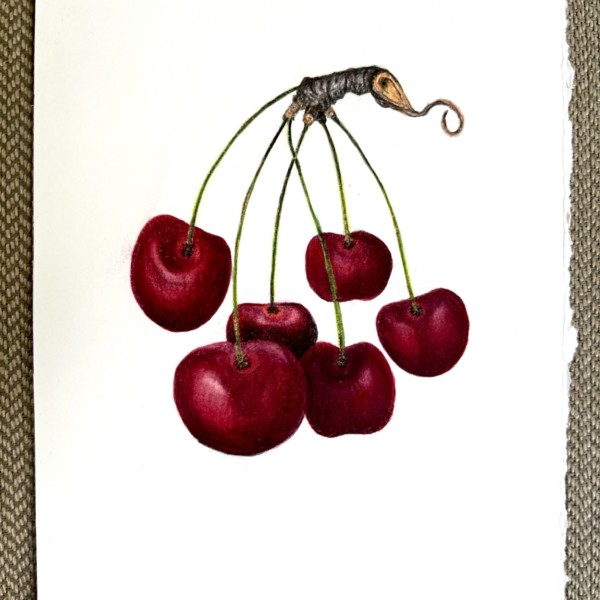
Margaret Hahn added 3 Photos 2 years, 10 months ago
-
Really beautiful, bee balm is a lovely plant 🪴
-
I love how you captured the colours of those petals, Margaret!
-
Wow! Wonderful flowers but those leaves are just superb!
-
Thanks! They are such interesting leaves to draw.
-
Lovely Margaret.That branch is so cool, and you dod a great job of observing and rendering it’s texture and form. Your cherries are adorable. I like how you used size to help show which cherries are in front and which are in back. That worked really well. I might lighten up the highlight on that main cherry a bit to really give it some shine. Nice work.
-
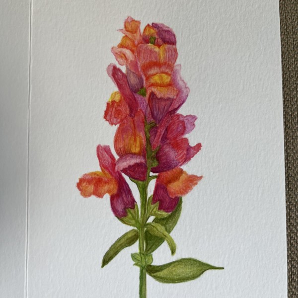
This is gorgeous, Margaret. The drawing is absolutely beautiful. Compositionally, I may have left a little more paper in that upper left corner, to give that flower a little more space. Also, in general, we try to avoid pointing the viewer to a corner. See how if you follow the line of that stem it takes your eye right to the corner, and then off…[Read more]
-
Gorgeous colors, and you captured the form of all those flowers so well. Great job. I think what this drawing could use, is some more 3 dimensional form overall. That cluster of flowers as a whole should be toned like a cylinder. That would help it look less flat, and give it some nice 3D form. It’s so hard with something with so many details and…[Read more]
-
Thanks,Pam. I was experimenting with mostly watercolor as I bought these cold press cards which don’t work well with pencils. But I agree about the flatness. Not sure what will work on this paper. Any suggestions?
-
Good point – will keep that in mind next drawing.
-
Hi Margaret, You could try taking a flat brush and gently try to lift out some highlights, especially toward the left. You could add some really dark darks using dry brush in some of those little areas that don’t receive any light. Hope this helps 🙂
-
-
Doug Milne commented on Richard A stjean's Photo 2 years, 10 months ago
This is off to a good start Richard! Remember you want to try to have 9 different tones starting with the lightest (color of the paper) to as dark as you can get. I would start by lightening the area around the main highlight and also darkening the darkest area on the right side and bottom. Than you can work on the transition of tones in between…[Read more]
-
Doug Milne commented on sheila y.'s Photo 2 years, 10 months ago
Wow Sheila! I really like how balanced this composition is! I also enjoy the complimentary orange and blue color combination! Beautiful!!!
-

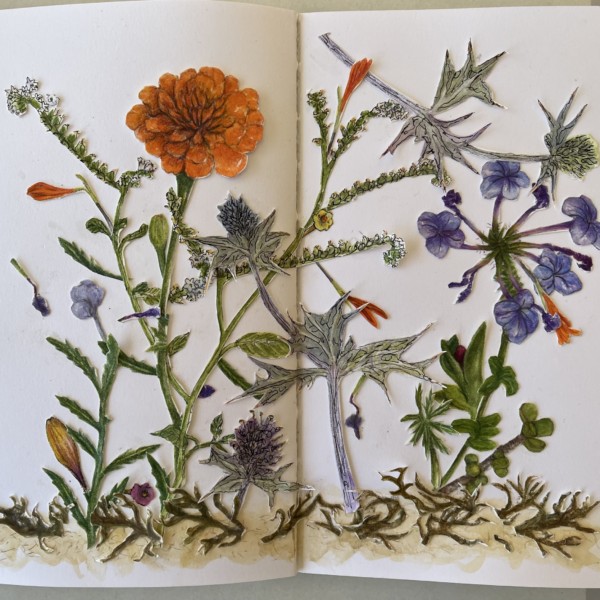
Ishbel Galloway commented on Ishbel Galloway's Photo 2 years, 10 months ago
Will add some seed pods and seeds as they dry
-
Ishbel Galloway added a Photo 2 years, 10 months ago
-
Will add some seed pods and seeds as they dry
-
Ishbel, wow! Those vibrant blues are so beautiful. You drew all of those different views so beautifully. I think this is at the stage where you just need to add some really dark darks in those little area’s that receive the least light to give this nice contrast. Wonderful work, Ishbel.
-
Thanks Pam. This was a bit overexposed I think but I also lost track of the highlights because I was experimenting with water color! The second version is a bit better maybe.
-
-
Richard A stjean added a Photo 2 years, 11 months ago
-
This is off to a good start Richard! Remember you want to try to have 9 different tones starting with the lightest (color of the paper) to as dark as you can get. I would start by lightening the area around the main highlight and also darkening the darkest area on the right side and bottom. Than you can work on the transition of tones in between…[Read more]
-
Richard, this is such a great improvement from your first sphere! Take Doug’s advice and it will be even better.
-
-
sheila y. added a Photo 2 years, 11 months ago
-
Wow Sheila! I really like how balanced this composition is! I also enjoy the complimentary orange and blue color combination! Beautiful!!!
-
Thanks, Doug. I had fun making this picture. I like blue and orange together, too.
-
Yes! I 100% agree with Doug. I also love all the different shapes and textures. It’s fantastic.
-
Thanks, Pam. The textures were varied depending on their environment. The stickiest is the blue-purple plumbago. The seaweed dried out. The sea holly has treacherous spikes!
-
-
Hélène Chiasson commented on Hélène Chiasson's Photo 2 years, 11 months ago
Anything to improve upon? I was feeling stuck so posted it to get your input.
-
Hélène Chiasson commented on Hélène Chiasson's Photo 2 years, 11 months ago
Hi Pam, thank you for your comments. The ´subject’ is a seed case from a tree grown in Hawaii. It was found along the road with other debris, like the beans on the left. I like drawing withered and dried plants or plant parts!
- Load More