Activity
-

Doug Milne commented on Patricia Zuroski's Photo 1 month, 1 week ago
Really wonderful Patricia! It is beautifully drawn and great colors. As you say it is in need of shading! It would help emphasize the form by doing shadow toning on the bottom right and the right side in addition to shadow toning the right side of the individual segments. The stem needs more toning and don’t forget the shadow the stem would cast o…[Read more]
-
Vanessa Fox added 5 Photos 1 month, 1 week ago
-
Beautiful Vanessa! The center detail is fantastic!
-
Nice study showing folds and shadows!
-
Hi Vanessa- some of the leaves have nice highlights on them and some don’t. The second and third leaf up from the bottom on the right could use some highlights and dark toning to give them some interest and definition as the other leaves have.
-
Wonderful Vanessa! There are several leaves where I would expect shadow toning where the leaf starts to fold over. Especially sides of the leaf furthest from the light source, but also somewhat on the leaf sides closer to the light source.
-
-
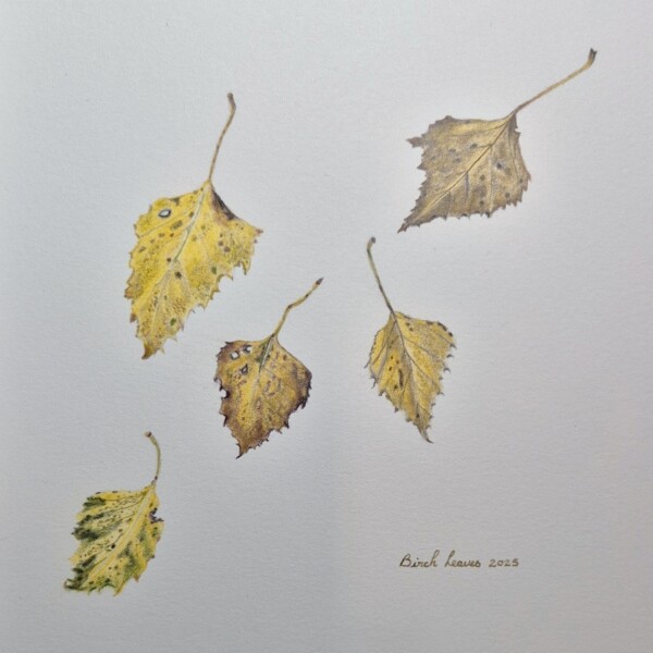
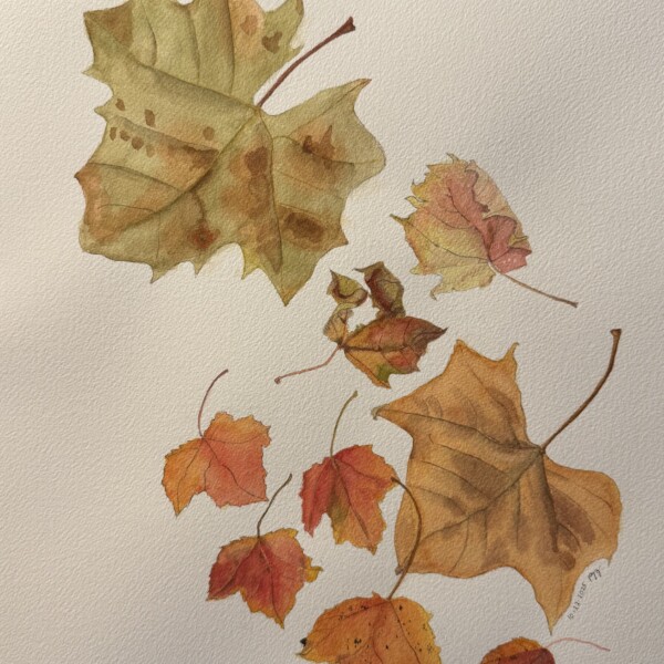
Denise Harris added a Photo 1 month, 1 week ago
-
Wonderful Denise! I really like how you composed the leaves. It truly gives the impression of falling leaves!
-
-
Machi commented on Machi's Photo 1 month, 1 week ago
Acorns were on the ground, but I plucked the leaf from the tree. Dried leaves on the ground looked too difficult to draw.
-
Machi added a Photo 1 month, 1 week ago
-
Acorns were on the ground, but I plucked the leaf from the tree. Dried leaves on the ground looked too difficult to draw.
-
Great details Machi and the colors are spot on!
-
The texture of your acorns is so wonderful. I want to pick them up!
-
-
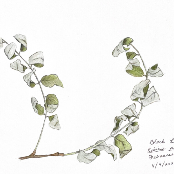
Patricia Zuroski commented on Patricia Zuroski's Photo 1 month, 1 week ago
This gourd reminded me of a crown! Does anyone have thoughts about the shading? I thought I had gone dark, but looking at it now, I wonder if I should go darker and create more contrast between the highlighted front and the back.
-
Patricia Zuroski added a Photo 1 month, 1 week ago
-
This gourd reminded me of a crown! Does anyone have thoughts about the shading? I thought I had gone dark, but looking at it now, I wonder if I should go darker and create more contrast between the highlighted front and the back.
-
Really wonderful Patricia! It is beautifully drawn and great colors. As you say it is in need of shading! It would help emphasize the form by doing shadow toning on the bottom right and the right side in addition to shadow toning the right side of the individual segments. The stem needs more toning and don’t forget the shadow the stem would cast o…[Read more]
-
Agree with the comments about creating 3 d form, but even without that this one made me smile. So charming!
-
Thank you, both, for your comments and help. I always hear Pam saying, “You can go darker!”
-
-
Patricia Zuroski commented on Patricia Zuroski's Photo 1 month, 1 week ago
Thank you. Doug. Yes, so many leaves calling out for attention!
-
Erin Russek commented on Erin Russek's Photo 1 month, 2 weeks ago
Thank you Doug. I was coming to that conclusion as well.
-
Doug Milne commented on Erin Russek's Photo 1 month, 2 weeks ago
Hi Erin- I love this piece! As I said before, finishing the studies on the bottom could make a difference to the overall composition and to my eye they do. The space between the leaves does not bother me as it did before. If you do add a leaf, it could be the back view and maybe also having it be faded (less detail). However, looking at it now my…[Read more]
-
Doug Milne commented on Hélène Chiasson's Photo 1 month, 2 weeks ago
Hi Helene- I think the newly added leaves are well placed and my eye now goes to the flower instead of the former negative space. Beautiful!
-
Hélène Chiasson added a Photo 1 month, 2 weeks ago
-
Hi Helene- I think the newly added leaves are well placed and my eye now goes to the flower instead of the former negative space. Beautiful!
-
-
Erin Russek commented on Erin Russek's Photo 1 month, 3 weeks ago
I think you are right Doug. That negative space between the two big leaves is all I can see now. Maybe the back of a leaf? I guess it’s back to the drawing board for me.
-
Erin Russek added a Photo 1 month, 3 weeks ago
-
I think you are right Doug. That negative space between the two big leaves is all I can see now. Maybe the back of a leaf? I guess it’s back to the drawing board for me.
-
Hi Erin- I love this piece! As I said before, finishing the studies on the bottom could make a difference to the overall composition and to my eye they do. The space between the leaves does not bother me as it did before. If you do add a leaf, it could be the back view and maybe also having it be faded (less detail). However, looking at it now my…[Read more]
-
Thank you Doug. I was coming to that conclusion as well.
-
I love the cross section!
-
-
Erin Russek commented on Erin Russek's Photo 1 month, 3 weeks ago
Thank you Doug! That’s very helpful
-
Doug Milne commented on Patricia Zuroski's Photo 1 month, 3 weeks ago
Wonderful page Patricia! You captured the look and feel of autumn! It certainly looks like what I see when I go out my door! The colors are spot on and some leaves really exude that look of wet decay. It is hard to walk down the street and bypass all the wonderful subjects that there are right now.
-
Doug Milne commented on Erin Russek's Photo 1 month, 3 weeks ago
You are off to a great start Erin! The stem and fruit look wonderful and seem completed to me. The leaves are almost there. The two, large center leaves need more dark and mid-range tones to give them definition. Thinking of where the light hits a leaf, there is a dark side of the main vein and a light side of a main vein. Right now, each side of…[Read more]
-
Patricia Zuroski added a Photo 1 month, 4 weeks ago
-
Wonderful page Patricia! You captured the look and feel of autumn! It certainly looks like what I see when I go out my door! The colors are spot on and some leaves really exude that look of wet decay. It is hard to walk down the street and bypass all the wonderful subjects that there are right now.
-
Thank you. Doug. Yes, so many leaves calling out for attention!
-
-
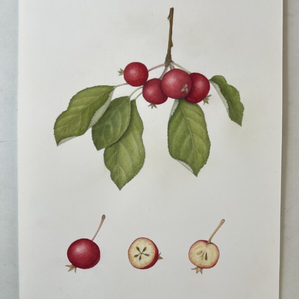
Erin Russek commented on Erin Russek's Photo 1 month, 4 weeks ago
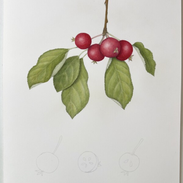
My neighborhood is filled with crab apple trees. I thought this would be a good chance to practice overlaps and multiple elements. I’m at the “scared to wreck it” stage.
-
Erin Russek added a Photo 1 month, 4 weeks ago
-
My neighborhood is filled with crab apple trees. I thought this would be a good chance to practice overlaps and multiple elements. I’m at the “scared to wreck it” stage.
-
You are off to a great start Erin! The stem and fruit look wonderful and seem completed to me. The leaves are almost there. The two, large center leaves need more dark and mid-range tones to give them definition. Thinking of where the light hits a leaf, there is a dark side of the main vein and a light side of a main vein. Right now, each side of…[Read more]
-
Thank you Doug! That’s very helpful
-
- Load More