Activity
-

Denise Harris added a Photo 1 month, 1 week ago
-
Doug Milne commented on Maureen Griffin's Photo 1 month, 3 weeks ago
Nice study page Maureen! Your color selection and saturation is really good! I would revisit the interior areas of the caps. The dark top ring on the side view should not be dark all the way around. Where the light hits it it should be light and be darker furthest from the light source. The left side of the interior of the cup, where it is…[Read more]
-
Doug Milne commented on Rita Haft's Photo 1 month, 3 weeks ago
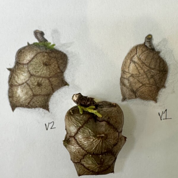
Wow Rita! The exterior view of this eggplant is gorgeous! You have captured the colors and skin texture beautifully! I am thrown by the cut view. Personally I don’t think there is enough going on visually to include it. I would matte it to not include the cut view. The exterior view is definitely frame worthy!!!
-
Doug Milne commented on Faye Forman's Photo 1 month, 3 weeks ago
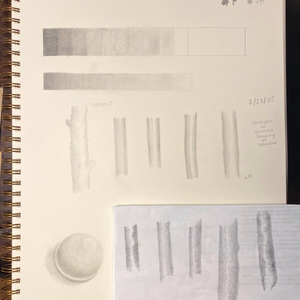
You are off to a good start Faye. Some areas need a revisit. With the tone blocks the mid-range blocks are too similar. Some of the blocks that should be light are darker than the darker blocks. You should be able to see that each block is different as they progress from light to dark (or dark to light). Using a B pencil which allows you to get…[Read more]
-
Maureen Griffin added a Photo 1 month, 3 weeks ago
-
Nice study page Maureen! Your color selection and saturation is really good! I would revisit the interior areas of the caps. The dark top ring on the side view should not be dark all the way around. Where the light hits it it should be light and be darker furthest from the light source. The left side of the interior of the cup, where it is…[Read more]
-
-
Rita Haft added a Photo 1 month, 3 weeks ago
-
Wow Rita! The exterior view of this eggplant is gorgeous! You have captured the colors and skin texture beautifully! I am thrown by the cut view. Personally I don’t think there is enough going on visually to include it. I would matte it to not include the cut view. The exterior view is definitely frame worthy!!!
-
-
Faye Forman added a Photo 1 month, 3 weeks ago
-
You are off to a good start Faye. Some areas need a revisit. With the tone blocks the mid-range blocks are too similar. Some of the blocks that should be light are darker than the darker blocks. You should be able to see that each block is different as they progress from light to dark (or dark to light). Using a B pencil which allows you to get…[Read more]
-
@dougmilne thank you Doug! Let me try again and apply your suggestions with the B pencil
-
-
Faye Forman commented on Katie Helmrick's Photo 1 month, 3 weeks ago
Absolutely beautiful
-
Doug Milne commented on Maureen Griffin's Photo 2 months ago
Yes Maureen! You did a great job capturing the colors and this is a much more interesting view than the original. See how the highlights on the actual subject really help emphasize the curves and form of the individual sections.
-
Doug Milne commented on Denise Harris's Photo 2 months ago
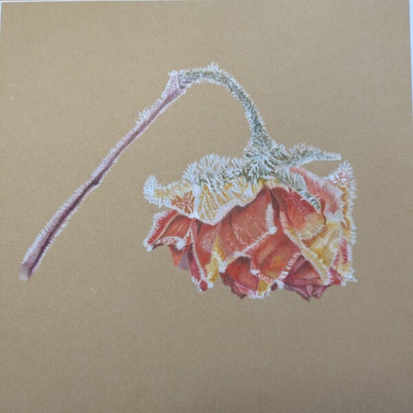
You did a great job capturing the frost Denise and this was a great subject for the Kraft paper! The one thing I am struggling with is the form toning. The flower is missing it’s full form impact because there is no light side or dark side. It will be tricky because you don’t want to eliminate where the frost is on the right side. I would add som…[Read more]
-
Maureen Griffin added a Photo 2 months ago
-
Yes Maureen! You did a great job capturing the colors and this is a much more interesting view than the original. See how the highlights on the actual subject really help emphasize the curves and form of the individual sections.
-
-
Denise Harris added a Photo 2 months ago
-
You did a great job capturing the frost Denise and this was a great subject for the Kraft paper! The one thing I am struggling with is the form toning. The flower is missing it’s full form impact because there is no light side or dark side. It will be tricky because you don’t want to eliminate where the frost is on the right side. I would add som…[Read more]
-
-
Doug Milne commented on Patricia Zuroski's Photo 2 months, 1 week ago
Hi Patricia- what special and unique project for you and your granddaughter!
-
Faye Forman commented on Faye Forman's Photo 2 months, 2 weeks ago
@dougmilne Thank you so much for your feedback! This is incredibly helpful. Taking a photo or using a reference from the internet or book makes a lot of sense. The shading and light source is the trickiest element for me. I also started with a pencil that cut too sharply into the kraft paper which led to my initial sketch being overly defined and…[Read more]
-
Patricia Zuroski commented on Patricia Zuroski's Photo 2 months, 2 weeks ago
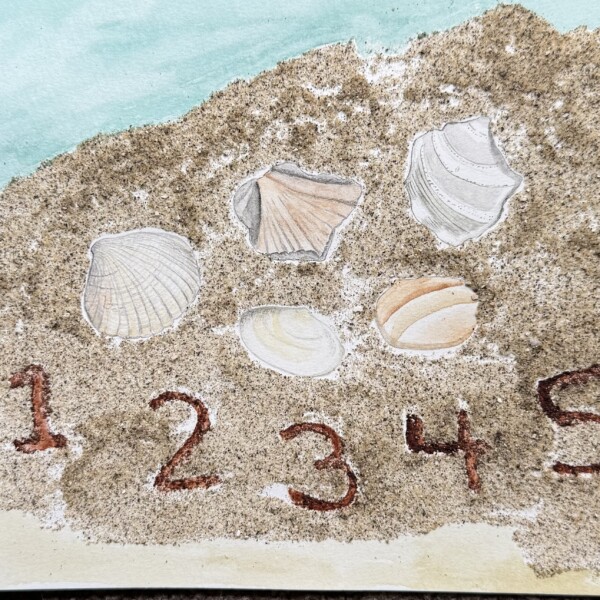
This was for fun for my granddaughter. She loves collecting shell fragments on the beach and is just learning to count. I sprinkled the drawing with sand so she could feel it. I find drawing shells is similar to drawing wood; so much texture and the colors and gradations are subtle.
-
Patricia Zuroski added a Photo 2 months, 2 weeks ago
-
This was for fun for my granddaughter. She loves collecting shell fragments on the beach and is just learning to count. I sprinkled the drawing with sand so she could feel it. I find drawing shells is similar to drawing wood; so much texture and the colors and gradations are subtle.
-
Hi Patricia- what special and unique project for you and your granddaughter!
-
-
Patricia Zuroski commented on Patricia Zuroski's Photo 2 months, 2 weeks ago
Thank you, Faye and Doug. I appreciate the encouragement.
-
Doug Milne commented on Faye Forman's Photo 2 months, 2 weeks ago
Hi Faye- there are a couple of suggestions for these paper whites. First would be to shade the top of the stem where it meets the flower petals. The petals would cast a shadow on the stem and the shape of the petal will help determine the size and shape of the shadow. Remember that there will be a curve to the shadow on the right hand side of the…[Read more]
-
Doug Milne commented on Maureen Griffin's Photo 2 months, 2 weeks ago
Great Maureen! You have a really nice range of tones on the branch segments and the buds and leaves are a nice addition! Be careful with the highlight. The main highlight on the lower angled branch is too centered. It should be moved to the left a little and the darkest edge of the branch would be the right side edge. The cast shadows are nice and…[Read more]
-
Doug Milne commented on Faye Forman's Photo 2 months, 2 weeks ago
Hi Faye- it has been nice to see the drawing process of your paper whites. They look good on the Kraft paper. Drawing live plant material is a challenge! One tool to use is a camera. Take a picture when the plant is fresh and is set up as you are going to draw it. It is a great reference. Another option is to get another fresh sample of the…[Read more]
- Load More