Activity
-

Pam commented on Maureen Doram's Photo 3 years, 3 months ago
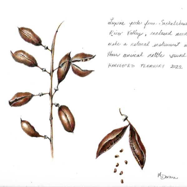
Very nice. I love that pod opening up and spilling its seeds. So fun! You did a beautiful job of leaving those edges of the pod walls nice and light where they meet the shadows on the inside. And those inside shadows are nice and interesting, and show some great form (not just a dark blob). I like all the different views of the seed pods that you…[Read more]
-
Pam commented on Theresia Schuba's Photo 3 years, 3 months ago
I just love root studies. They are so much fun. You are off to a great start. You really captured the “feel” of those roots and the way they twist and overlap and tangle. One trick that can help a bit is to take some some of the medium to larger shapes that are created by the negative space between roots, and tone that whole space a bit darker. It…[Read more]
-
Pam commented on sheila y.'s Photo 3 years, 3 months ago
Yes! Gosh this is just fantastic. I love the composition changes. Just gorgeous.
-
Pam commented on Mary Frost's Photo 3 years, 3 months ago
Mary, this is looking great! Nice use of pattern to show the contour of the tomato. It’s working really well. Your toning is beautiful and smooth, and the leaves around the stem are wonderful. I agree with Katy about the cast shadow. I played around a bit with it in photoshop very roughly, where I added a bit more core shadow and moved the… -

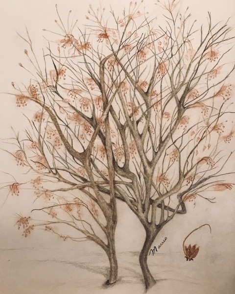
Wendy Kleinman commented on Wendy Kleinman's Photo 3 years, 3 months ago
Trees in workshop – Clethera
-
-
Trees in workshop – Clethera
-
Wendy, so beautiful!!! This has a lovely ethereal quality to it. It’s great! Looking forward to seeing Sam’s feedback.
-
That is just lovely! Love the subtle coloring..
-
This is so beautiful, feels so cold and yet so alive!
-
Thank you all for the support!
-
-
Doug Milne commented on Maureen Doram's Photo 3 years, 3 months ago
Great job Maureen!!! The color saturation is fantastic! The thing I question are the highlights. The highlights are so strong on the 2 bottom pods, but not as strong on any of the other pods. Specifically the top two pods on the left. Should the top pod highlight be stronger or the bottom pod highlights be toned down? What do you think?
-
mary jo gimber commented on mary jo gimber's Photo 3 years, 3 months ago
Doug, Thanks for your critique. The colored branch started as a blind contour drawing in ink. Then I decided to use some color. I could try erasing the color but don’t think I can do anything about the ink drawing. It was fun doing the pencil drawing with the red berries. Hope to get more drawing done soon. Thanks again. mj
-

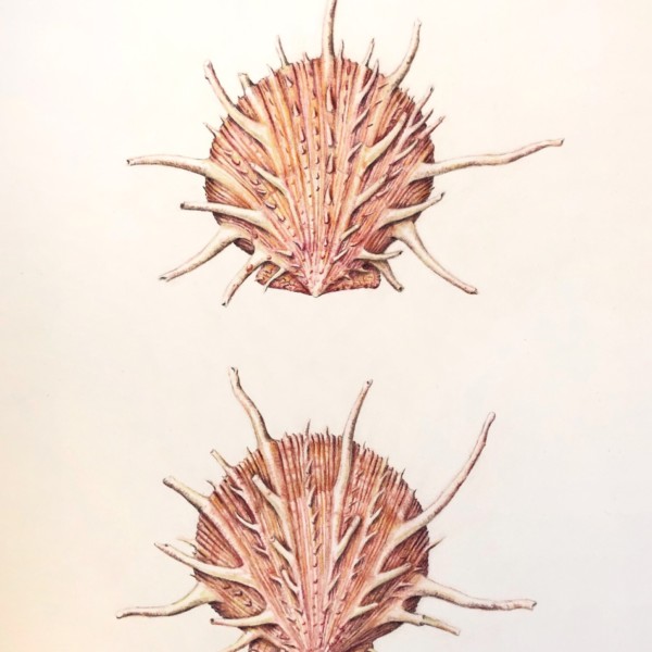
Jill Amadei added a Photo 3 years, 3 months ago
-
Oh Jill. You have such a beautiful style. These are gorgeous. Maybe (really, maybe – because I love these just as they are), you could darken the right sides of these a bit to show that convex form of the shell as a whole? But again, it is gorgeous just as it is. Thanks for sharing your lovely work.
-
-
Maureen Doram commented on Wendy Hollender's Photo 3 years, 3 months ago
So inspiring, it reads like a sweet melody!
-
Maureen Doram added a Photo 3 years, 3 months ago
-
Great job Maureen!!! The color saturation is fantastic! The thing I question are the highlights. The highlights are so strong on the 2 bottom pods, but not as strong on any of the other pods. Specifically the top two pods on the left. Should the top pod highlight be stronger or the bottom pod highlights be toned down? What do you think?
-
Very nice. I love that pod opening up and spilling its seeds. So fun! You did a beautiful job of leaving those edges of the pod walls nice and light where they meet the shadows on the inside. And those inside shadows are nice and interesting, and show some great form (not just a dark blob). I like all the different views of the seed pods that you…[Read more]
-
@doug-milne great idea about the highlights, thanks so much
-
@pgthompson thanks for the tips, it’s wonderful to get your feedback
-
-
Theresia Schuba commented on Theresia Schuba's Photo 3 years, 3 months ago
Hi Kathy, thank you very much for your great advice. I like your ideas of changing the greens and roots and I‘ll simply start to draw a new bulb. These roots are so fascinating! Thanks a lot!!!
-
Katy Lyness commented on sheila y.'s Photo 3 years, 3 months ago
Hi Sheila, I was just comparing this one to your last version, what a great study/lesson in composition! Just a subtle tweak, but the difference is amazing. This party is really rockin!
-
Katy Lyness commented on Wendy Hollender's Photo 3 years, 3 months ago
Oh, Wendy, its always a pleasure to see your work!
-
Katy Lyness commented on Theresia Schuba's Photo 3 years, 3 months ago
Hi Theresia, Ah, spring! My bulbs are just peeking up. I love this time of year. You have done a great job on the brown bulb. You are so good at spherical subjects! But I’d like to see some work on the greens. They seem one note. Try adding some indigo in the shadows and yellow/green in the highlights. Maybe even some browns from the bulb to tie t…[Read more]
-
Katy Lyness commented on Mary Frost's Photo 3 years, 3 months ago
I see you have lightened the shadows since the last submission. I think that was a good move. Now think about adding some color to the shadows. I believed I mentioned indigo. Also, the reflective light could be better placed. Even though, because of ambient light and translucency of the subject, you will see a dark edge next to the cast shadow,…[Read more]
-
Pam commented on Wendy Hollender's Photo 3 years, 3 months ago
What a fantastic composition. I love everything about it.
-

Wendy Hollender added a Photo 3 years, 3 months ago
-
What a fantastic composition. I love everything about it.
-
Oh, Wendy, its always a pleasure to see your work!
-
So inspiring, it reads like a sweet melody!
-
WOW~~~!!!!!!!! Wendy!! 🤩
-
-
Wendy Kleinman commented on Wendy Hollender's Photo 3 years, 3 months ago
Welcome home Wendy! Glad you’re back safe and sound and with a new drawing board. Pam – thank you for the great laugh. I have the fantasy that everyone is working from a perfectly fabulous studio and you brought me down to earth.
Wendy Marris -

sara stauffer commented on sara stauffer's Photo 3 years, 3 months ago
I would be so happy to show my redesign lettering aid! Or do you mean how do chose content?
- Load More