Activity
-

Maureen Griffin added a Photo 1 year, 6 months ago
-
Faye Forman added 2 Photos 1 year, 6 months ago
-
Doug Milne commented on Brittany Czerna's Photo 1 year, 6 months ago
This is a good start Brittany. There are a couple of areas to revisit. The main highlight is too centered. It should shift over to the left a little. Since the left edge is closest to the light source it should only be a 3-4 on the tone scale as you did on the tone arc bar post. The darker side should be the right edge. I don’t know if I would b…[Read more]
-
Doug Milne commented on Brittany Czerna's Photo 1 year, 6 months ago
Welcome to the ArtFeed Brittany! It is good to practice the arc tone bars. The fourth one up from the bottom is the most successful. The common problem with all of them is the areas flanking the highlight are too dark. Those areas should just have a little bit of color and the toning will smoothly transition darker as it moves away from the…[Read more]
-
Doug Milne commented on Maureen Griffin's Photo 1 year, 6 months ago
This is really good Maureen! Nice highlight and range of tones that are creating great form.
-
Doug Milne commented on Ishbel Galloway's Photo 1 year, 6 months ago
Wow Ishbel! This is gorgeous! The colors, textures and crispness are just amazing!
-

Ishbel Galloway added a Photo 1 year, 6 months ago
-
Wow Ishbel! This is gorgeous! The colors, textures and crispness are just amazing!
-
I love the contrast of stiff, pointed interior (stigma?) and wilting, droopy petal. Beautiful..
-
-
Brittany Czerna added a Photo 1 year, 6 months ago
-
This is a good start Brittany. There are a couple of areas to revisit. The main highlight is too centered. It should shift over to the left a little. Since the left edge is closest to the light source it should only be a 3-4 on the tone scale as you did on the tone arc bar post. The darker side should be the right edge. I don’t know if I would b…[Read more]
-
-
Brittany Czerna added a Photo 1 year, 6 months ago
-
Welcome to the ArtFeed Brittany! It is good to practice the arc tone bars. The fourth one up from the bottom is the most successful. The common problem with all of them is the areas flanking the highlight are too dark. Those areas should just have a little bit of color and the toning will smoothly transition darker as it moves away from the…[Read more]
-
-
Maureen Griffin added a Photo 1 year, 6 months ago
-
This is really good Maureen! Nice highlight and range of tones that are creating great form.
-
-
Doug Milne commented on Kellie Patton's Photo 1 year, 6 months ago
Great job Kellie! The color selection and saturation are wonderful! As is your toning and patterning! The apple has great form and everything came together to make the image very realistic!
-
Doug Milne commented on Denise Beach's Photo 1 year, 6 months ago
Wonderful progression images and details! Fantastic page Denise!
-
Doug Milne commented on Denise Beach's Photo 1 year, 6 months ago
Great page Denise!
-
Doug Milne commented on Denise Beach's Photo 1 year, 6 months ago
This is a good study page Denise! I was just telling another artist that leaves can often be more challenging than the flower or other aspects of the plant. As you probably noticed there are some basic rules, but every type of leaf will require something unique to identify it. I have it in my head that kale leaves have a lot of pillowing on them.…[Read more]
-
Doug Milne commented on Gale Foster's Photo 1 year, 6 months ago
This is beautifully rendered Gale and the colors are wonderful! Great job! The flower center is especially good! Your lettering also compliments the flower. My one comment would be the highlights on the leaves. They look too white and strategically placed. Look at Wendy’s leaves in her books and lesson videos (and others on the ArtFeed) or in b…[Read more]
-
Doug Milne commented on Denise Harris's Photo 1 year, 6 months ago
Happy New Year Denise! I am not familiar with this plant. The cluster of flowers at the top are a little hard to read. I would think of adding more shadow toning (and keeping highlights) to give the individual flowers some definition. You can use an ocher or gold, etc to add some darks so as not to muddy the yellow colors. I would think about…[Read more]
-
Doug Milne commented on Gale Foster's Photo 1 year, 6 months ago
Hi Gale- the cast shadow is positioned perfectly. I would just lighten it a little. The shadow fades as it moves away from the subject. Your color selection is also great! If the pear had a shiny surface, the highlights are okay, but I would expect them to be toned down a little by adding some color to them. I think the leaves have too many…[Read more]
-
Doug Milne commented on Gale Foster's Photo 1 year, 6 months ago
Wow! The cone segments have so much texture and dimension! Great job! Remember though, the overall cone itself will require the full range of tones from highlight to dark to give it it’s form. The details really stand out, but the cone itself looks flat. By adding the form toning the whole cone will look realistic and take this image to the next level.
-
Doug Milne commented on Gale Foster's Photo 1 year, 6 months ago
Good job Gale! The berries have a strong highlight which emphasizes their shiny skin. Generally holly leaves are also very shiny. For drawing future holly leaves, I would leave the white of the paper rather than adding white on top later. It makes for a stronger highlight, which you need here. This image would make a nice holiday card next year.
-
Denise Harris added a Photo 1 year, 6 months ago
-
Happy New Year Denise! I am not familiar with this plant. The cluster of flowers at the top are a little hard to read. I would think of adding more shadow toning (and keeping highlights) to give the individual flowers some definition. You can use an ocher or gold, etc to add some darks so as not to muddy the yellow colors. I would think about…[Read more]
-
- Load More
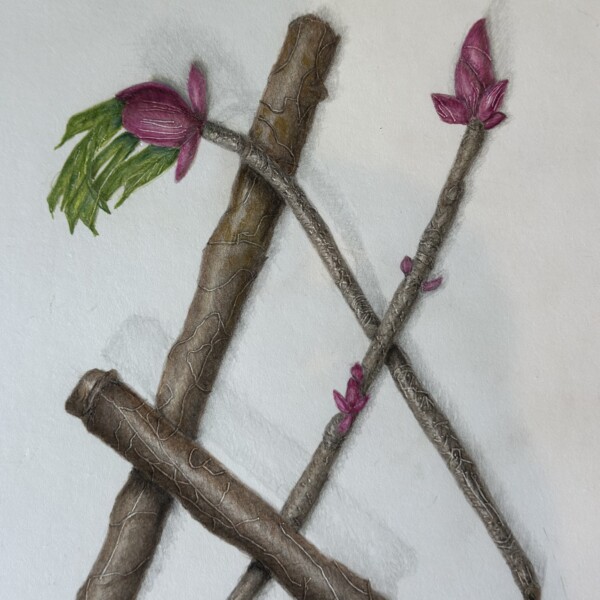


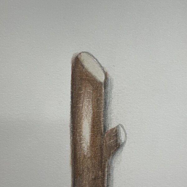
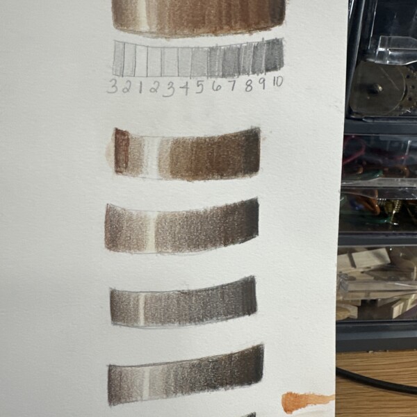
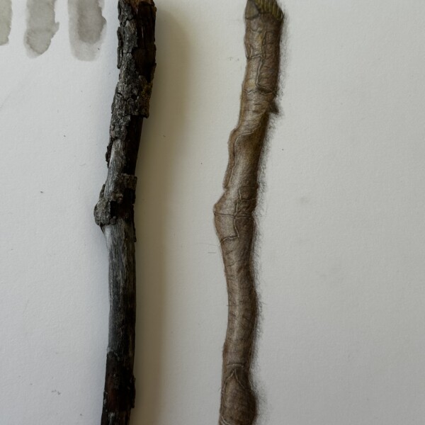

Great Maureen! You have a really nice range of tones on the branch segments and the buds and leaves are a nice addition! Be careful with the highlight. The main highlight on the lower angled branch is too centered. It should be moved to the left a little and the darkest edge of the branch would be the right side edge. The cast shadows are nice and…[Read more]