Activity
-
Margaret Hahn added 2 Photos 3 years, 9 months ago
-
Vanessa.M.C added a Photo 3 years, 9 months ago
-
Sharon Combey added a Photo 3 years, 9 months ago
-
-
Hi Douglass- this sketch looks much closer to what I saw on the photo of your persimmon. Good job! Right now on your sketch, the center diamond shape looks like it is sitting on top of the caps. I think it actually sits lower and the four points of the diamond blend into the respective caps. I think that will be an important detail if you do…[Read more]
-
-
Wendy Kleinman added a Photo 3 years, 9 months ago
-
Elizabeth Simonson commented on Elizabeth Simonson's Photo 3 years, 9 months ago
Completed lily composition. I had to use a low res to upload so I’m not sure how it will translate. I can still smell these flowers!!
-
Elizabeth Simonson added a Photo 3 years, 9 months ago
-
Completed lily composition. I had to use a low res to upload so I’m not sure how it will translate. I can still smell these flowers!!
-
White flower on white paper. If only I could do this well
-
Thanks Vern. Been quite a learning experience!!
-
Beautiful Elizabeth!
-
Thanks Sam for your help during the class. It really helped me.
-
-
sara stauffer added a Photo 3 years, 9 months ago
-
-
Doug Milne commented on Douglass Reitter's Photo 3 years, 9 months ago
Hi Douglass- I can’t find the message you sent out yesterday, but I did a quick sketch of the sepal cap to show you what I meant about the four sections of the cap I am seeing in your picture. Hope this helps!
-
Katy Lyness commented on Cathie Hunter's Photo 3 years, 9 months ago
Hi Cathie, I like seeing you playing with composition! The power of three is working here. And I like the linear quality of the stems contrasting the solidness of the flower. I think the two buds could be less parallel and less the same size. I’d have placed the right one slightly lower. Also it would be nice if one of them were more open. The…[Read more]
-
Katy Lyness commented on sara stauffer's Photo 3 years, 9 months ago
Fun page! And good question on the cast shadow. You could go either way. I like a cast shadow, as it can give the images more depth. It separates them from the page in a nice way. I’d make it subtle and be careful to keep the light source similar in each object. However, it looks nice the way it is, too. Maybe use a piece of tracing paper and do a…[Read more]
-
-
Even though you suiggested paper colored ghlights I knew from last suggestions that shiny objects have white highlights, Matt objects have light highlights. So with this and the repositioning of the highlights much higher up led to this total look. I could even see how the highlights and stem shadow played off each other. Luckily I was looking at…[Read more]
-
-
Theodora Korasidis commented on Theodora Korasidis's Photo 3 years, 9 months ago
Thanks for your feedback.
-
-
Hi Cathie, I like seeing you playing with composition! The power of three is working here. And I like the linear quality of the stems contrasting the solidness of the flower. I think the two buds could be less parallel and less the same size. I’d have placed the right one slightly lower. Also it would be nice if one of them were more open. The…[Read more]
-
-
sara stauffer commented on sara stauffer's Photo 3 years, 9 months ago
I’m continuing to work on this and would love some advice about whether I should add cast shadows?
-
sara stauffer added a Photo 3 years, 9 months ago
-
I’m continuing to work on this and would love some advice about whether I should add cast shadows?
-
Fun page! And good question on the cast shadow. You could go either way. I like a cast shadow, as it can give the images more depth. It separates them from the page in a nice way. I’d make it subtle and be careful to keep the light source similar in each object. However, it looks nice the way it is, too. Maybe use a piece of tracing paper and do a…[Read more]
-
-
Doug Milne commented on Maureen Doram's Photo 3 years, 9 months ago
Hi Maureen- That branch segment is amazing and as usual your leaves just glow!!!
-
Doug Milne commented on Douglass Reitter's Photo 3 years, 9 months ago
The toning on the body and along the right edge of the cap has helped. I am still missing the cap details that show that there are four sections to the cap. I would lighten the cast shadow a little and if you are going to have a cast shadow I would expect to see a reflected highlight on the persimmon.
-
Doug Milne commented on Cathie Hunter's Photo 3 years, 9 months ago
Nice page Cathie! The side view on the upper left is particularly good! Some subjects like the bud on the left are outlined and be careful not to do that. I think of cyclamen as being very bold, rich colors. You could have more saturation here. You could use red/violet or navy blue for toning rather than black. I think the black has muddied your…[Read more]
- Load More
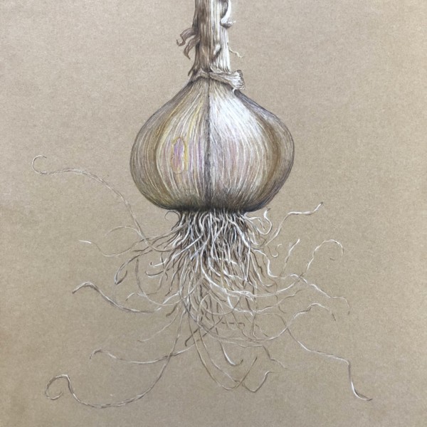

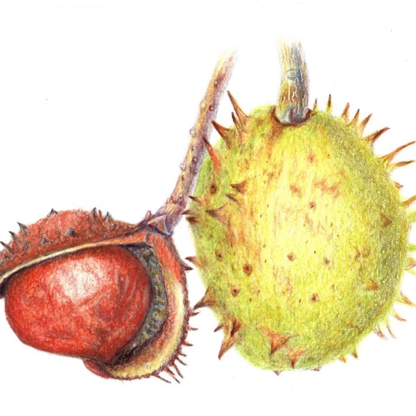


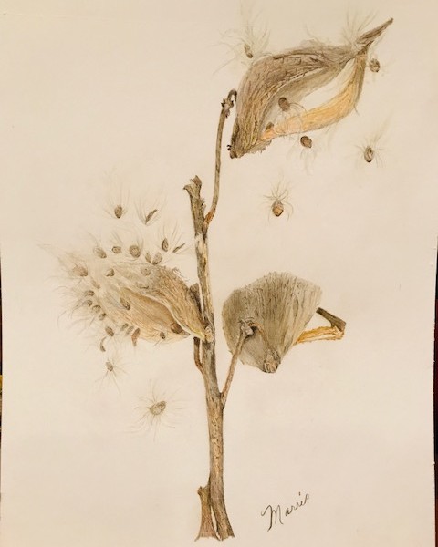
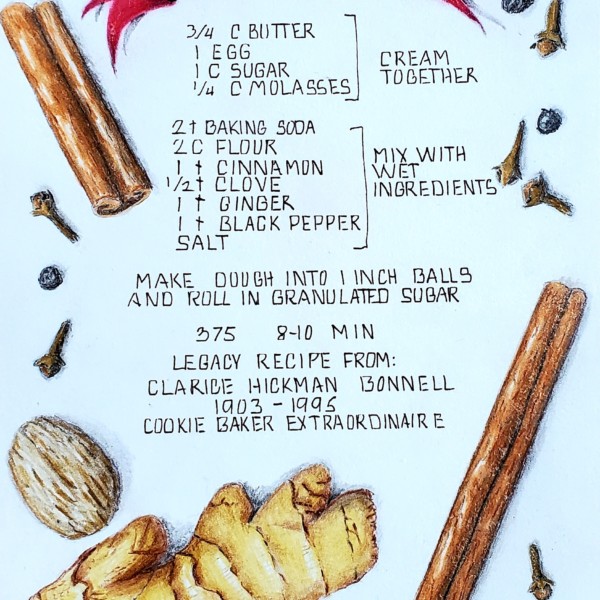
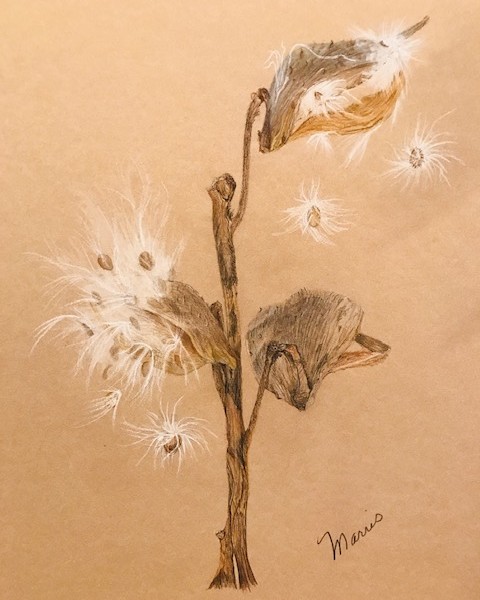
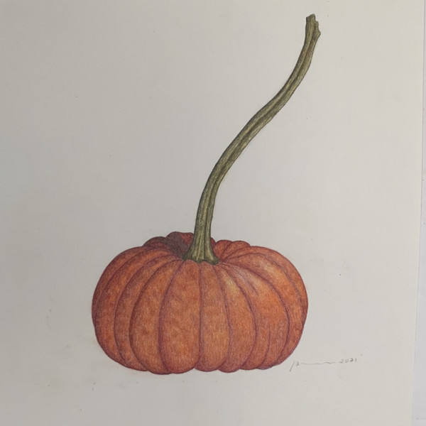
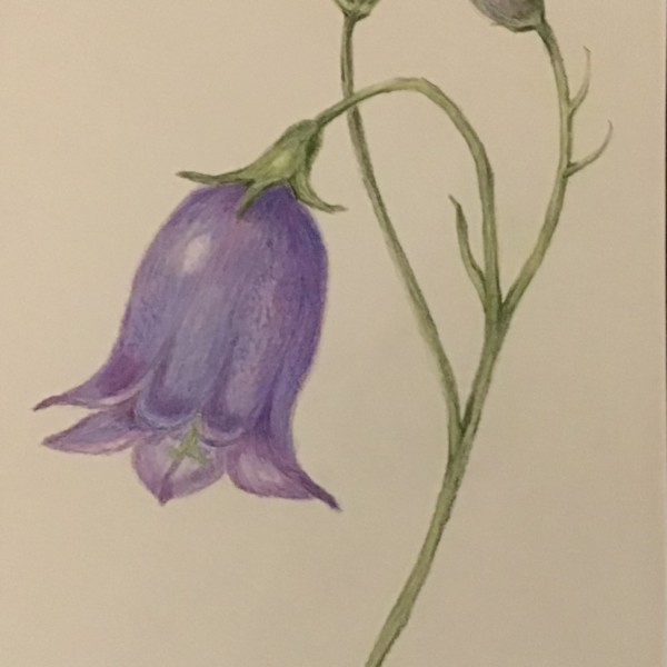
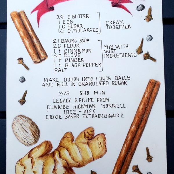
I love the overall look of this drawing. As Vern says, it glows! Wonderful observation of the colors in what is often seen as a monochromatic subject. The hints of yellow and magenta really enhance this drawing!
Thanks, Vern. Yes – the kiwi are drying up on the tree. I agree there needs another cross section to the left – the round view!