Activity
-

Doug Milne commented on Maureen Griffin's Photo 1 year, 7 months ago
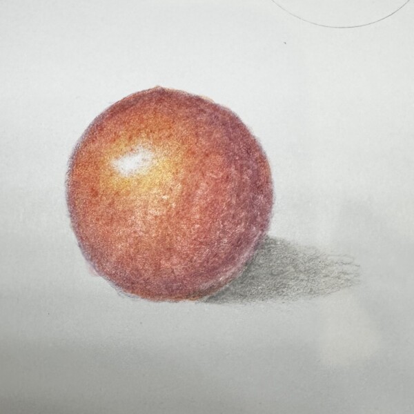
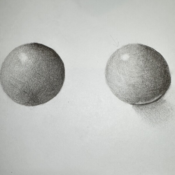
Nice job on these spheres Maureen! You are almost there. With the sphere on the left the right side and bottom should be darker and smoothly transition lighter as it moves toward the main highlight. I would take a kneaded eraser and lift some of the pigment around the highlight. The toning around the highlight should be lighter and transition…[Read more]
-
Doug Milne commented on Sarah Lees's Photo 1 year, 7 months ago
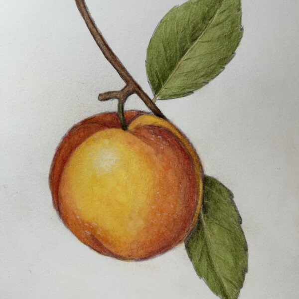
The color selection and saturation are wonderful Sarah! I think you could lighten the upper left side a little as it is closest to the light source and I would darken the right and bottom side as it is furthest from the light source. Great job!
-
Doug Milne commented on Ishbel Galloway's Photo 1 year, 7 months ago
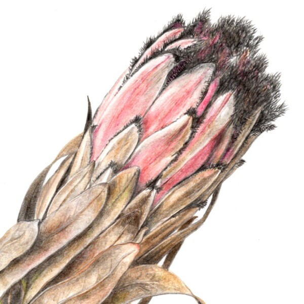
Gorgeous subtle colors Ishbel! Love the angled view! Everything about it creates a very stunning image!
-
Rita Haft commented on Rita Haft's Photo 1 year, 7 months ago
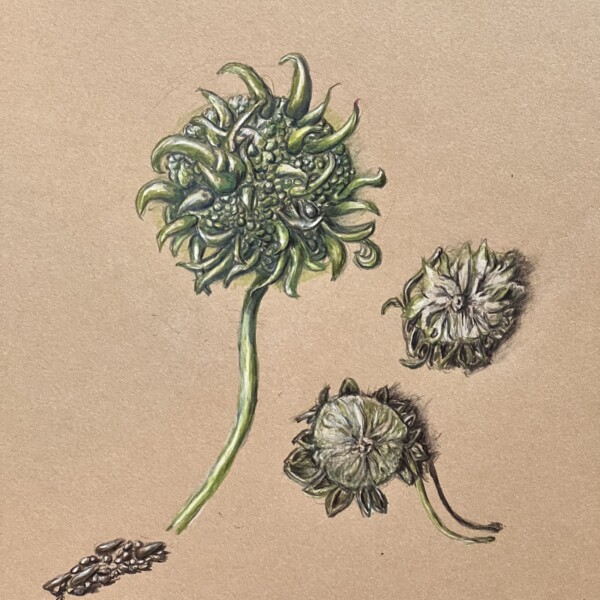
Sweet gum tree pod and seeds
-
Rita Haft added a Photo 1 year, 7 months ago
-
Sweet gum tree pod and seeds
-
-

Ishbel Galloway added a Photo 1 year, 7 months ago
-
Gorgeous subtle colors Ishbel! Love the angled view! Everything about it creates a very stunning image!
-
Very beautiful! What does it represent?
-
Thanks Doug! Helene: Not sure what you mean but It’s a sugarbush plant, native to South Africa
-
-
-
The color selection and saturation are wonderful Sarah! I think you could lighten the upper left side a little as it is closest to the light source and I would darken the right and bottom side as it is furthest from the light source. Great job!
-
Thank you-those comments are very helpful.
-
-
Maureen Griffin added a Photo 1 year, 7 months ago
-
The colors are nice Maureen, you just need more saturation. It does not have much form at the moment because it needs a range of tones from dark to light to convey form. Lighten the area around the highlight so it is softer. The cast shadow is getting there. It needs to be darker at the subject edge and transition lighter as you have done, but…[Read more]
-
-
Maureen Griffin added a Photo 1 year, 7 months ago
-
Nice job on these spheres Maureen! You are almost there. With the sphere on the left the right side and bottom should be darker and smoothly transition lighter as it moves toward the main highlight. I would take a kneaded eraser and lift some of the pigment around the highlight. The toning around the highlight should be lighter and transition…[Read more]
-
@doug-milne. Incredibly helpful feedback.. Your descriptions are very actionable. Thank you!
-
-
Maureen Griffin added a Photo 1 year, 7 months ago
-
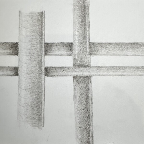
Ah! The dreaded plaid, overlap lesson. It is often very challenging for students. First off, I would not worry about doing the reflected light on this lesson. Referring to the arc bar lesson, concentrate on getting the full range of tones on each cylinder (including the highlight). Also, these are round objects so there would not be a shadow on…[Read more]
-
-
Maureen Griffin added a Photo 1 year, 7 months ago
-
Colors are great Maureen, it just needs more saturation! Don’t be afraid to add layers of color. That is the great thing about color pencil – it is easy to lift or erase color if you think you have gone too far! Don’t forget to leave a nice white highlight. Onion skins are usually pretty shiny. The shinier the subject, the whiter the highlight.
-
@doug-milne Thank you for this very helpful feedback!
-
-
Maureen Griffin added a Photo 1 year, 7 months ago
-
This is a really interesting image Maureen! Be aware that each root/tuber should have the full range (if the subject is wide enough to fit the whole range) of tones to convey that the roots/tubers are cylindrical. Otherwise they look like they are flat, which of, some may be.
-
-
Maureen Griffin added a Photo 1 year, 7 months ago
-
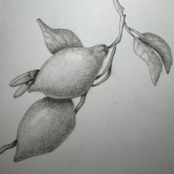
Really great composition Maureen! Nice toning and the fruits have good form!
-
-
Maureen Griffin added a Photo 1 year, 7 months ago
-
The colors and patterning are really good Maureen! I would suggest adding more shadow toning along the right side and bottom to enhance the apples form. Using the red-violet pencil for a red (or orange) subject would be good for that. Refer to your other posts for descriptions of what to do for the cast shadow and reflective light. This is looking…[Read more]
-
-
Clayton Simpson added 2 Photos 1 year, 7 months ago
-
Hi Clayton, I like how the image goes off the page! Really nice saturation of color! Be sure not to outline the subject. The edges should not be dark unless they are in shadow. Nice job!
-
Really nice use of the space on the page! See my comment on outlines on your other post.
-
I was experimenting with ink
-
-
Kellie Patton added a Photo 1 year, 7 months ago
-
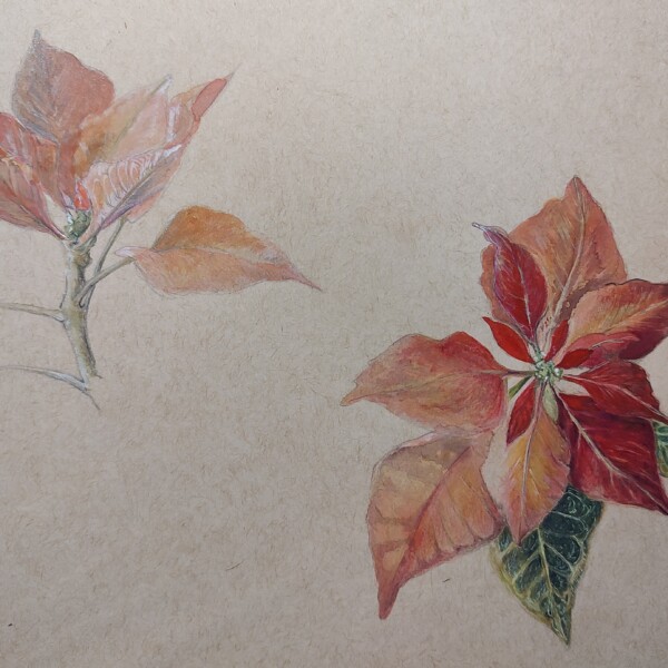
I like seeing the progression Kellie! The more finished leaves have great saturation!
-
I meant to also say, don’t forget to keep the highlights. It is easy to do when you are working on saturated subjects, but the highlights are imperative to the success of the drawing. It is looking really good so far!
-
Thank you so much for the feedback. I will keep working on it.
-
-
Kellie Patton added a Photo 1 year, 7 months ago
-
The lighter colors are great Kellie and I like how it is positioned on the page. With a light colored subject using a mid to darker green or ochre or brown to do the shaded areas helps the lighter colors from getting muddy looking.
-
-
Kellie Patton added a Photo 1 year, 7 months ago
-
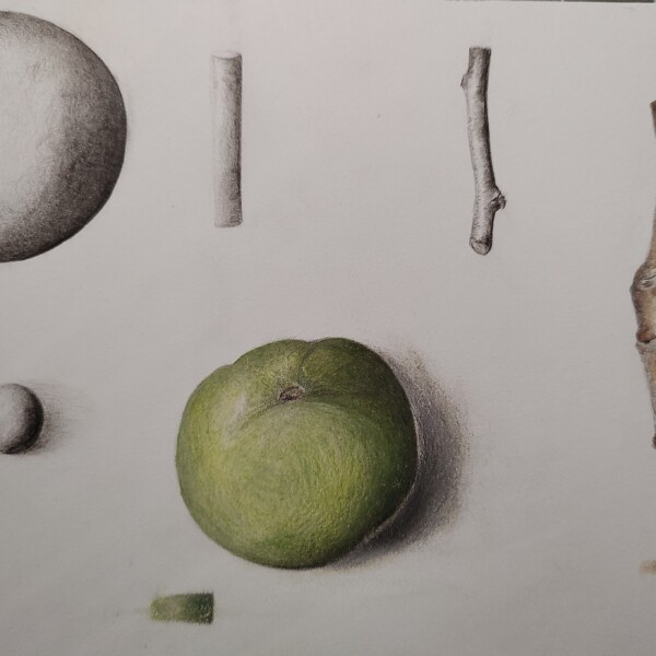
Great study page Kellie! The branch on the right is beautiful! Wonderful toning and shading! The mud-ranges tones could go up higher on the graphite sphere and have a more noticeable main highlight on the apple and the sphere. The white edge on the apple is confusing. It looks like it is not part of the apple so that would be the darkest part of…[Read more]
-
-
-
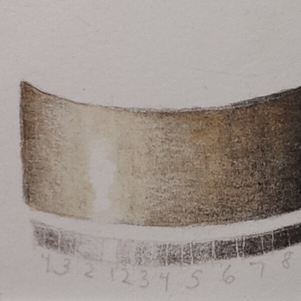
Great job on this arc tone bar Kellie! The areas flanking the highlight could be a little lighter, but overall you have a really good range of tones!
-
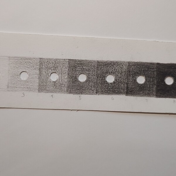
Really good range of tones Kellie!
-
-
Sarah Lees commented on Sarah Lees's Photo 1 year, 7 months ago
Yes, thanks!
- Load More