Activity
-

mary jo gimber added a Photo 4 years ago
-

Ishbel Galloway commented on Ishbel Galloway's Photo 4 years ago
Thanks Doug!
-
Liz Paganelli commented on Liz Paganelli's Photo 4 years ago
Thanks Doug your comments really helped when I was drawign tohe roots, I’ll go in and add more darks.
-
Doug Milne commented on Kyra Saulnier's Photo 4 years ago
Hi Kyra- nice job on this onion. The positions of the roots on your drawing look different than on the live subject. Maybe the onion was turned to a different view when you drew it. Your onion has form, but the colors have gotten murky. Doing the base toning in a green or light brown rather than the dark sepia would still let you achieve the…[Read more]
-
Doug Milne commented on Liz Paganelli's Photo 4 years ago
Wow Liz- you went from the simple roots on a recent post to this complicated structure! Fantastic job on these roots!!! I am thinking that maybe there could be more detail on the lettuce, but I like the simplicity of it compared to the roots. I can’t stop looking at the roots anyway!
-
Doug Milne commented on Ishbel Galloway's Photo 4 years ago
You have mastered the pillows Ishbel! Great job!
-
Ishbel Galloway added a Photo 4 years ago
-
You have mastered the pillows Ishbel! Great job!
-
Thanks Doug!
-
-
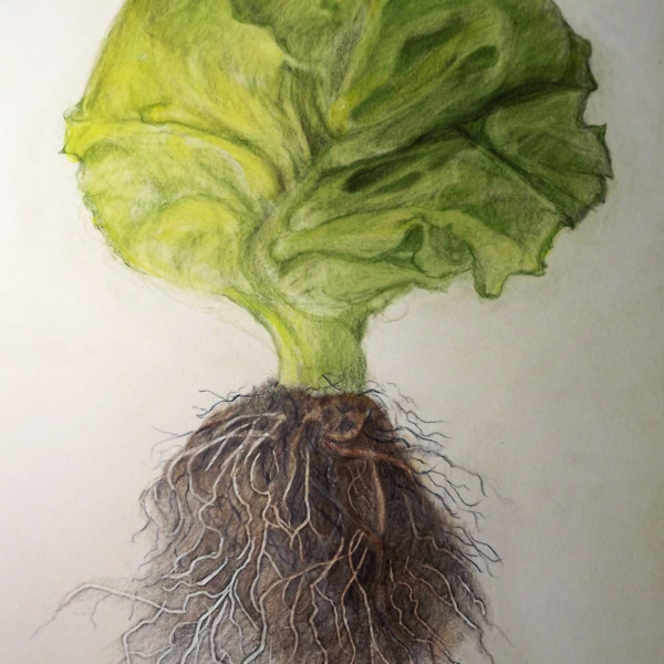
Liz Paganelli added a Photo 4 years ago
-
Wow Liz- you went from the simple roots on a recent post to this complicated structure! Fantastic job on these roots!!! I am thinking that maybe there could be more detail on the lettuce, but I like the simplicity of it compared to the roots. I can’t stop looking at the roots anyway!
-
Thanks Doug your comments really helped when I was drawign tohe roots, I’ll go in and add more darks.
-
I love this drawing!
-
-
Liz Paganelli commented on Liz Paganelli's Photo 4 years ago
I found this at the farmers market and just loved the shape. it was fun to draw. I am going to take your advice and continue to work on it.
-
Liz Paganelli commented on Liz Paganelli's Photo 4 years ago
Thanks, I really struggled with this, sometimes when you think something is going to be easy it turnes out to be difficult.
-
Liz Paganelli commented on Liz Paganelli's Photo 4 years ago
Thank You!
-
Liz Paganelli commented on Liz Paganelli's Photo 4 years ago
Thanks so much your comment it’s very helpful. Yellow is a dificuly color and need to use more of a variety.
-
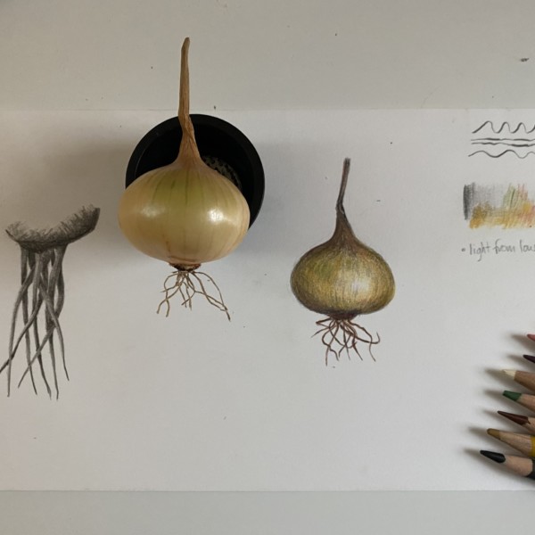
Kyra Saulnier added a Photo 4 years ago
-
Hi Kyra- nice job on this onion. The positions of the roots on your drawing look different than on the live subject. Maybe the onion was turned to a different view when you drew it. Your onion has form, but the colors have gotten murky. Doing the base toning in a green or light brown rather than the dark sepia would still let you achieve the form,…[Read more]
-
-
Karen Wright commented on Karen Wright's Photo 4 years ago
Thanks, Katy. It does have an outline lol My eyes didn’t even Notice till you mentioned it. I’m working on the Orange now AND it also has a bit of an outline.Maybe my style…I don’t know -) I’m a photographer—-who never used color pencils till this class—-and who is struggling with shadows! Not really sure how to do the shadow on the bottom tw…[Read more]
-
Katy Lyness commented on Maureen Doram's Photo 4 years ago
On closer look, I’m seeing what may be a drawing error. the ellipse of the center section of the middle flower seems too round. It doesn’t match with the shape of the sepals below the flower. It may be that is bulbous and sticks out, but then the shading on it would be a bit different Could be I’m over analyzing. Your drawing is usually correct.
-
Katy Lyness commented on Karen Wright's Photo 4 years ago
Hi Karen, this is a really nice drawing! It has a bit of an outline feel, which I don’t mind. In fact I rather like it. You may find this is your style. However, for a more realistic look, bring the darks around on the shadow side (Think of core shadow and reflective light.) and make the highlight a bit more prominent. I’d also refine more what is…[Read more]
-
Katy Lyness commented on Karen Minden's Photo 4 years ago
Again, nice to see you working on flowers! And the color you have created seems spot on! It is hard to read this drawing from the photo, but it looks to me that you could bring in some more darks, especially where the petals join.
-
Katy Lyness commented on Karen Minden's Photo 4 years ago
Hi Karen, I love seeing you moving into the challenge of brightly colored flowers. And this Anemone is a beautiful subject. You have chosen some good colors, but I think you can go darker, especially in the center where the petals meet. As it is, my eyes are drawn to the buds. I want a reason for them to come back to the beautiful flower. Also…[Read more]
-
Katy Lyness commented on Maureen Doram's Photo 4 years ago
Hi Maureen, Again, big fan! I love the colors you are getting into your whites in this drawing. My eye is drawn into the rich shadow areas.
-
Katy Lyness commented on Maureen Doram's Photo 4 years ago
If I haven’t said it before, I’ll say it now: I’m a big fan of your work. This drawing is so pleasing to look at! I love your rich hues and I am quite fond of your somewhat on the edge of being sketchy quality. You have a distinct style. Also nice lettering.
- Load More
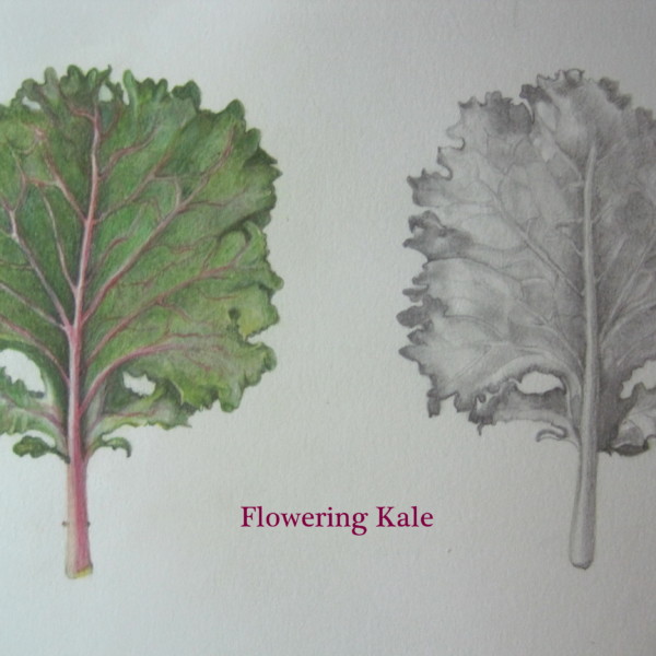

Color pencil front of leaf and graphite back of leaf of flowering kale. “Chidori Red” variety. Drawn from a small plant which has not turned red yet. chidori red