Activity
-

-
-

Lovely Sheila! The style of it looks like a combination of your works of years past combined with what you have been doing recently. The centers (flowers?) are mesmerizing!
-
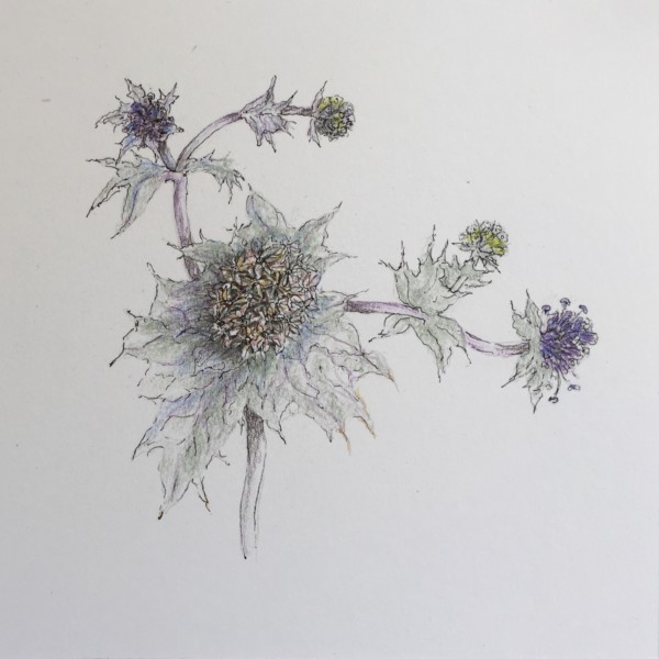
Thanks, Doug. I think the centers are made of little flowers, like other composite (?) flowers. It was fun for me to look at them.
-
-

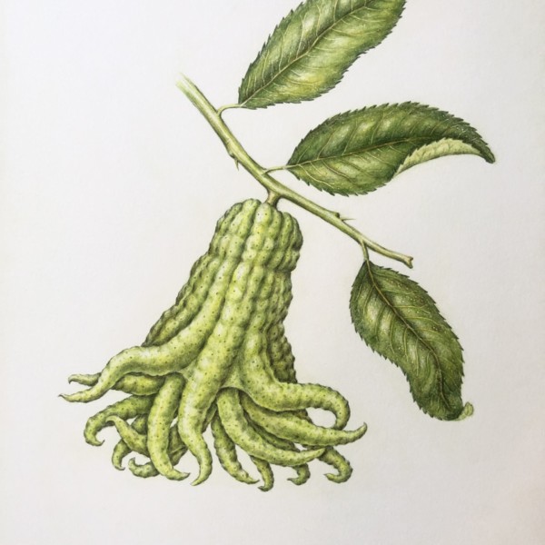
Jill Amadei added a Photo 3 years, 9 months ago
-
Great Jill- it looks like you crossed an octopus and a squash! Beautiful toning and details!
-
-
sheila y. commented on sheila y.'s Photo 3 years, 9 months ago
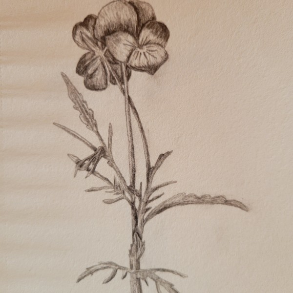
Thanks, Vern and Sam, for your feedback and suggestions in the July webinar meeting. I will try not gluing the whole item. I like the shadows that get cast. Really humid weather has everything popping up. So, nothing is glued down yet. I’m still playing around.
-
sheila y. added a Photo 3 years, 9 months ago
-
Thanks, Vern and Sam, for your feedback and suggestions in the July webinar meeting. I will try not gluing the whole item. I like the shadows that get cast. Really humid weather has everything popping up. So, nothing is glued down yet. I’m still playing around.
-
-
Doug Milne commented on Liz Paganelli's Photo 3 years, 9 months ago
Beautiful Liz- I love the composition and how you placed the image on the page! Great green too! Remembering that leaf veins have a light and dark side I would add more dark toning to the appropriate side of the veins. That detail will add nice definition. I would lighten the cast shadows. They are too dark and competing with the leaves. Shadows…[Read more]
-
Doug Milne commented on Karen Bolduc's Photo 3 years, 9 months ago
The leaves are really well done Karen! I am confused by the dark color on the flowers. Maybe that is suppose to be where the color was darker, but I am missing the range of tones that lets me know which parts are in highlight, which are in shadow and what areas are in between light and dark. Toning is going to trump color on a black and white drawing.
-
Doug Milne commented on Karen Bolduc's Photo 3 years, 9 months ago
This is nicely rendered Karen! I would add a range of tones to the lower right side to emphasize the form.
-
Doug Milne commented on Karen Bolduc's Photo 3 years, 9 months ago
Nice job Karen! I think you could add more dark toning where petals overlap to add some punch.
-
Doug Milne commented on Karen Bolduc's Photo 3 years, 9 months ago
Hi Karen- the berries look great! I would take another look at the leaves. Generally veins taper as they travel to the outside edges. It looks like your primary veins are tapering, but not the secondary ones. Also paying attention to the highlights and darker tones on the leaves will give them more dimension and interest.
-
Doug Milne commented on Liz Paganelli's Photo 3 years, 9 months ago
These leaves are beautifully rendered Liz! You could emphasize the highlights more especially on the dogwood leaf. The highlights you have have all ready helped give dimension. You could punch up the dark areas as well. Great job!
-
Wendy Kleinman commented on Wendy Kleinman's Photo 3 years, 9 months ago
Yes the melon had a cast shadow as it was propped up on a plate, on both sides of the melon, but I didn’t think it wise to show both sides. I had trouble with the shadow because the paper somehow was damaged, so the effect is blotchy. The more I tried to fix it, with a wash to blend it out, the worse it got so I decided to leave it as is for now. -
Doug Milne commented on Liz Paganelli's Photo 3 years, 9 months ago
Great composition Liz. Highlights aren’t necessarily very noticeable on some leaves, but I think you need some in addition to more range of tones and colors. Green leaves often have an array of different greens. Playing up the highlights and darker areas will give the leaves more dimension and interest.
-
Doug Milne commented on Ishbel Galloway's Photo 3 years, 9 months ago
Wow!!! Those roots Ishbell!!! One area I think could use some punch is the two garlics on the right that are hidden by the three leaves. I would expect the leaves to cast shadows on the garlic and currently they look like they sort of blend together. Great job!!!!
-
Doug Milne commented on Wendy Kleinman's Photo 3 years, 9 months ago
The seeds are amazing Wendy! The dark edge of the cast shadow closest to the melon fades in and out. Would a half of melon have a small cast shadow?
-
Liz Paganelli commented on Wendy Kleinman's Photo 3 years, 9 months ago
Love the seeds and all the texture inside!
-
Liz Paganelli commented on Ishbel Galloway's Photo 3 years, 9 months ago
Well Done!
-
Liz Paganelli commented on Karen Bolduc's Photo 3 years, 9 months ago
nicely done – I like the stems and the thorns, they feel prickly.
-
Liz Paganelli added a Photo 3 years, 9 months ago
-
Beautiful Liz- I love the composition and how you placed the image on the page! Great green too! Remembering that leaf veins have a light and dark side I would add more dark toning to the appropriate side of the veins. That detail will add nice definition. I would lighten the cast shadows. They are too dark and competing with the leaves. Shadows…[Read more]
-
-
Karen Bolduc added 2 Photos 3 years, 9 months ago
-
This is nicely rendered Karen! I would add a range of tones to the lower right side to emphasize the form.
-
The leaves are really well done Karen! I am confused by the dark color on the flowers. Maybe that is suppose to be where the color was darker, but I am missing the range of tones that lets me know which parts are in highlight, which are in shadow and what areas are in between light and dark. Toning is going to trump color on a black and white drawing.
-
- Load More