Activity
-

Karen Wright added a Photo 4 years, 3 months ago
-
Clare Lindberg commented on Maureen Doram's Photo 4 years, 3 months ago
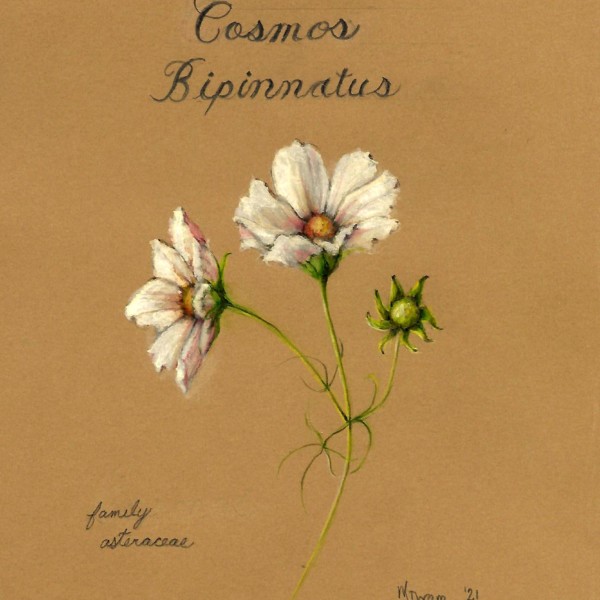
Your cosmos are dancing on toned paper. Beautiful.
-
Clare Lindberg commented on mary jo gimber's Photo 4 years, 3 months ago
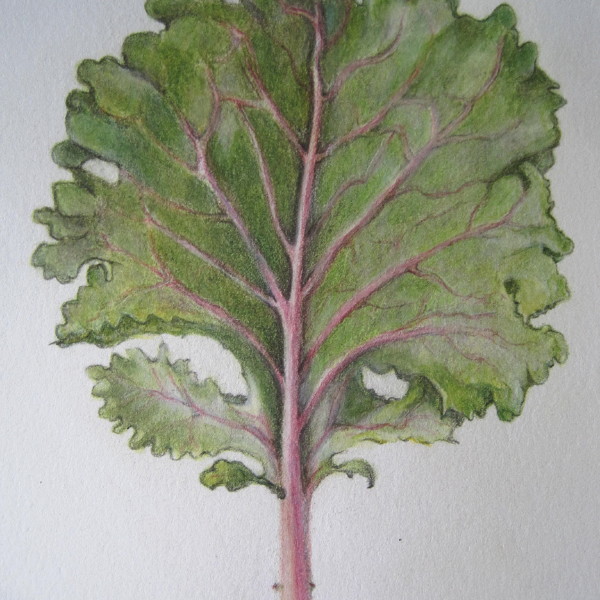
I can feel the airy thinnest of the kale leaf
-
Maureen Doram added a Photo 4 years, 3 months ago
-
Your cosmos are dancing on toned paper. Beautiful.
-
so beautiful and evocative of another time
-
Hi Maureen, Again, big fan! I love the colors you are getting into your whites in this drawing. My eye is drawn into the rich shadow areas.
-
On closer look, I’m seeing what may be a drawing error. the ellipse of the center section of the middle flower seems too round. It doesn’t match with the shape of the sepals below the flower. It may be that is bulbous and sticks out, but then the shading on it would be a bit different Could be I’m over analyzing. Your drawing is usually correct.
-
@katylyness I think you might be right about the ellipse and the sepals below, thanks for your feedback!
-
-
Maureen Doram added a Photo 4 years, 3 months ago
-
If I haven’t said it before, I’ll say it now: I’m a big fan of your work. This drawing is so pleasing to look at! I love your rich hues and I am quite fond of your somewhat on the edge of being sketchy quality. You have a distinct style. Also nice lettering.
-
-
mary jo gimber added a Photo 4 years, 3 months ago
-
I can feel the airy thinnest of the kale leaf
-
Thank you for your comment Clare.
-
Hi Mary Jo, I agree with Clare, you have really captured the feel of this leaf! The solid prominence of the mid rib and the gradually diminishing side veins, then the oh, so skillfully way you have captured the interesting, ruffly edges! Great job!
-
Beautiful feel to this leaf!
-
-
Cathie Hunter added a Photo 4 years, 3 months ago
-
Hi Cathie, Nice texture on this squash! I really feel the bumpy texture. And the stem, especially the area where it meets the top of the squash has some interesting details. Good job! What this drawing needs now is a more spherical look. You can accomplish this by focusing on the light source and adding shadows and accentuating the highlight. I…[Read more]
-
-
Cathie Hunter commented on Cathie Hunter's Photo 4 years, 3 months ago
Wow, thank you so much for all these thoughtful and helpful recommendations on how to improve this sketch .I will most definitely try this again with a more mindful approach. Thanks!
-
Doug Milne commented on Liz Paganelli's Photo 4 years, 3 months ago
Great rich, saturated colors Liz! You could use more dark and mid-range tones along the right side of the bulb to emphasize the form. Remember that roots in the back should be the darkest, mid-range lighter and the ones in the front will be the lightest. They should also have arc toning to convey their form. Remembering your light source I would…[Read more]
-
Doug Milne commented on Liz Paganelli's Photo 4 years, 3 months ago
Liz- you are off to a good start with this orange! There are a couple of areas I would revisit. The highlight is too tight. I would lighten the area around it to make it a little more irregular. This is also an area where the texture of the skin is very evident. You have created form, but I would add more dark toning. As I mentioned on another…[Read more]
-
Doug Milne commented on Liz Paganelli's Photo 4 years, 3 months ago
Hi Liz- nice rich colors! The stem needs toning from highlight to darks so it will have form. You have a good variety of oranges on the flowers, but I am having trouble reading them. The highlights are not strong enough and there is not enough variety of mid and dark tones. Red/violet is a good pencil to use for the toning with orange rather than…[Read more]
-
-
Again, nice to see you working on flowers! And the color you have created seems spot on! It is hard to read this drawing from the photo, but it looks to me that you could bring in some more darks, especially where the petals join.
-
-
-
Hi Karen, I love seeing you moving into the challenge of brightly colored flowers. And this Anemone is a beautiful subject. You have chosen some good colors, but I think you can go darker, especially in the center where the petals meet. As it is, my eyes are drawn to the buds. I want a reason for them to come back to the beautiful flower. Also…[Read more]
-
-
Doug Milne commented on Liz Paganelli's Photo 4 years, 3 months ago
This is a nice drawing Liz- the problem I am having is with the colors. The stem and leaves look like the same yellowish color as the flower. I would work on making the stem and leaves green, which would give the drawing more contrast and look more realistic. Consider that leaves, etc. are not one color green, but often have a variety greens.…[Read more]
-
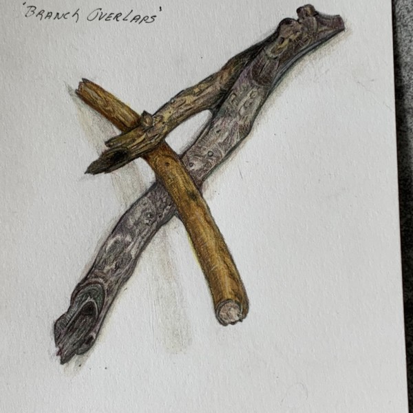
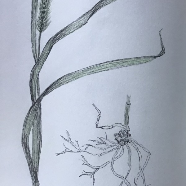
Doug Milne commented on Cathie Hunter's Photo 4 years, 3 months ago
Hi Cathie- the spike flower is nicely drawn! They are not easy to draw and you have done a beautiful job! I would suggest you add toning to the overlaps on both the roots and the stem and leaves. There is going to be a shadow created when (for example) a root crosses over another root and that shaded area should be toned. This lets the viewer know…[Read more]
-
-
Hi Cathie- the spike flower is nicely drawn! They are not easy to draw and you have done a beautiful job! I would suggest you add toning to the overlaps on both the roots and the stem and leaves. There is going to be a shadow created when (for example) a root crosses over another root and that shaded area should be toned. This lets the viewer know…[Read more]
-
Wow, thank you so much for all these thoughtful and helpful recommendations on how to improve this sketch .I will most definitely try this again with a more mindful approach. Thanks!
-
-
Karen Wright commented on Karen Wright's Photo 4 years, 3 months ago
Great advise! I purchased a new sharpener – used a sharp point on a chrome oxide green pencil and what a distinct difference it made.
-
Karen Wright commented on Karen Wright's Photo 4 years, 3 months ago
Eiyiyi…I didn’t realize what I was getting myself into technically when I collected this stem —- came complete with bugs!!!! Thanks for the positive feedback, and critique.
-
Karen Wright commented on Karen Wright's Photo 4 years, 3 months ago
Thank you. I think I understand why the mid rib was too wide and the tip is really off…I just sketched a leaf out of my head and colored it in —. I’ll try this exercise again with a real leaf! Great feedback…thanks again…
-
Wendy Kleinman commented on Wendy Kleinman's Photo 4 years, 3 months ago
That’s for all the support!
- Load More


Hi Karen, this is a really nice drawing! It has a bit of an outline feel, which I don’t mind. In fact I rather like it. You may find this is your style. However, for a more realistic look, bring the darks around on the shadow side (Think of core shadow and reflective light.) and make the highlight a bit more prominent. I’d also refine more what is…[Read more]
Thanks, Katy. It does have an outline lol My eyes didn’t even Notice till you mentioned it. I’m working on the Orange now AND it also has a bit of an outline.Maybe my style…I don’t know -) I’m a photographer—-who never used color pencils till this class—-and who is struggling with shadows! Not really sure how to do the shadow on the bottom twig —…[Read more]