Activity
-
Renata commented on Wendy Kleinman's Photo 4 years, 3 months ago
This looks beautiful, Wendy! I love the fibrous look, as well as the range of colours. Makes me want to draw one! 🙂
-

Liz Paganelli commented on Jill Amadei's Photo 4 years, 3 months ago
beautiful!
-
Liz Paganelli added a Photo 4 years, 3 months ago
-
This is a nice drawing Liz- the problem I am having is with the colors. The stem and leaves look like the same yellowish color as the flower. I would work on making the stem and leaves green, which would give the drawing more contrast and look more realistic. Consider that leaves, etc. are not one color green, but often have a variety greens.…[Read more]
-
Thanks so much your comment it’s very helpful. Yellow is a dificuly color and need to use more of a variety.
-
-
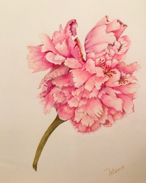
Liz Paganelli added a Photo 4 years, 3 months ago
-
Hi Liz- nice rich colors! The stem needs toning from highlight to darks so it will have form. You have a good variety of oranges on the flowers, but I am having trouble reading them. The highlights are not strong enough and there is not enough variety of mid and dark tones. Red/violet is a good pencil to use for the toning with orange rather than…[Read more]
-
Thank You!
-
-
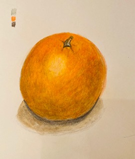
Liz Paganelli added a Photo 4 years, 3 months ago
-
Liz- you are off to a good start with this orange! There are a couple of areas I would revisit. The highlight is too tight. I would lighten the area around it to make it a little more irregular. This is also an area where the texture of the skin is very evident. You have created form, but I would add more dark toning. As I mentioned on another…[Read more]
-
Thanks, I really struggled with this, sometimes when you think something is going to be easy it turnes out to be difficult.
-
-
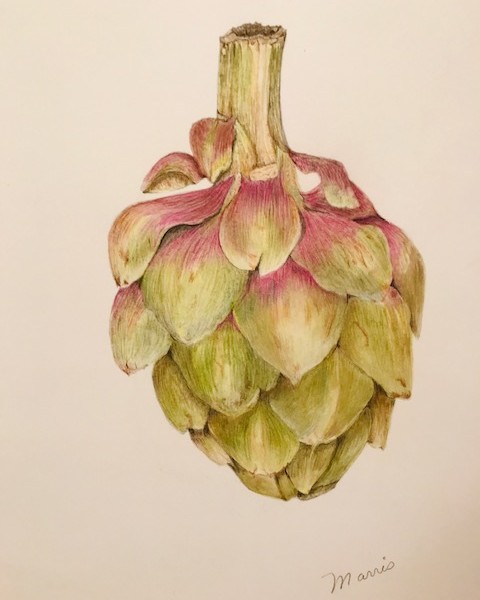
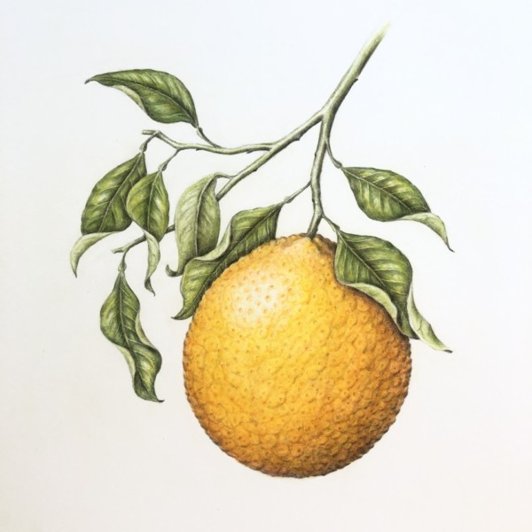
Liz Paganelli added a Photo 4 years, 3 months ago
-
Great rich, saturated colors Liz! You could use more dark and mid-range tones along the right side of the bulb to emphasize the form. Remember that roots in the back should be the darkest, mid-range lighter and the ones in the front will be the lightest. They should also have arc toning to convey their form. Remembering your light source I would…[Read more]
-
I found this at the farmers market and just loved the shape. it was fun to draw. I am going to take your advice and continue to work on it.
-
-
Katy Lyness commented on Jill Amadei's Photo 4 years, 3 months ago
Hi Jill, Nice work! This has a much rounder feel. And again, kudos on the your handling of yellow!
-
Katy Lyness commented on Wendy Kleinman's Photo 4 years, 3 months ago
Hi Wendy, This looks great! Not only did you make the stem more cylindrical, you also added some interesting detail! Good job!
-
Katy Lyness commented on Wendy Kleinman's Photo 4 years, 3 months ago
Hi Wendy, This is such a lovely drawing! I have enjoyed watching you develop it. Great job.
As far as the stem attaching to the flower, I think the thing that bothers me is its position centered directly below the petal. I think if it were off centered a bit it would read better. Just a thought. -
Katy Lyness commented on Karen Wright's Photo 4 years, 3 months ago
Hi again, Karen,
Now that I have seen 3 of your drawings, I think I am going to be a fan! This twig is so interesting to look at! I feel that you really enjoyed finding all those little bumps and crevices. I’m excited to see what you will do with other botanical subjects. -
Katy Lyness commented on Karen Wright's Photo 4 years, 3 months ago
Hi Karen, Another good leaf exercise! I like the reddish hues you have added to both leaves. Also good value range. That midrib really jumps out. Maybe too much. I’d have to see the leaf, but in this drawing it seems a bit wide/too prominent. I also want it see it resolved at the tip. I’m not sure what is happening there? But overall very nice work.
-
Katy Lyness commented on Karen Wright's Photo 4 years, 3 months ago
Hi Karen, Nice leaf exercise! You have lovely rich, dark values. Also a good feel for light source and the fold of the leaf. I like that you have included notes on the colors. This information will come in handy in future drawings! I’d like to see a slightly sharper edge on the right side of the leaf to separate it from the cast shadow. But…[Read more]
-
Wendy Kleinman added a Photo 4 years, 3 months ago
-
Hi Wendy, This looks great! Not only did you make the stem more cylindrical, you also added some interesting detail! Good job!
-
This looks beautiful, Wendy! I love the fibrous look, as well as the range of colours. Makes me want to draw one! 🙂
-
That’s for all the support!
-
-
Wendy Kleinman added a Photo 4 years, 3 months ago
-
Hi Wendy, This is such a lovely drawing! I have enjoyed watching you develop it. Great job. As far as the stem attaching to the flower, I think the thing that bothers me is its position centered directly below the petal. I think if it were off centered a bit it would read better. Just a thought.
-
-
Karen Wright added a Photo 4 years, 3 months ago
-
Hi again, Karen, Now that I have seen 3 of your drawings, I think I am going to be a fan! This twig is so interesting to look at! I feel that you really enjoyed finding all those little bumps and crevices. I’m excited to see what you will do with other botanical subjects.
-
Eiyiyi…I didn’t realize what I was getting myself into technically when I collected this stem —- came complete with bugs!!!! Thanks for the positive feedback, and critique.
-
-
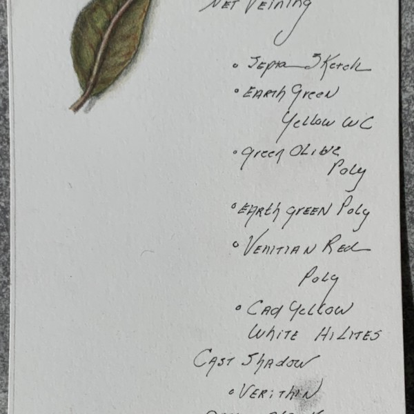
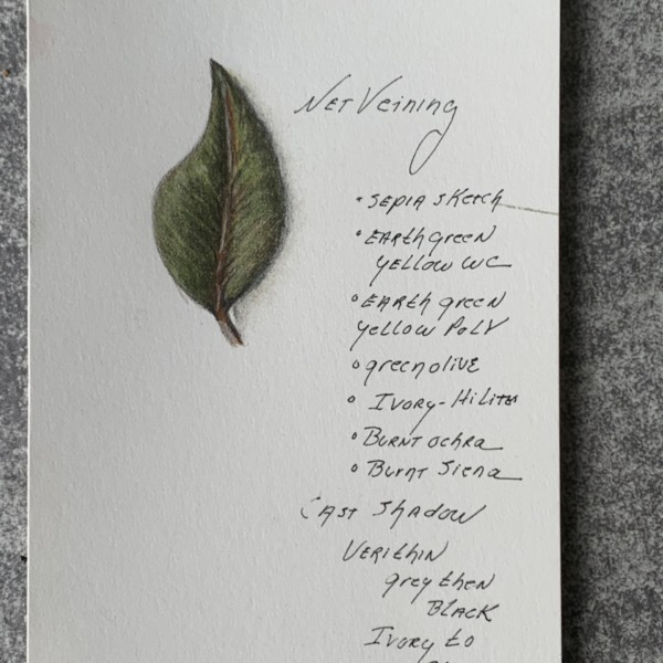
Karen Wright added 2 Photos 4 years, 3 months ago
-
Hi Karen, Nice leaf exercise! You have lovely rich, dark values. Also a good feel for light source and the fold of the leaf. I like that you have included notes on the colors. This information will come in handy in future drawings! I’d like to see a slightly sharper edge on the right side of the leaf to separate it from the cast shadow. But…[Read more]
-
Hi Karen, Another good leaf exercise! I like the reddish hues you have added to both leaves. Also good value range. That midrib really jumps out. Maybe too much. I’d have to see the leaf, but in this drawing it seems a bit wide/too prominent. I also want it see it resolved at the tip. I’m not sure what is happening there? But overall very nice work.
-
Thank you. I think I understand why the mid rib was too wide and the tip is really off…I just sketched a leaf out of my head and colored it in —. I’ll try this exercise again with a real leaf! Great feedback…thanks again…
-
Great advise! I purchased a new sharpener – used a sharp point on a chrome oxide green pencil and what a distinct difference it made.
-
-
Kaye Metzler commented on Kaye Metzler's Photo 4 years, 3 months ago
Thank you Vern! All your comments are sooo helpful! Know that all your suggestions will be put to practice by me! Creating that dimensional is a challenge and I know that I just need to push those dark tones more. Ahh, practice, but I so love that coloring space I find myself in when I am working on an image!
-
Julia Shmotkina commented on Julia Shmotkina's Photo 4 years, 3 months ago
Thank you both
-
Julia Shmotkina commented on Julia Shmotkina's Photo 4 years, 3 months ago
Thank you for the feedback, this is really helpful! Will try and dig out Doug’s description:)
-

Jill Amadei added a Photo 4 years, 3 months ago
-
beautiful!
-
Love the tones on the curling leaves!
-
- Load More