Activity
-

Laurie McConnachie commented on Laurie McConnachie's Photo 3 years, 10 months ago
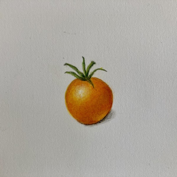
Laurie McConnachie 2 minutes ago
The real tomato is more orange than ‘gold’ – a hybrid variation-definitely not a red tomato, When I held it up to the drawing, the color match looked pretty close- it is orange with warm yellow undertones -
Laurie McConnachie added a Photo 3 years, 10 months ago
-
Laurie McConnachie 2 minutes ago The real tomato is more orange than ‘gold’ – a hybrid variation-definitely not a red tomato, When I held it up to the drawing, the color match looked pretty close- it is orange with warm yellow undertones
-
Hi Laurie, This is a great looking tomato. I love the warm orange with the yellow undertones. And nice soft reflective light. Good job!
-
-
Katy Lyness commented on Julie Z.D.'s Photo 3 years, 10 months ago
It seems there is always some way to make a drawing just a bit better. That’s a problem for me. Sometimes I work a drawing too much. One has to know when to stop and just start a whole new one. That being said, I think you can work this one a little bit more.
-
Katy Lyness commented on Emilie Sanmartin's Photo 3 years, 10 months ago
Hi Emilie, This looks great! Nice spheric shape. and smooth toning. Now try adding some more colors. Some oranges or yellows in the mid tones. Also start thinking about a cast shadow and reflective light. This is a great start!
-
Katy Lyness commented on Ishbel Galloway's Photo 3 years, 10 months ago
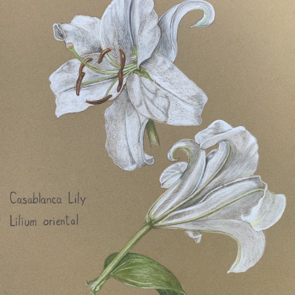
Hi Ishbel, Lovely drawing! Those white lilies really look great on the Kraft paper. I love the cast shadows of the stamens. Great job!
-
Emilie Sanmartin added 2 Photos 3 years, 10 months ago
-
Hi Emilie, This looks great! Nice spheric shape. and smooth toning. Now try adding some more colors. Some oranges or yellows in the mid tones. Also start thinking about a cast shadow and reflective light. This is a great start!
-
Thanks a lot for the feedback! I’ll work on my colors. Haven’t learnt cast shadow yet but will add it once I do.
-
-

Ishbel Galloway added a Photo 3 years, 10 months ago
-
Hi Ishbel, Lovely drawing! Those white lilies really look great on the Kraft paper. I love the cast shadows of the stamens. Great job!
-
Thanks Katy!
-
So pretty!
-
-
mary jo gimber commented on mary jo gimber's Photo 3 years, 10 months ago
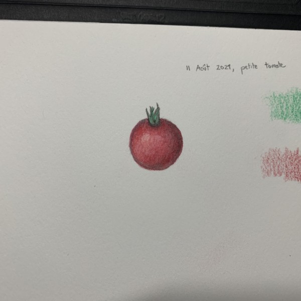
Katy, Thanks so much for your comments. I see exactly what you mean about the tomato shadow. This is an excellent lesson for me because I used dark sepia watercolor to put the shadow in before I used the pencils. Also, forgot to use wet on wet. Just tried to correct it with more red pencil but it still doesn’t look right. Thanks again, Mary Jo
-
Julie Z.D. commented on Julie Z.D.'s Photo 3 years, 10 months ago
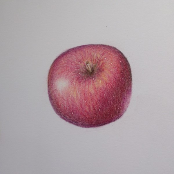
The goalposts keep moving…;)
-
Katy Lyness commented on Julie Z.D.'s Photo 3 years, 10 months ago
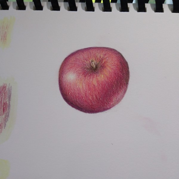
I agree with Doug that you have done a great job of capturing that “apple texture and color.” And I like the improvements you have made. To take this to the next level I suggest you give the stem a little attention. Think about the light source and the shape of that indentation around the stem. The shadow side would be on the left and you would…[Read more]
-
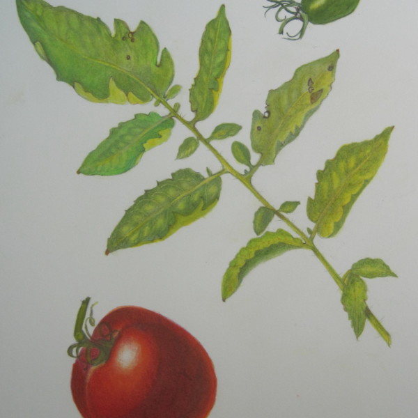
Katy Lyness commented on mary jo gimber's Photo 3 years, 10 months ago
Hi Mary Jo, Lovely drawing! You make that tomato leaf so interesting to look at! I like the curling leaves and the way you are showing the pillows between the veins. I also love the sepals on your little green tomato. I like the richness of the red in the larger tomato, but think the shadow ends abruptly and covers too much of the tomato. I want…[Read more]
-

sheila y. commented on sheila y.'s Photo 3 years, 10 months ago
Thanks, Rita! I’m glad it’s appealing to look at, maybe a little relaxing like a fish tank? 🙂 -
Rita Haft commented on sheila y.'s Photo 3 years, 10 months ago
This is so pretty- i could stare at it for hours
-
Julie Z.D. added a Photo 3 years, 10 months ago
-
I agree with Doug that you have done a great job of capturing that “apple texture and color.” And I like the improvements you have made. To take this to the next level I suggest you give the stem a little attention. Think about the light source and the shape of that indentation around the stem. The shadow side would be on the left and you would…[Read more]
-
The goalposts keep moving…;)
-
It seems there is always some way to make a drawing just a bit better. That’s a problem for me. Sometimes I work a drawing too much. One has to know when to stop and just start a whole new one. That being said, I think you can work this one a little bit more.
-
-
Doug Milne commented on Julie Z.D.'s Photo 3 years, 10 months ago
Hi Julie- the colors and saturation are really good and you have created a great apple skin! There are a couple of areas I would revisit. The highlight should move over a little to the right. The highlight and the darkest toning would not be on the same side. The left side would have dark toning on the bottom as you have shown, but not quite that…[Read more]
-
mary jo gimber added a Photo 3 years, 10 months ago
-
Hi Mary Jo, Lovely drawing! You make that tomato leaf so interesting to look at! I like the curling leaves and the way you are showing the pillows between the veins. I also love the sepals on your little green tomato. I like the richness of the red in the larger tomato, but think the shadow ends abruptly and covers too much of the tomato. I want…[Read more]
-
Katy, Thanks so much for your comments. I see exactly what you mean about the tomato shadow. This is an excellent lesson for me because I used dark sepia watercolor to put the shadow in before I used the pencils. Also, forgot to use wet on wet. Just tried to correct it with more red pencil but it still doesn’t look right. Thanks again, Mary Jo
-
-
Julie Z.D. added a Photo 3 years, 10 months ago
-
Hi Julie- the colors and saturation are really good and you have created a great apple skin! There are a couple of areas I would revisit. The highlight should move over a little to the right. The highlight and the darkest toning would not be on the same side. The left side would have dark toning on the bottom as you have shown, but not quite that…[Read more]
-
-
sheila y. commented on sheila y.'s Photo 3 years, 10 months ago
Thanks, Doug! I always appreciate your feedback and glad to hear from you. -
Katy Lyness commented on Fanny Bischoff's Photo 3 years, 10 months ago
Hi Fanny, I like the changes you made. This drawing really has the feel of ivy. I agree with Vern that the veining could use a little more finessing. Especially that large leaf hanging down near the center. Did you use the embossing technique? I alway have issues with that when I use it. So easy to be heavy handed. Sometimes you can go in with a…[Read more]
-
Fanny Bischoff commented on Fanny Bischoff's Photo 3 years, 10 months ago
The word Ivy isn’t well placed and the text is a bit uneven. I need to learn about composition!
Adding more toning was a good advice, as always. - Load More