Activity
-

Fanny Bischoff added a Photo 3 years, 10 months ago
-

Ishbel Galloway commented on Ishbel Galloway's Photo 3 years, 10 months ago
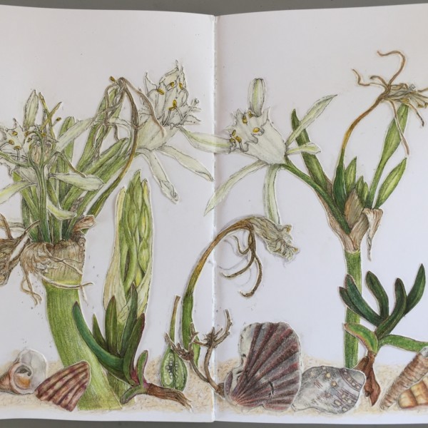
Oops I mean petals
-
Ishbel Galloway commented on Ishbel Galloway's Photo 3 years, 10 months ago
Hi Doug – yes, you’re right. I used some white watercolour to brighten the leaves but I see now they’re too uniform. Thanks!
-
Doug Milne commented on Ishbel Galloway's Photo 3 years, 10 months ago
Hi Ishbell- great drawing! I think the top white rimmed flowers could use some toning. It appears from the rear flower view that the petals curve forward a little, which would cause some shadowing on areas of the petals.
-
Doug Milne commented on sheila y.'s Photo 3 years, 10 months ago
Hi Sheila- my eye went to those papery parts at the end of the stems – so good!!!! And the one that is wrapped up like a baby in a blanket – beautiful!
-
Ishbel Galloway added a Photo 3 years, 10 months ago
-
Hi Ishbell- great drawing! I think the top white rimmed flowers could use some toning. It appears from the rear flower view that the petals curve forward a little, which would cause some shadowing on areas of the petals.
-
Hi Doug – yes, you’re right. I used some white watercolour to brighten the leaves but I see now they’re too uniform. Thanks!
-
Oops I mean petals
-
-

sheila y. added a Photo 3 years, 10 months ago
-
Hi Sheila- my eye went to those papery parts at the end of the stems – so good!!!! And the one that is wrapped up like a baby in a blanket – beautiful!
-
Thanks, Doug! I always appreciate your feedback and glad to hear from you.
-
This is so pretty- i could stare at it for hours
-
Thanks, Rita! I’m glad it’s appealing to look at, maybe a little relaxing like a fish tank? 🙂
-
So lovely
-
Thanks, Maureen.
-

Fantastic and fantastical! I’m loving your cutout compositions. There add some whimsy without kitsch. They make me want to look closer at each element.
-
Thanks, Pam. I appreciate the feedback. I hope you’re all well.
-
-
Katy Lyness commented on Clo's Photo 3 years, 10 months ago
I’d try a warm yellow, dark cadmium yellow may work incorporated into your key color. Also try different greens for your grisaille.
-
Doug Milne commented on paigemeredith's Photo 3 years, 10 months ago
Yellow flowers are so tricky Paige! I think the upper face of the curved up area on the middle petal would be lighter because it would catch the light. The lower section of the curve would be toned a little because it would not catch as much of the light and toning there would convey that it curves under there. I would tone more to the right of…[Read more]
-
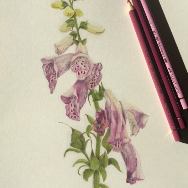
Doug Milne commented on Petra Andersson's Photo 3 years, 10 months ago
Beautiful foxglove drawing Petra! The colors and details are spot on! I love how you captured the wilting blooms on the bottom right. I think the drawing would benefit from more touches of dark toning. Like where a flower on top would cast a shadow on a flower, leaf or stem behind it. That would especially help the cluster of wilted flowers on the…[Read more]
-
Doug Milne commented on Rita Haft's Photo 3 years, 10 months ago
I don’t know what this is Rita, but it is fascinating to look at! The colors go so beautifully together! I feel like I should be looking for a hidden image in the intricate upper section! Really beautiful! Great job!
-
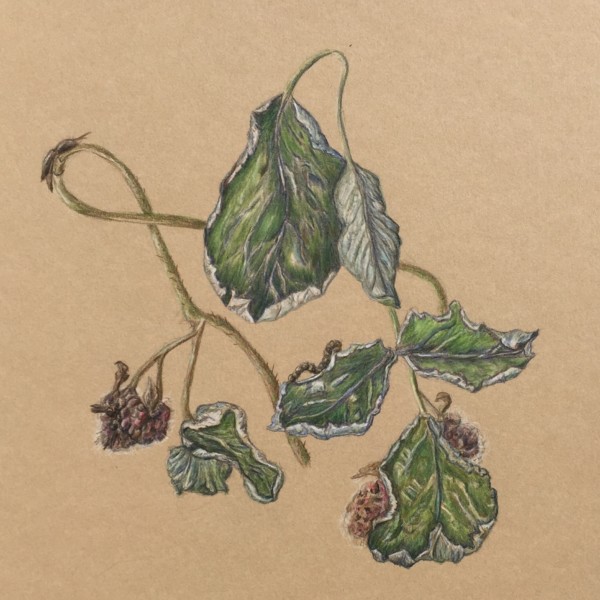
Doug Milne commented on Rita Haft's Photo 3 years, 10 months ago
Love the colors and it looks good on the Kraft paper! Some of the details on the leaves are confusing to me, but maybe it is because they are wilting. The larger leaves don’t have the same veining patterns as the smaller leaves.
-
Doug Milne commented on Marilyn Tooke's Photo 3 years, 10 months ago
This is a nice page Marilyn! I think most of the flowers and the poppy seed heads could use more dark toning. The seed heads could use it to enhance their form (they could use more saturation too!). Even tough the anemone is white it still needs toning on the petal overlaps, etc.
-
Clare Lindberg commented on Petra Andersson's Photo 3 years, 10 months ago
Very nice. I can really sense the soft diaphanous tissue of the blossoms.
-
-
Very nice. I can really sense the soft diaphanous tissue of the blossoms.
-
Beautiful foxglove drawing Petra! The colors and details are spot on! I love how you captured the wilting blooms on the bottom right. I think the drawing would benefit from more touches of dark toning. Like where a flower on top would cast a shadow on a flower, leaf or stem behind it. That would especially help the cluster of wilted flowers on the…[Read more]
-
-
Petra Andersson commented on Katy Lyness's Photo 3 years, 10 months ago
Ahhhh i see what you mean. I will definitely stay tuned. My dream is to become one of the few German botanical artists. There is nothing on this topic in Germany and it fascinates me so incredibly. I have to believe in development. Thank you very much for your effort, I am very pleased.
-
-
I don’t know what this is Rita, but it is fascinating to look at! The colors go so beautifully together! I feel like I should be looking for a hidden image in the intricate upper section! Really beautiful! Great job!
-
-
-
Love the colors and it looks good on the Kraft paper! Some of the details on the leaves are confusing to me, but maybe it is because they are wilting. The larger leaves don’t have the same veining patterns as the smaller leaves.
-
-
Katy Lyness commented on Petra Andersson's Photo 3 years, 10 months ago
I just sent a sketchy drawing of peppers up to my portfolio and notice I could have taken my own advice concerning scratchy cast shadows.
-
Katy Lyness commented on Katy Lyness's Photo 3 years, 10 months ago
My sketchy side
- Load More


The word Ivy isn’t well placed and the text is a bit uneven. I need to learn about composition! Adding more toning was a good advice, as always.
Hi Fanny, I like the changes you made. This drawing really has the feel of ivy. I agree with Vern that the veining could use a little more finessing. Especially that large leaf hanging down near the center. Did you use the embossing technique? I alway have issues with that when I use it. So easy to be heavy handed. Sometimes you can go in with a…[Read more]
Thank you! I tried to narrow the veins in this version but not too much as my subject had very strong and visible veining. I did use embossing in some of the veining and I agree it’s not an easy technique to work with!