Activity
-
Renata commented on Margaret Hahn's Photo 3 years, 9 months ago
Can’t stop looking at this. It makes me feel like trying one but even one head feels really challenging!! Amazing work.
-

Doug Milne commented on Nadine's Photo 3 years, 9 months ago
Hi Nadine- great color and saturation! Love the texture you achieved! There are a couple of areas I would revisit. Be careful – this has an outline around most of it. It is also missing the mid and dark tones that would really help emphasize the form. The cast shadow is darkest at the subject and then it should transition lighter as it moves away…[Read more]
-
Doug Milne commented on Renata's Photo 3 years, 9 months ago
Wow Renata! The leaves are sooooo gooood!!!!! I would add a little dark toning to the petals to give them some impact – the base of the petals where they meet the stamens and overlaps. Right now I can’t stop looking at those fantastic leaves!!!!!!
-
Doug Milne commented on Wendy Kleinman's Photo 3 years, 9 months ago
Hi Wendy – beautiful! The leaves are so good! I would add a range of tones to the branch to emphasize it’s form. Nice work!
-
Doug Milne commented on Wendy Kleinman's Photo 3 years, 9 months ago
Hi Wendy- it is nice to see the finished version of this! The blueberries look so good and really pop! I think you could add some more dark toning on the leaves where they disappear behind the fruit. Great job!
-
Doug Milne commented on mary jo gimber's Photo 3 years, 9 months ago
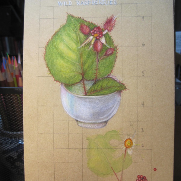
Hi Mary Jo- beautiful colors and it is an interesting view showing it in a cup. Be careful the curve of the cup base is not too straight. It should be more like the curve of the upper portion of the cup. I think you could add touches of darker toning like the base of the leaf that is inside the cup and behind the fruit where it would create…[Read more]
-
Doug Milne commented on Marina Segalovitch's Photo 3 years, 9 months ago
Great job Marina! The color and texture of the crabapples are so good! I think the leaf on the right is the back view and the other two are front views, but they all look like back views to me. I think showing the secondary veins attach to the main vein would help them read more as fronts.
-
Doug Milne commented on Renata's Photo 3 years, 9 months ago
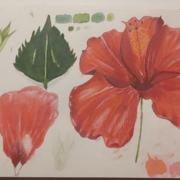
Hi Renata- I am wondering if the secondary veins end at the leaf edge or do they turn up before they reach the edge? The veins are very prominent especially on the leaf on the right. Is that cluster of leaves in the middle suppose to be attached to the stem and we can’t see it? It looks like it is floating there and I find it confusing. Also t…[Read more]
-
Doug Milne commented on Renata's Photo 3 years, 9 months ago
Another beauty Renata! Amazing textured leaves!
-
Doug Milne commented on Renata's Photo 3 years, 9 months ago
So good Renata!!!! Love the addition of the second falling petal. The drawing has a wild look to it which works so well!!! Amazing job!!!!
-
Nandini added a Photo 3 years, 9 months ago
-
Nandini added a Photo 3 years, 9 months ago
-
Nandini added 2 Photos 3 years, 9 months ago
-
Hi Nadine- great color and saturation! Love the texture you achieved! There are a couple of areas I would revisit. Be careful – this has an outline around most of it. It is also missing the mid and dark tones that would really help emphasize the form. The cast shadow is darkest at the subject and then it should transition lighter as it moves away…[Read more]
-
-
Clare Lindberg commented on Margaret Hahn's Photo 3 years, 9 months ago
To me, your hydrangea piece is everything.
-
Renata added a Photo 3 years, 9 months ago
-
Wow Renata! The leaves are sooooo gooood!!!!! I would add a little dark toning to the petals to give them some impact – the base of the petals where they meet the stamens and overlaps. Right now I can’t stop looking at those fantastic leaves!!!!!!
-
Thanks for this too, Doug! I like the leaves too but find it hard to add dark areas to the flowers. I’ll definitely try though!
-
-
-
Hi Wendy – beautiful! The leaves are so good! I would add a range of tones to the branch to emphasize it’s form. Nice work!
-
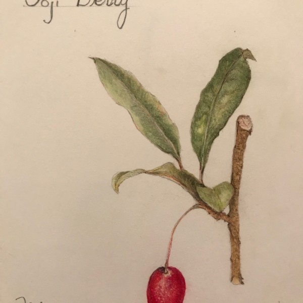
P.S. they are Goumi Berries.
-
-
-
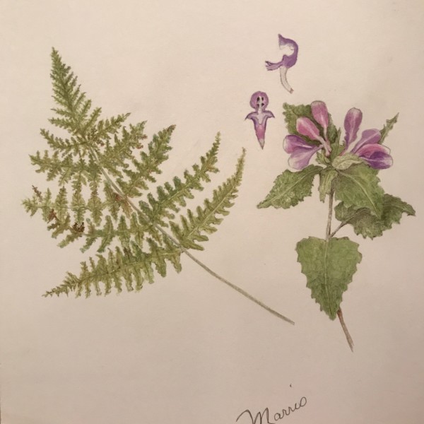
Fern love!!!
-
-
Wendy Kleinman added a Photo 3 years, 9 months ago
-
Hi Wendy- it is nice to see the finished version of this! The blueberries look so good and really pop! I think you could add some more dark toning on the leaves where they disappear behind the fruit. Great job!
-
-
mary jo gimber added a Photo 3 years, 9 months ago
-
Hi Mary Jo- beautiful colors and it is an interesting view showing it in a cup. Be careful the curve of the cup base is not too straight. It should be more like the curve of the upper portion of the cup. I think you could add touches of darker toning like the base of the leaf that is inside the cup and behind the fruit where it would create…[Read more]
-
-

Ishbel Galloway commented on Ishbel Galloway's Photo 3 years, 9 months ago
Yes, I also thought all those amputated stems on the left were a bit problematic!
- Load More