Activity
-
Maureen Griffin added a Photo 2 weeks, 2 days ago
-
Maureen Griffin added a Photo 2 weeks, 2 days ago
-
Colors are great Maureen, it just needs more saturation! Don’t be afraid to add layers of color. That is the great thing about color pencil – it is easy to lift or erase color if you think you have gone too far! Don’t forget to leave a nice white highlight. Onion skins are usually pretty shiny. The shinier the subject, the whiter the highlight.
-
@doug-milne Thank you for this very helpful feedback!
-
-
Maureen Griffin added a Photo 2 weeks, 2 days ago
-
Maureen Griffin added a Photo 2 weeks, 2 days ago
-
Maureen Griffin added a Photo 2 weeks, 2 days ago
-
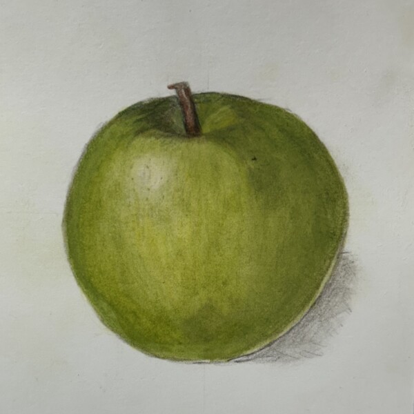
The colors and patterning are really good Maureen! I would suggest adding more shadow toning along the right side and bottom to enhance the apples form. Using the red-violet pencil for a red (or orange) subject would be good for that. Refer to your other posts for descriptions of what to do for the cast shadow and reflective light. This is looking…[Read more]
-
-
Clayton Simpson added 2 Photos 2 weeks, 3 days ago
-
Hi Clayton, I like how the image goes off the page! Really nice saturation of color! Be sure not to outline the subject. The edges should not be dark unless they are in shadow. Nice job!
-
Really nice use of the space on the page! See my comment on outlines on your other post.
-
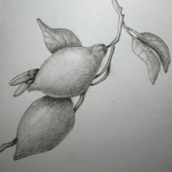
I was experimenting with ink
-
-
Kellie Patton added a Photo 2 weeks, 3 days ago
-
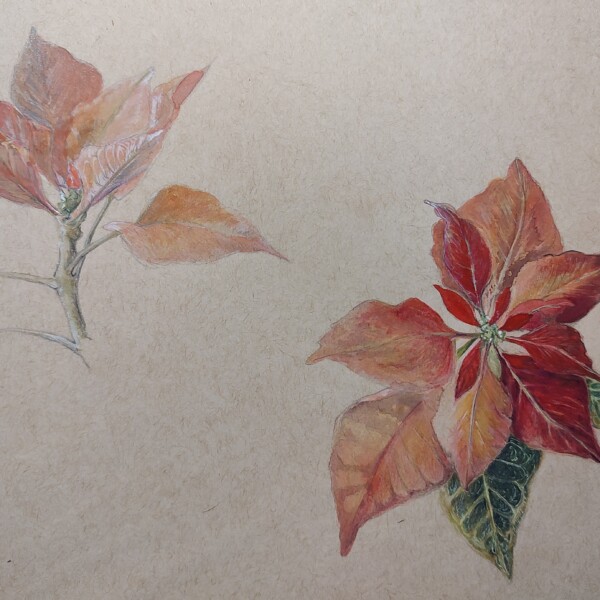
I like seeing the progression Kellie! The more finished leaves have great saturation!
-
I meant to also say, don’t forget to keep the highlights. It is easy to do when you are working on saturated subjects, but the highlights are imperative to the success of the drawing. It is looking really good so far!
-
Thank you so much for the feedback. I will keep working on it.
-
-
Kellie Patton added a Photo 2 weeks, 3 days ago
-
Kellie Patton added a Photo 2 weeks, 3 days ago
-
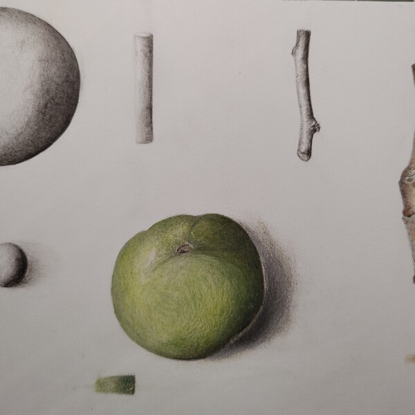
Great study page Kellie! The branch on the right is beautiful! Wonderful toning and shading! The mud-ranges tones could go up higher on the graphite sphere and have a more noticeable main highlight on the apple and the sphere. The white edge on the apple is confusing. It looks like it is not part of the apple so that would be the darkest part of…[Read more]
-
-
Sarah Lees commented on Sarah Lees's Photo 2 weeks, 5 days ago
Yes, thanks!
-
Doug Milne commented on Katie Helmrick's Photo 2 weeks, 5 days ago
Gorgeous Katie! It has so much going for for it! The colors, the highlights, shadows and pillowing are all so well done! Bravo!
-
Doug Milne commented on Hélène Chiasson's Photo 2 weeks, 5 days ago
Hi Helene! Happy Holidays to you too! I so enjoy seeing your beautiful work and I look forward to seeing more in the future! Vern’s suggestion was great and I can see the additional improvement in the leaves! I doubt that they could get any better than they are now!
-
Doug Milne commented on Sarah Lees's Photo 2 weeks, 5 days ago
Great colors and nice form Sarah! The main highlight could be a little whiter, which signifies a shiny surface. The reflected light is too much of a controlled white line. It should not be as bright as the main highlight. Add some color to tone it down. Try using an ivory pencil to blend the colors and then add some of the green on top. This…[Read more]
-
Doug Milne commented on Sarah Lees's Photo 2 weeks, 5 days ago
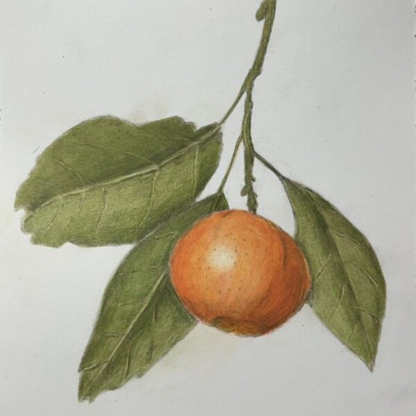
Really nice Sarah! Great colors and saturation! I think you could tone down the main highlight a little. It is a good place to also put more subtle texture. Be aware of the white lines where the edge of the orange meets the leaves. Good job!
-
Katie Helmrick added a Photo 3 weeks, 3 days ago
-
Hélène Chiasson commented on Hélène Chiasson's Photo 3 weeks, 6 days ago
Hi Doug, As you suggested, the drawing looks better with the crisper edges. i also followed Vern’s suggestion to add different shades of green to the leaves in order to make them look more distinct. The various shades (from lemon yellow to pine green) do not show up very well but I think that they make a difference. Thank you for your support…[Read more]
-
Hélène Chiasson added a Photo 3 weeks, 6 days ago
-
Hi Doug, As you suggested, the drawing looks better with the crisper edges. i also followed Vern’s suggestion to add different shades of green to the leaves in order to make them look more distinct. The various shades (from lemon yellow to pine green) do not show up very well but I think that they make a difference. Thank you for your support…[Read more]
-
Hi Helene! Happy Holidays to you too! I so enjoy seeing your beautiful work and I look forward to seeing more in the future! Vern’s suggestion was great and I can see the additional improvement in the leaves! I doubt that they could get any better than they are now!
-
-
Patricia Nesbitt commented on Patricia Nesbitt's Photo 1 month ago
Thanks Doug! 😊
-
Sarah Lees added 2 Photos 1 month ago
-
Really nice Sarah! Great colors and saturation! I think you could tone down the main highlight a little. It is a good place to also put more subtle texture. Be aware of the white lines where the edge of the orange meets the leaves. Good job!
-
Great colors and nice form Sarah! The main highlight could be a little whiter, which signifies a shiny surface. The reflected light is too much of a controlled white line. It should not be as bright as the main highlight. Add some color to tone it down. Try using an ivory pencil to blend the colors and then add some of the green on top. This will…[Read more]
-
Yes, thanks!
-
- Load More
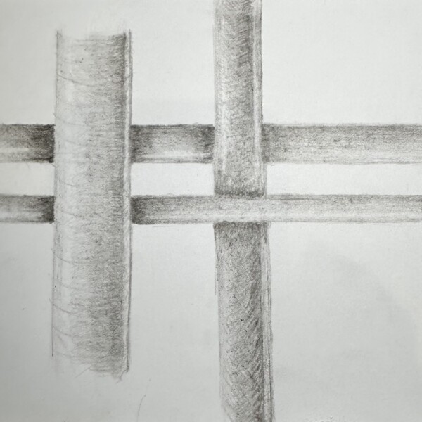





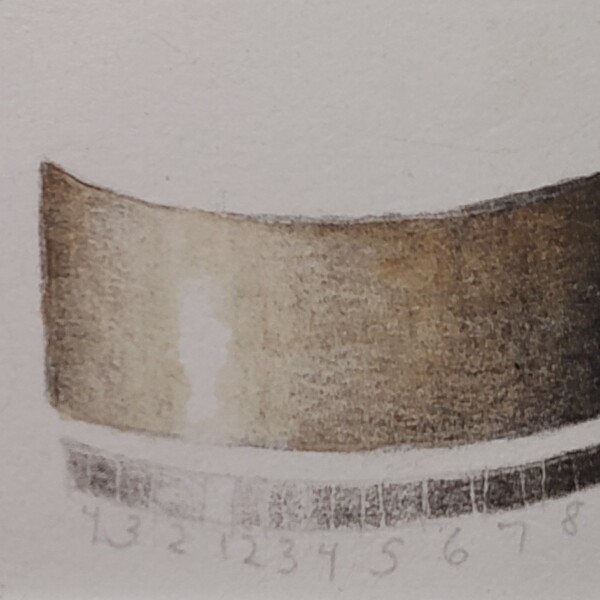
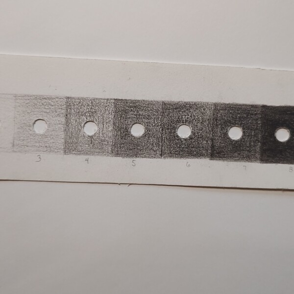
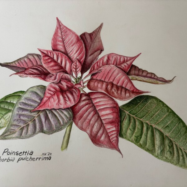
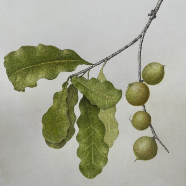
Ah! The dreaded plaid, overlap lesson. It is often very challenging for students. First off, I would not worry about doing the reflected light on this lesson. Referring to the arc bar lesson, concentrate on getting the full range of tones on each cylinder (including the highlight). Also, these are round objects so there would not be a shadow on…[Read more]