Really nice Sarah! Great colors and saturation! I think you could tone down the main highlight a little. It is a good place to also put more subtle texture. Be aware of the white lines where the edge of the orange meets the leaves. Good job!
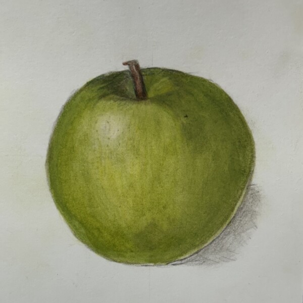
Great colors and nice form Sarah! The main highlight could be a little whiter, which signifies a shiny surface. The reflected light is too much of a controlled white line. It should not be as bright as the main highlight. Add some color to tone it down. Try using an ivory pencil to blend the colors and then add some of the green on top. This will give the area more of a glow effect, which is what you are trying to achieve.

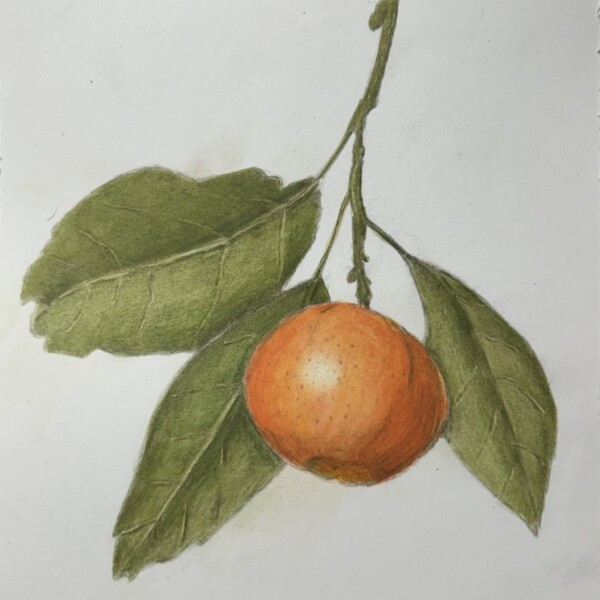
Really nice Sarah! Great colors and saturation! I think you could tone down the main highlight a little. It is a good place to also put more subtle texture. Be aware of the white lines where the edge of the orange meets the leaves. Good job!
Great colors and nice form Sarah! The main highlight could be a little whiter, which signifies a shiny surface. The reflected light is too much of a controlled white line. It should not be as bright as the main highlight. Add some color to tone it down. Try using an ivory pencil to blend the colors and then add some of the green on top. This will give the area more of a glow effect, which is what you are trying to achieve.
Yes, thanks!