Activity
-

Doug Milne commented on Katie Helmrick's Photo 2 months, 2 weeks ago
This is wonderful Katie! Beautiful colors and you have really captured the silky quality of the petals. Great job!
-
Doug Milne commented on Patricia Zuroski's Photo 2 months, 2 weeks ago
This is beautifully rendered Patricia and I like the unique view. Having the leaves behind the flower helps make it stand out! Great attention to the details!
-
Doug Milne commented on Rita Haft's Photo 2 months, 2 weeks ago
As usual, you get great saturated color Rita! I particularly like the image of the single petal. I think it really captures the petal’s delicacy!
-
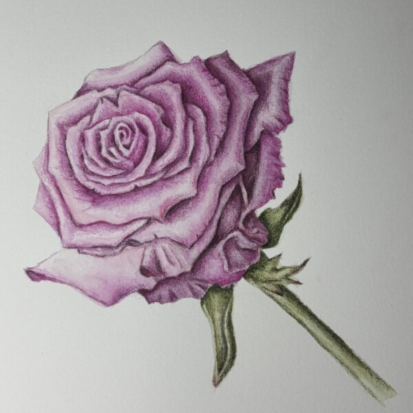
Katie Helmrick added a Photo 2 months, 3 weeks ago
-
This is wonderful Katie! Beautiful colors and you have really captured the silky quality of the petals. Great job!
-
Absolutely beautiful
-
-
Faye Forman commented on Ishbel Galloway's Photo 2 months, 3 weeks ago
I love the contrast of stiff, pointed interior (stigma?) and wilting, droopy petal. Beautiful..
-
Faye Forman commented on Patricia Zuroski's Photo 2 months, 3 weeks ago
Absolutely beautiful crispy curling leaves
-
Faye Forman commented on Faye Forman's Photo 2 months, 3 weeks ago
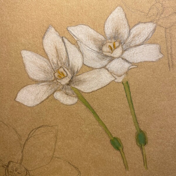
Hi @dougmilne I’m grateful for your feedback on my past posts and I’m wondering if I can ask you a question about shading. By the time I’ve come back to work on the paperwhites, they have shriveled and I’m not able to get the same angle with my light source. Due to this I’ve improvised the shading. Wondering what is the best way to make a subject…[Read more]
-
Faye Forman added a Photo 2 months, 3 weeks ago
-
Hi @dougmilne I’m grateful for your feedback on my past posts and I’m wondering if I can ask you a question about shading. By the time I’ve come back to work on the paperwhites, they have shriveled and I’m not able to get the same angle with my light source. Due to this I’ve improvised the shading. Wondering what is the best way to make a subject…[Read more]
-
Hi Faye- it has been nice to see the drawing process of your paper whites. They look good on the Kraft paper. Drawing live plant material is a challenge! One tool to use is a camera. Take a picture when the plant is fresh and is set up as you are going to draw it. It is a great reference. Another option is to get another fresh sample of the plant,…[Read more]
-
Hi Faye- there are a couple of suggestions for these paper whites. First would be to shade the top of the stem where it meets the flower petals. The petals would cast a shadow on the stem and the shape of the petal will help determine the size and shape of the shadow. Remember that there will be a curve to the shadow on the right hand side of the…[Read more]
-
@dougmilne Thank you so much for your feedback! This is incredibly helpful. Taking a photo or using a reference from the internet or book makes a lot of sense. The shading and light source is the trickiest element for me. I also started with a pencil that cut too sharply into the kraft paper which led to my initial sketch being overly defined and…[Read more]
-
-
Patricia Zuroski commented on Patricia Zuroski's Photo 2 months, 3 weeks ago
I am in New Zealand and it’s sunflower season. It’s the leaves that were most compelling behind a beautiful flower.
-
Patricia Zuroski added a Photo 2 months, 3 weeks ago
-
I am in New Zealand and it’s sunflower season. It’s the leaves that were most compelling behind a beautiful flower.
-
Absolutely beautiful crispy curling leaves
-
This is beautifully rendered Patricia and I like the unique view. Having the leaves behind the flower helps make it stand out! Great attention to the details!
-
Thank you, Faye and Doug. I appreciate the encouragement.
-
-
Rita Haft added a Photo 2 months, 3 weeks ago
-
As usual, you get great saturated color Rita! I particularly like the image of the single petal. I think it really captures the petal’s delicacy!
-
-
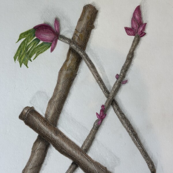
Maureen Griffin added a Photo 2 months, 3 weeks ago
-
Great Maureen! You have a really nice range of tones on the branch segments and the buds and leaves are a nice addition! Be careful with the highlight. The main highlight on the lower angled branch is too centered. It should be moved to the left a little and the darkest edge of the branch would be the right side edge. The cast shadows are nice and…[Read more]
-
-
-
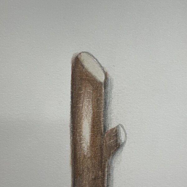
Doug Milne commented on Brittany Czerna's Photo 3 months ago
This is a good start Brittany. There are a couple of areas to revisit. The main highlight is too centered. It should shift over to the left a little. Since the left edge is closest to the light source it should only be a 3-4 on the tone scale as you did on the tone arc bar post. The darker side should be the right edge. I don’t know if I would b…[Read more]
-
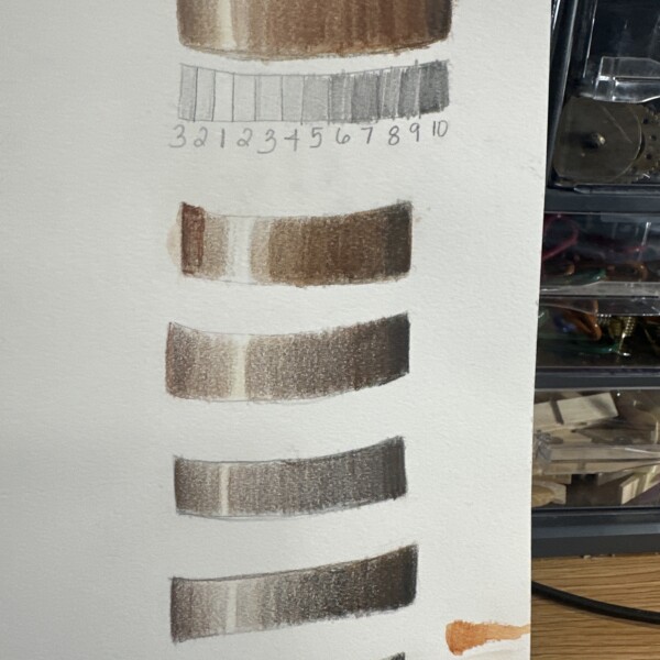
Doug Milne commented on Brittany Czerna's Photo 3 months ago
Welcome to the ArtFeed Brittany! It is good to practice the arc tone bars. The fourth one up from the bottom is the most successful. The common problem with all of them is the areas flanking the highlight are too dark. Those areas should just have a little bit of color and the toning will smoothly transition darker as it moves away from the…[Read more]
-
Doug Milne commented on Maureen Griffin's Photo 3 months ago
This is really good Maureen! Nice highlight and range of tones that are creating great form.
-
Doug Milne commented on Ishbel Galloway's Photo 3 months ago
Wow Ishbel! This is gorgeous! The colors, textures and crispness are just amazing!
-

Ishbel Galloway added a Photo 3 months ago
-
Wow Ishbel! This is gorgeous! The colors, textures and crispness are just amazing!
-
I love the contrast of stiff, pointed interior (stigma?) and wilting, droopy petal. Beautiful..
-
-
Brittany Czerna added a Photo 3 months ago
-
This is a good start Brittany. There are a couple of areas to revisit. The main highlight is too centered. It should shift over to the left a little. Since the left edge is closest to the light source it should only be a 3-4 on the tone scale as you did on the tone arc bar post. The darker side should be the right edge. I don’t know if I would b…[Read more]
-
-
Brittany Czerna added a Photo 3 months ago
-
Welcome to the ArtFeed Brittany! It is good to practice the arc tone bars. The fourth one up from the bottom is the most successful. The common problem with all of them is the areas flanking the highlight are too dark. Those areas should just have a little bit of color and the toning will smoothly transition darker as it moves away from the…[Read more]
-
- Load More