Activity
-

Doug Milne commented on Sarah Lees's Photo 1 year, 8 months ago
Nice Sarah- you got to practice water drops a lot on this piece! Great colors! I would tone down the shadows a little. They don’t need to be so dark.
-
Doug Milne commented on Sarah Lees's Photo 1 year, 8 months ago
Hi Sarah- as I mentioned on the lemon, be aware of having the subject being outlined. With the reflected light, it should not be as white as the main highlight. Nor should it be a controlled thin line. Since it is a reflection, the shape should be looser in appearance. Not the easiest thing to achieve, but it gets easier with practice. Beautiful…[Read more]
-
Doug Milne commented on Sarah Lees's Photo 1 year, 8 months ago
Welcome to the ArtFeed Sarah! You have been busy and have a great selection of posts! The color of the lemon is nice and bright and it is not easy to capture. There are a couple of things to consider. Be careful to not have the subject be outlined. You don’t want to see the dark outside edges, especially when they are near the light source. You c…[Read more]
-
Doug Milne commented on Karye Hood's Photo 1 year, 8 months ago
Charming Karye! Composition, colors, toning – it has everything going for it! It lives up to the title!
-
Doug Milne commented on Jenny Wilson's Photo 1 year, 8 months ago
Hi Jenny- welcome to the ArtFeed! The rendering and colors are very good! You want to have the initial sketch lines be as light as possible. It looks like your peach is outlined and especially as the left side is closest to the light source you don’t want to see that dark outside edge. With the pit – there is no variation in the photo in the a…[Read more]
-
Doug Milne commented on Katie Helmrick's Photo 1 year, 8 months ago
Great job on the patterning Katie! As I commented on your pomegranate and I notice on some of your other posts, I would work on getting more saturation on your subjects. The drawing and toning is great! Just stronger, more saturated color!
-
Doug Milne commented on Katie Helmrick's Photo 1 year, 8 months ago
This is beautifully drawn Katie! I expect a pomegranate to be more saturated with color. The toning and reflected light are wonderful!
-
Denise Harris added a Photo 1 year, 8 months ago
-
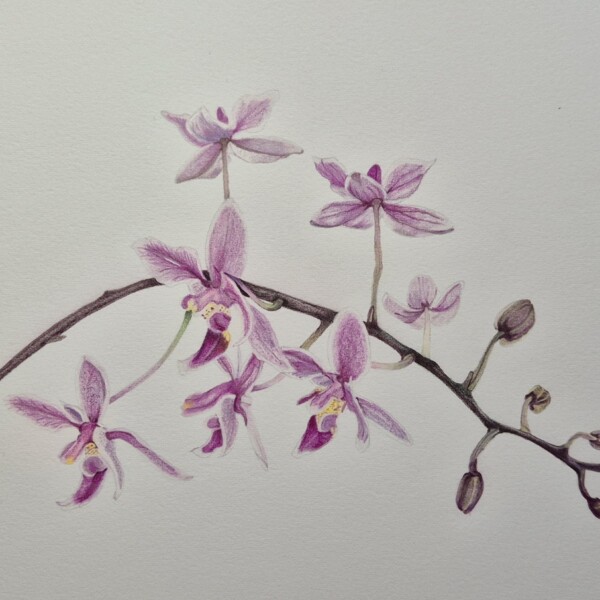
Beautiful colors Denise! I would consider adding some darker tones to the shadow areas to give the flowers more definition and clarity. Maybe use more of the red/violet and/or dark indigo. Nice job!
-
-
Patricia Zuroski commented on Patricia Zuroski's Photo 1 year, 8 months ago
Thank you for the feedback, Doug. I’ve been doing more watercolor (without pencil) to get better at mixing colors. This one, I think, is both, pencil and watercolor. Still unsure about how to make the highlights blend in well so that they don’t look like a hole in the leaf! The fall colors have been spectacula.
-
Doug Milne commented on Katie Helmrick's Photo 1 year, 8 months ago
Hi Katie- welcome to the ArtFeed! This is beautifully rendered! Darkening the areas that are in shadow (in the “v” where petals overlap) and especially the sepals and petals on the right side, which is furthest from the light source the image will start to have more contrast and pop! Remember too that the stamen cluster in the center will cast a s…[Read more]
-
Doug Milne commented on Ishbel Galloway's Photo 1 year, 8 months ago
Wonderful Ishbel! There is great contrast, but you still have nice delicacy on the flower petals!
-
Doug Milne commented on Patricia Zuroski's Photo 1 year, 8 months ago
Wonderful Patricia! I love the composition with the fallen leaves at the bottom of the page! And the glowing quality of the leaves is so beautiful! Bravo!
-
Doug Milne commented on Patricia Zuroski's Photo 1 year, 8 months ago
Beautiful Patricia! I love the illustrative quality of the image! As you put the range of tones on the branch, there should also be a range of tones on the lichen so you are conveying it curves around to the back of the branch.
-
Doug Milne commented on Patricia Zuroski's Photo 1 year, 8 months ago
Nice study page Patricia! Is this bittersweet?
-
Doug Milne commented on Hélène Chiasson's Photo 1 year, 8 months ago
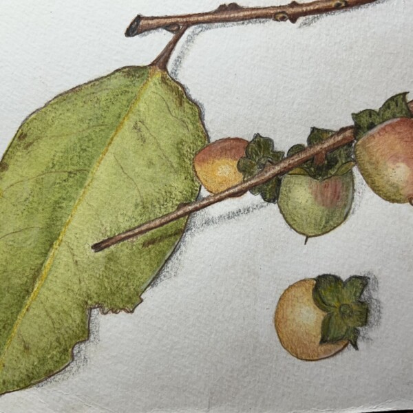
The leaves do look better Helene! I really like the addition of the ripened fruit. It has contrast and crispness that makes it stand out. Making the edges of the other subjects crisper and the shadows darker might help the balance of the overall composition.
-
Doug Milne commented on Hélène Chiasson's Photo 1 year, 8 months ago
Gorgeous Helene!
-
Doug Milne commented on Ishbel Galloway's Photo 1 year, 8 months ago
Great colors and textures Ishbel! I think you could get darker on the underside of where the skin folds over and also the underside of the stem fold. The stem looks unfinished to me and needs more definition.
-
Sarah Lees added 3 Photos 1 year, 8 months ago
-
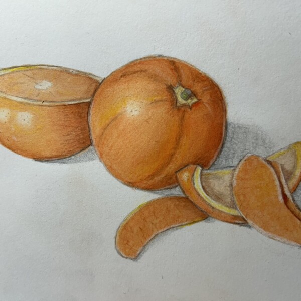
Hi Sarah- nice colors! I would look at some of the other citrus drawings on the ArtFeed (or online or books) for ideas in creating citrus textures. Think of using white on the orange segments and cut view to give them some interest and increase that juicy quality.
-
Yes, agreed. TY!
-
-
-
Sarah Lees added 3 Photos 1 year, 8 months ago
-
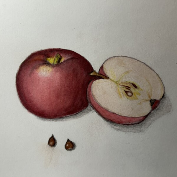
What a striking image Sarah! Wonderful composition and that highlight really makes the whole image pop! Bravo!
-
Many thanks!
-
- Load More