Activity
-
Renata commented on Harriet O’Donnell's Photo 4 years ago
This is so beautiful! I actually like the colours a lot!
-

Jill Amadei commented on Jill Amadei's Photo 4 years ago
I have added some varying shades of green as Katy suggested 🙂 Thank you for the tip!
-
Jill Amadei added a Photo 4 years ago
-
I have added some varying shades of green as Katy suggested 🙂 Thank you for the tip!
-
This is beautiful, Jill! I actually love the leaves and all that movement they suggest!
-

Jill, these are elegant!
-
This looks great, Jill. The extra green has given your plant a lively personality.
-

So great Jill. I love those leaves and the character-ness of all of these. wonder if the bells could have a bit more colour saturation in some places. Might just be the photograph, though.
-
-

Julie Z.D. commented on Julie Z.D.'s Photo 4 years ago
Switched to watercolor paper to see if it made a difference. It does.
-
Julie Z.D. added a Photo 4 years ago
-
Switched to watercolor paper to see if it made a difference. It does.
-
Hi Julie- this is much better! Nice range of smooth toning! I think you could go darker on the right side edge (and be sure to adjust the tones to the left of it if need be). The left edge looks like an outline. The left edge gets to be a 3 or 4 because it is close to the light source. I would add a little more of the tone you have on that left…[Read more]
-
-
sheila y. commented on sheila y.'s Photo 4 years ago
Thanks, Jill. I’d never seen red strawberry flowers, but that’s what the nursery had, hanging basket style. I hope they taste good! -
sheila y. commented on sheila y.'s Photo 4 years ago
Thank you, Renata. I’m having fun using black and white!?! -

Pam commented on Pam's Photo 4 years ago
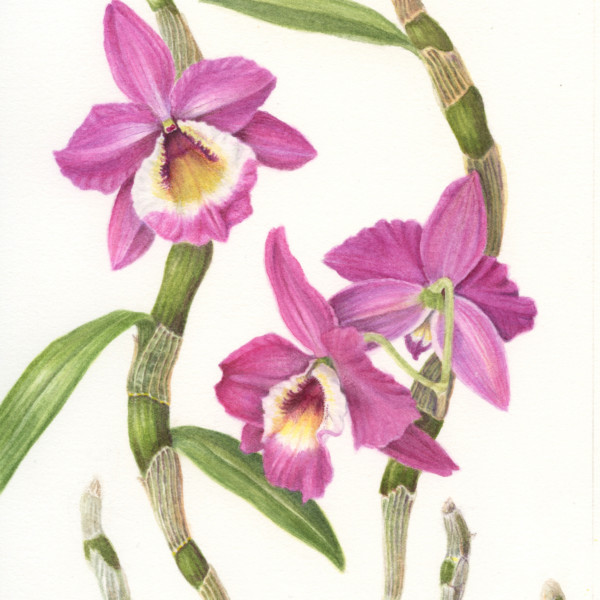
I took a worshop with Dick Rauh and Carol Woodin about orchids, and then painted this in watercolor. I’m trying to decide whether to take it further with colored pencil, or if I should leave it in just watercolor. (This is a Dendrobium orchid).
-
Pam added a Photo 4 years ago
-
I took a worshop with Dick Rauh and Carol Woodin about orchids, and then painted this in watercolor. I’m trying to decide whether to take it further with colored pencil, or if I should leave it in just watercolor. (This is a Dendrobium orchid).
-
Wow! This is beautiful!
-
Oh look at those stems! This is so beautiful!
-
Pam, what a beautiful piece! Great composition! And , watercolor!?! Beautiful!
-
Thanks guys. The stems (which I just learned are actually storage organs called pseudobulbs) are what made me want to draw this orchid. They are so interesting. My plan is to fine-tune the drawing a bit, and then try to paint it on vellum. But knowing me, I’ll get distracted and never get around to it 🙂
-
Gorgeous Pam!!! Love those dark centers!!! Your painting is so crisp and fresh!!!! Love it!!!!
-
Beautiful! How did paint the papery white/tan parts over the green of the stems? Did you paint the green of the stem first, but if so, how coukd you layer the lighter color over that? However you did it, it looks so real – the flowers are beautiful, too!
-
Laurie, funny you should ask, because I wanted to try to paint the canes again, this time using masking fluid on the veins in the papery bits before painting. In the original, I didn’t use masking. I just painted around the veins using a lighter color than the fleshy parts, and then got really dark in some places to make the really light areas l…
-
Hi Pam, Thank you for explaining this to me- It is helpful to learn how you did it- much appreciated!
-
-
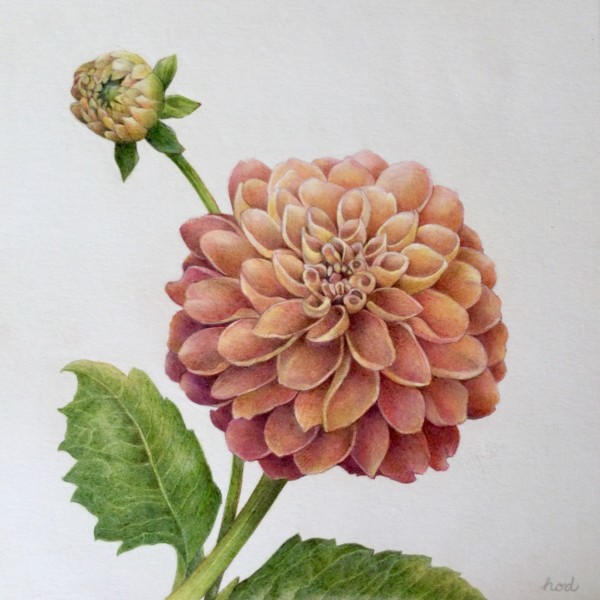
Harriet O’Donnell commented on Harriet O’Donnell's Photo 4 years ago
Maybe a bit of artistic license with the colours! The flower wilted quickly and my photographs flattened out any subtle changes in colour that drew me to the flower in the first place.
-
Katy Lyness commented on Cynthia Ziegler's Photo 4 years ago
Beautiful, subtle toning! I love the glow that comes from the adding that warm color to the mostly monochromatic drawing. I wish that cross section was not so close to the edge of the paper. Even so, I’d like see more detail there.
-
Katy Lyness commented on mary jo gimber's Photo 4 years ago
Nice study page! I really like your experimentation with color. The purple moving to yellow on the main flower, is quite stunning. I’d like to see more text: Your comments on the process and some identification of the plant parts.
-
Katy Lyness commented on Harriet O’Donnell's Photo 4 years ago
So lovely! You have really captured the essence of this flower. I love the subtle movement of color.
-
Katy Lyness commented on Marilyn Tooke's Photo 4 years ago
Hi Marilyn, Nice drawing. That lemon is especially nice! You have chosen the perfect colors to achieve the shape. I love the little dimples. I think the orange is less successful. Maybe add some warm darks in the shadows to get more of a spheric shape.
-
Katy Lyness commented on Cynthia Ziegler's Photo 4 years ago
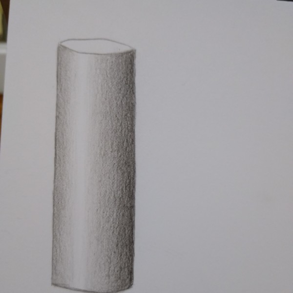
Nice drawing. I like the cleaness of it. I think you could focus more on achieving the feel of the cylinder, especially the verticals. Think of the light source. Which side is it coming from? The bars would be darker on the opposite side. Also, decide where your highlight would be.
-
Camille Maravegias commented on Camille Maravegias's Photo 4 years ago
I missed the Webinar but did the rendering. I am still fascinated by the chickpea sprouting. I still have one on my window sill. It stands up in the a small pool of water facing the sun. I’m amazed!
-
Camille Maravegias added a Photo 4 years ago
-
I missed the Webinar but did the rendering. I am still fascinated by the chickpea sprouting. I still have one on my window sill. It stands up in the a small pool of water facing the sun. I’m amazed!
-
Camille, this is wonderful. So interesting to study!
-
Beautiful rendering and composition Camille!!
-
What an incredible plant, so inspiring.
-
-
Cynthia Ziegler commented on Harriet O’Donnell's Photo 4 years ago
This is beautiful Harriet!!
-
Harriet O’Donnell added a Photo 4 years ago
-
This is beautiful Harriet!!
-
So lovely! You have really captured the essence of this flower. I love the subtle movement of color.
-
Maybe a bit of artistic license with the colours! The flower wilted quickly and my photographs flattened out any subtle changes in colour that drew me to the flower in the first place.
-
This is so beautiful! I actually like the colours a lot!
-
Beautiful!
-
Gorgeous! So full!
-
Wonderful!
-
Gorgeous Harriet! The colors are beautiful! The centers of both flowers draw your eyes right in!!!
-
Gorgeous, as usual. You make it look so effortless – what beautiful portraits.
-
-
Cynthia Ziegler added a Photo 4 years ago
-
Beautiful, subtle toning! I love the glow that comes from the adding that warm color to the mostly monochromatic drawing. I wish that cross section was not so close to the edge of the paper. Even so, I’d like see more detail there.
-
This is such a cool drawing.
-
Thanks 🙏🏻. I will get into more detail when/if my mad drawing skillz improve! Need to make use of that magnifying glass 🔍
-
- Load More