Activity
-

Sam McWilliams commented on Bettina's Photo 4 years, 3 months ago
Good job. I feel like it is begging for some watercolour layers. Try extending one side of the stem at the bottom just a bit, so as not to have a straight cut off horizontal line.
-
Sam McWilliams commented on Bettina's Photo 4 years, 3 months ago
Gorgeous bean portraits! I want a good highlight on the largest one. Maybe you can darker the browns around the edges and leave a lighter highlight running down the left of centre.
-
Sam McWilliams commented on Bettina's Photo 4 years, 3 months ago
You can try going around the edges with a sharp coloured pencil to give the seeds clean edges. Some people like using Verithins, others just very sharp Polychromos.
-
Sam McWilliams commented on Bettina's Photo 4 years, 3 months ago
Looking good, Bettina!
-
Sam McWilliams commented on Jill Amadei's Photo 4 years, 3 months ago
Clearly you were prepared for the challenge! What an impressive creature – I am very pleased to make its acquaintance. I mean, you did a stellar job. Question – are the forms actually that neatly tubular or are they more modified/modulated? I think this drawing would benefit from the trick where you sneak in a few long strokes of a warmer colour…[Read more]
-
Sam McWilliams commented on Katherine McCartney's Photo 4 years, 3 months ago
And Brava on your first flower. 🙂
-
Sam McWilliams commented on Katherine McCartney's Photo 4 years, 3 months ago
Fantastic! You could darken your greens on the leaf behind the overlap of the petal lower left. That’ll push that leaf back farther and push the white flower forward. Use some chrome oxide green and dark sepia. Same thing on the other leaves. Darken where they go behind the flowers in front. Keep highlights of course.
-
Sam McWilliams commented on Katherine McCartney's Photo 4 years, 3 months ago
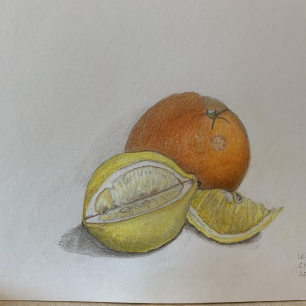
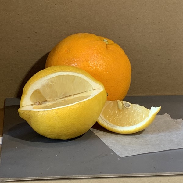
Ochres are nice for toning lemons. You can even try some purple for the shaded rounding of lemons. Saturate the yellows and oranges! These are very fun to do on Kraft paper as well.
-
Sam McWilliams commented on Katherine McCartney's Photo 4 years, 3 months ago
Nice work, Katherine! Very interesting cuts – I like that. See if you can shade off that outline on the top rear edge of the cut lemon – we usually don’t want to see any outlines. Let your cast shadows fadeout softly at their edges.
-
Sam McWilliams commented on Katherine McCartney's Photo 4 years, 3 months ago
Typing more on the flower photo…
-
Sam McWilliams commented on Katherine McCartney's Photo 4 years, 3 months ago
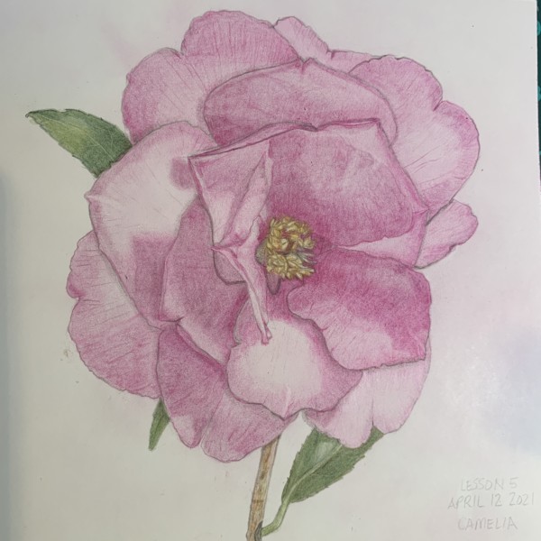
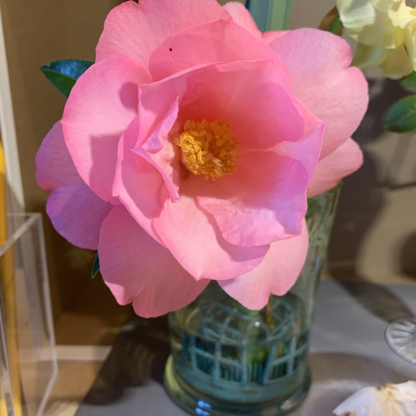
Hi Katherine – excellent start. Are you a lefty lighting from the right? I think you can use some purple and gray and at the end dark sepia where you need it fr your grisaille toning. I’d try to mix up a water-colour that matches that gorgeous pink in your photo for your local colour.
-

Katherine McCartney commented on Katherine McCartney's Photo 4 years, 3 months ago
will appreciate feedback here about shading as working with pink first time, and understanding what colors to use for shading will be helpful.
-
Katherine McCartney added 2 Photos 4 years, 3 months ago
-
will appreciate feedback here about shading as working with pink first time, and understanding what colors to use for shading will be helpful.
-
Hi Katherine – excellent start. Are you a lefty lighting from the right? I think you can use some purple and gray and at the end dark sepia where you need it fr your grisaille toning. I’d try to mix up a water-colour that matches that gorgeous pink in your photo for your local colour.
-
Typing more on the flower photo…
-
This is so delicate!
-
I am right handed and lighting from the right. I don’t have a purple yet but next visit to art store will get.
-
-
Katherine McCartney commented on Katherine McCartney's Photo 4 years, 3 months ago
my first flower.
-
Katherine McCartney added a Photo 4 years, 3 months ago
-
Nice work, Katherine! Very interesting cuts – I like that. See if you can shade off that outline on the top rear edge of the cut lemon – we usually don’t want to see any outlines. Let your cast shadows fadeout softly at their edges.
-
-
Katherine McCartney added a Photo 4 years, 3 months ago
-
Ochres are nice for toning lemons. You can even try some purple for the shaded rounding of lemons. Saturate the yellows and oranges! These are very fun to do on Kraft paper as well.
-
Also, I really like the still life you have set up here. Inspiring.
-
-
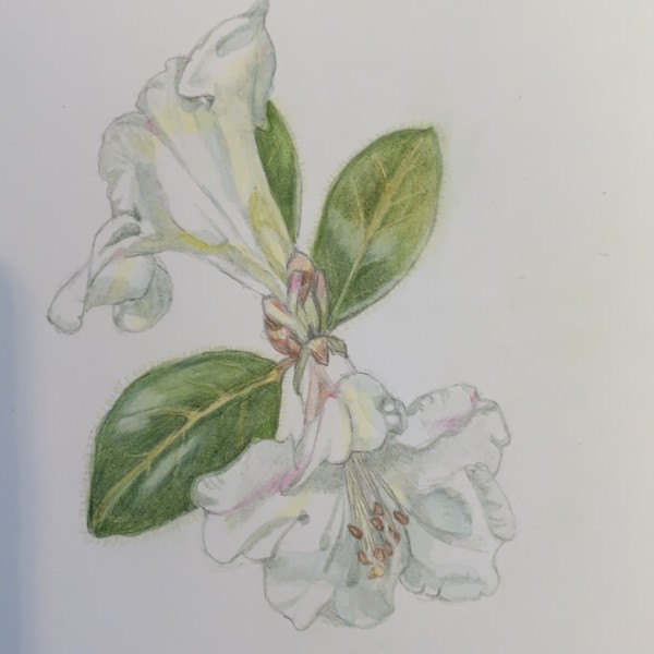
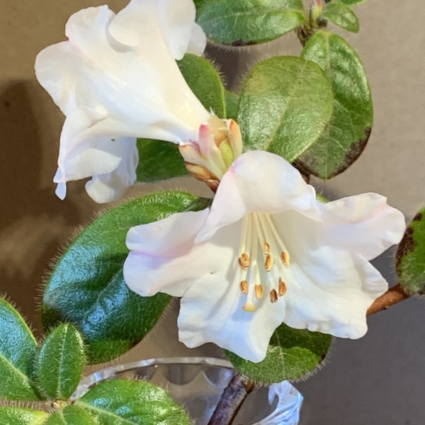
Katherine McCartney added a Photo 4 years, 3 months ago
-
my first flower.
-
Fantastic! You could darken your greens on the leaf behind the overlap of the petal lower left. That’ll push that leaf back farther and push the white flower forward. Use some chrome oxide green and dark sepia. Same thing on the other leaves. Darken where they go behind the flowers in front. Keep highlights of course.
-
And Brava on your first flower. 🙂
-
-
Katherine McCartney added a Photo 4 years, 3 months ago
-

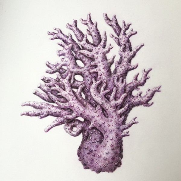
Jill Amadei commented on Jill Amadei's Photo 4 years, 3 months ago
I’ve never drawn such a complicated shape, with so many overlapping parts before. It was challenging! I’d appreciate any feedback 😊 thank you!
-
-
I’ve never drawn such a complicated shape, with so many overlapping parts before. It was challenging! I’d appreciate any feedback 😊 thank you!
-
Clearly you were prepared for the challenge! What an impressive creature – I am very pleased to make its acquaintance. I mean, you did a stellar job. Question – are the forms actually that neatly tubular or are they more modified/modulated? I think this drawing would benefit from the trick where you sneak in a few long strokes of a warmer colour…[Read more]
-
- Load More