Activity
-

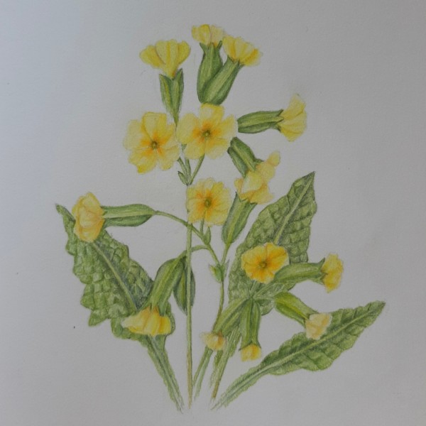
Ingrid Schenk commented on Ingrid Schenk's Photo 4 years, 5 months ago
@dougmilne thanks a lot for your feedback I ‘ll give it a try! For me the toning and shading of yellow seems rather difficult, hope I won’t spoil it …
-
Doug Milne commented on Ingrid Schenk's Photo 4 years, 5 months ago
Hi Ingrid- the open face flowers are particularly striking! I would go back and do more toning at the overlaps and areas that would be in shadow. For example – the cluster of buds in front of the leaf on the lower right does not read well. The leaves obviously have a lot of texture, but they could use more of a range of tones and greens to…[Read more]
-
Ingrid Schenk added a Photo 4 years, 5 months ago
-
Hi Ingrid- the open face flowers are particularly striking! I would go back and do more toning at the overlaps and areas that would be in shadow. For example – the cluster of buds in front of the leaf on the lower right does not read well. The leaves obviously have a lot of texture, but they could use more of a range of tones and greens to…[Read more]
-
@dougmilne thanks a lot for your feedback I ‘ll give it a try! For me the toning and shading of yellow seems rather difficult, hope I won’t spoil it …
-

Lovely Ingrid, and like Doug said, going darker in your greens will help pop those yellows out. Don’t be afraid to darken them. And yes – true – everyone is challenged by the toning of the yellows.
-
@sammcwilliams thank you Sam!
-
Thank you Ingrid. Now i know the english name for “Himmelsschlüssel”
-
-
Renata commented on Renata's Photo 4 years, 5 months ago
Thanks @vern! It took me a while to get it done because I was using photos – which made me value drawing from life even more. I am thinking I should put a scale by the habit drawing as it is usually really tall!
-
Renata commented on Renata's Photo 4 years, 5 months ago
Thank you, @ Mary Jo! I enjoy seeing your drawings too! I think we learn a lot from this art feed, and it is fun!
-

Pam commented on Pam's Photo 4 years, 5 months ago
Fern, thanks for the guidance. That’s what my instincts were telling me too. I’ll give it a try!
-
Pam commented on Pam's Photo 4 years, 5 months ago
I’m attempting a milkweed (again. Lol). At the moment, I’m working on that cluster of three pods, and I’m having trouble figuring out how to make that pod in the back go back in space. Do I lighten it more? Or should I darken it more? My fear is that if I make it darker, the peduncles won’t stand out enough. Any advice?
-
Pam added a Photo 4 years, 5 months ago
-
I’m attempting a milkweed (again. Lol). At the moment, I’m working on that cluster of three pods, and I’m having trouble figuring out how to make that pod in the back go back in space. Do I lighten it more? Or should I darken it more? My fear is that if I make it darker, the peduncles won’t stand out enough. Any advice?
-
Fern, thanks for the guidance. That’s what my instincts were telling me too. I’ll give it a try!
-
I agree with the Vern! Beautiful, Pam.
-
-
mary jo gimber commented on Renata's Photo 4 years, 5 months ago
You drawings are so lovely. I look forward to seeing them.
-
mary jo gimber commented on mary jo gimber's Photo 4 years, 5 months ago
Thank you, Vern. Yes, I really need to practice measuring and perspective. I have started to put a one inch graph on my paper to see if that will help me get my measurements in the right place. I have a clear 4×12 inch plastic quilting ruler which I have also tried to use to see more clearly. It is divided into one inch squares. It seems to… -
Renata added a Photo 4 years, 5 months ago
-
You drawings are so lovely. I look forward to seeing them.
-
Thank you, @ Mary Jo! I enjoy seeing your drawings too! I think we learn a lot from this art feed, and it is fun!
-
Thanks @vern! It took me a while to get it done because I was using photos – which made me value drawing from life even more. I am thinking I should put a scale by the habit drawing as it is usually really tall!
-
I like the scale idea, Renata, as long as it doesn’t detract from the beauty of your drawing. But it’d be great information. Your colours here are stunning.
-
Thanks Sam! I will work on the scales and repost.
-
-
Renata commented on Colleen Brannen's Photo 4 years, 5 months ago
I like this a lot too! The surface looks so smooth and warm, just like a real carambola! 🙂
-
Jessica Pullins commented on Colleen Brannen's Photo 4 years, 5 months ago
I love this! It looks like a photograph.
-
Katy Lyness commented on Colleen Brannen's Photo 4 years, 5 months ago
I love this drawing. So lovely! The warm shadow colors. The interesting angle you have chosen. The the sharp edges verses soft edges. So masterfully done! Beautiful! Now I want to see the cross section!
-
mary jo gimber commented on mary jo gimber's Photo 4 years, 5 months ago
Doug, Thanks so much for your critique. The truth must now come out. After I finished the yellow apple I noticed that it was too big on the right lower quarter. I tried to erase it but that didn’t work. My next idea was to use a shadow to reduce the size of the apple. It worked but I had to go dark on the part that I was hiding. Then I… -
Doug Milne commented on Katherine McCartney's Photo 4 years, 5 months ago
Hi Katherine- the green leaf is an interesting subject and you did a great job with it. You could use more toning on the red leaf and I would try to incorporate the embossed lines more. Nice job!
-
Doug Milne commented on Katherine McCartney's Photo 4 years, 5 months ago
Hi Katherine- You are off to a good start!!!! I can see from the photograph that you drew the highlight in where you saw it, but that is not the correct position for a highlight. If you are right handed the highlight would be in the upper left quadrant and in the upper right quadrant if you are left handed. It is key to set up your lighting before…[Read more]
-
Doug Milne commented on mary jo gimber's Photo 4 years, 5 months ago
Hi Mary Jo- these apples are gorgeous! The view on the right is hard to do and you have done a great job! The patterning is amazing and really plays up the apple’s forms. Oddly enough I don’t see much toning that would traditionally establish the form. The cast shadows are way too dark and I would lighten them considerably! With a cast shadow tha…[Read more]
-
Doug Milne commented on Katherine McCartney's Photo 4 years, 5 months ago
Hi Katherine- the colors are so pleasing and you have some nice pillowing. It looks like you used an embossing tool and there are areas it dominates. Once you use it you are committed, but it could be incorporated more. The cast shadow is very sketchy and I would work on achieving a smoother finish. Nice job!
-

sheila y. commented on sheila y.'s Photo 4 years, 5 months ago
@sam-mcwilliams, thanks for your feedback. It feels like a fun time to “cross the gutter”, spring busting out so fast. I feel happy to do fast studies and still use our fantastic color pencils and watercolor pencils. Just into going where it takes me right now. Happy spring!! - Load More