Activity
-

Margaret Hahn commented on Ingrid Schenk's Photo 4 years, 6 months ago
Beautiful detail!
-

sheila y. commented on sheila y.'s Photo 4 years, 6 months ago
Thanks, Sam. I’ll try that with the white watercolor on Kraft. Big challenge for me! -
-
Beautiful detail!
-
This is very striking Ingrid! It is beautifully rendered and I really enjoy the pops of color on the grey tones of the branches!
-
@margarethahn thank you so much Margaret!
-
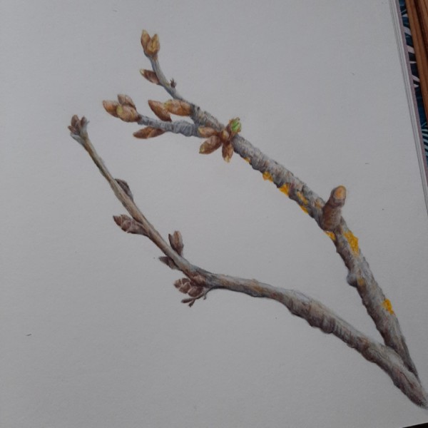
@dougmilne Thank you Doug! I enjoyed studying the branch, so interesting to see different phases of growth … but it was a challenge to draw and I wish I could have painted more of these details of growth… needs a bigger seize, next time 😊
-
@vernfannin thank you so much Vern! 😊
-
-

Sandra Gortemaker added a Photo 4 years, 6 months ago
-
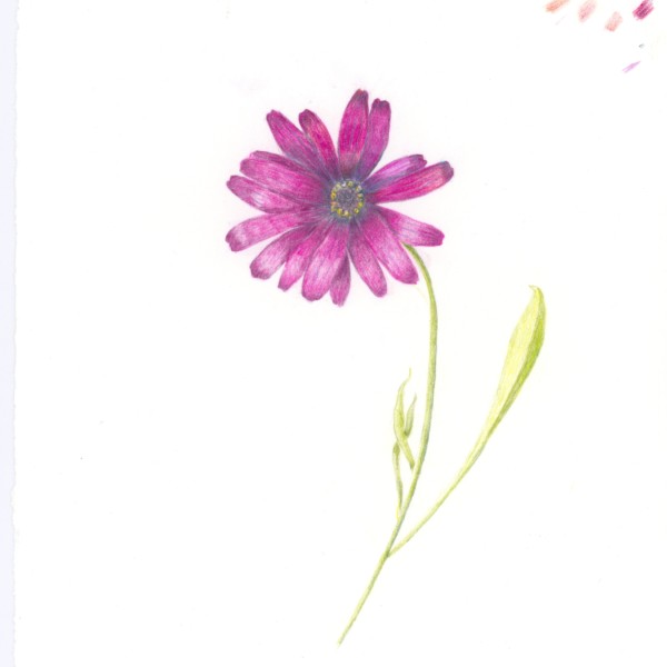
Hi Sandra- the petal color is spot on! These flowers also have such intense color in the centers. I would add some more dark toning on the petals surrounding the center to make it pop more. I was thinking you did a drawing of this flower in Greece too?
-
It’s the same, I was trying if i could upload some work without having a paid plan. Still contemplating if i should sign up again. Little time to draw.
-

I thought I recognized this! Nice to see you here.
-
How I wish to go back! But no traveling allowed yet.
-
-

Sam McWilliams commented on Mary's Photo 4 years, 6 months ago
Nice Mary! Fun to have the golden yellow and reds for my eyes to play off of. Great toning and highlights on your tomatoes. Observe the shadows here – see how it looks like your light comes form a different place/angle on the tomatoes v leaf? I’d like to see highlights on the leaf as well. Love the curved stem.
-
Sam McWilliams commented on Mary's Photo 4 years, 6 months ago
This looked real at first glance. 🙂 soften the shadow and give me those highlights on the side branches too. You can try using a variety of greens in the needles – so that some parts appear closer or farther away.
-
Sam McWilliams commented on Mary's Photo 4 years, 6 months ago
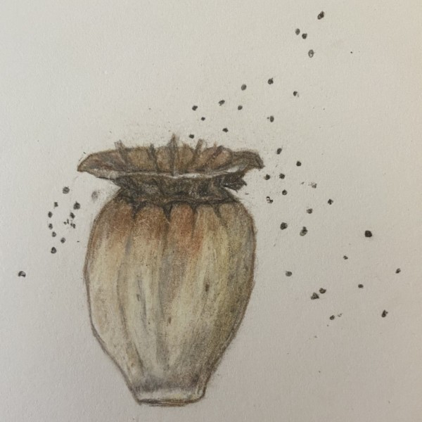
Fun! Seeds to the wind. I love it. Endeavor to give me the highlight and shaded side on the form, so that I can feel its volume. Nice observation of the “lip” curling toward you.
-
Sam McWilliams commented on Mary's Photo 4 years, 6 months ago
Excellent practice. Great that you saw and recorded the cast shadow of the stem. Again – where would your shadow fall if light is coming from your left shoulder.
-
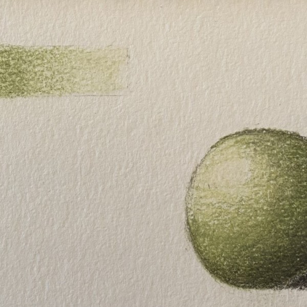
Sam McWilliams commented on Mary's Photo 4 years, 6 months ago
Nice smooth gradations on your tone bar. The shadow on your ball would move diagonally up to the right away from the ball and your light source. I’d make your shadow a bit lighter/softer – you don’t want the shadow to upstage the main actor – it has a supporting role. And make sure not to overemphasize the reflective highlight – it doesn’t want to…[Read more]
-
Sam McWilliams commented on Mary's Photo 4 years, 6 months ago
Good practice. I think I’d see more highlights on the inside right of that cup if my light is shining down on it from the left (like at or above my left shoulder).
-
Sam McWilliams commented on Mary's Photo 4 years, 6 months ago
Hi Mary – good toning exercises. Many folks here enjoy using a hot press smooth paper – you can try it and see if you like it. Less texture = smoother blends.
-
Sam McWilliams commented on Ishbel Galloway's Photo 4 years, 6 months ago
Yes, the centre one really has a great 3d volume to it. I loved staring at these guys – what an amazing creature.
-
Sam McWilliams commented on sheila y.'s Photo 4 years, 6 months ago
I’ve been liking putting some loose white water-colour down in different trabsparencies and leaving some Kraft paper showing, then building on top of that. I find it really fun to see how much I can let the Kraft paper do the talking. My favs here are your highlight on the rind, and the highlights/ wet glow on the orange slice.
-
Sam McWilliams commented on Wendy Kleinman's Photo 4 years, 6 months ago
Here’s a second bright spot for you – your drawings are Always so wonderful – I love how all the V shapes in this move my eye back and forth up and down the axis of your drawing – like nature’s musical scale.
-
Ishbel Galloway commented on Ishbel Galloway's Photo 4 years, 6 months ago
Thanks! I was pretty pleased with this.
-
Ishbel Galloway commented on Ishbel Galloway's Photo 4 years, 6 months ago
It started out as all water colour (during the zoom workshop) but then I worked on it a bit (and improved it I think) with pencils.
-
Bonnie Simandle added a Photo 4 years, 6 months ago
-
Mary added a Photo 4 years, 6 months ago
-
Fantastic Mary! The colors are details are so good. I would suggest darkening the toning on the right side edge. It looks lighter than the left side edge and it should be darker because it is further away from the light source.
-
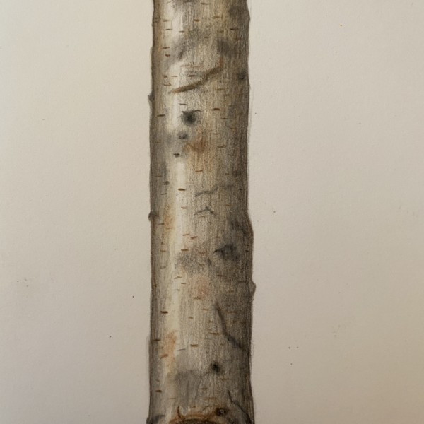
@doug-milne Thanks for the feedback Doug. My eye was telling me that the more shadow I added, the less white it appears. Since I do not see a shadow on the stick, I feel like I am losing the essence of the white. I will go back and rework this as you suggested. I so appreciate your help!
-
@doug-milne I had a real tough time with the inside of the stick. I am trying to make the inner part show a stick within a stick and don’t quite know how to do that. There are some really interesting deep and dark holes that look like they were burnt into the wood. Any thoughts?
-
-
Mary added 7 Photos 4 years, 6 months ago
-
Hi Mary – good toning exercises. Many folks here enjoy using a hot press smooth paper – you can try it and see if you like it. Less texture = smoother blends.
-
Good practice. I think I’d see more highlights on the inside right of that cup if my light is shining down on it from the left (like at or above my left shoulder).
-
Nice smooth gradations on your tone bar. The shadow on your ball would move diagonally up to the right away from the ball and your light source. I’d make your shadow a bit lighter/softer – you don’t want the shadow to upstage the main actor – it has a supporting role. And make sure not to overemphasize the reflective highlight – it doesn’t want to…[Read more]
-
Excellent practice. Great that you saw and recorded the cast shadow of the stem. Again – where would your shadow fall if light is coming from your left shoulder.
-
Fun! Seeds to the wind. I love it. Endeavor to give me the highlight and shaded side on the form, so that I can feel its volume. Nice observation of the “lip” curling toward you.
-
This looked real at first glance. 🙂 soften the shadow and give me those highlights on the side branches too. You can try using a variety of greens in the needles – so that some parts appear closer or farther away.
-
Nice Mary! Fun to have the golden yellow and reds for my eyes to play off of. Great toning and highlights on your tomatoes. Observe the shadows here – see how it looks like your light comes form a different place/angle on the tomatoes v leaf? I’d like to see highlights on the leaf as well. Love the curved stem.
-
@sam-mcwilliams The shadow would angling up more.
-
Ok! I will get in there and highlight and darken it up. Thanks Sam.
-
So even if I see a screaming dark shadow I should not put that in? I have to remember to not always draw what I see as it doesn’t get translated well.
-
Ok, highlights coming up if I can figure out how to do that. (I drew these tomatoes and leaf at different times. I was trying to be cheap and smash a bunch of stuff together to save paper;)
-
@sam-mcwilliamsThanks Sam!.I have some hot pressed paper now.
-
Ok, I will redo. I so appreciate all your advice. Thank you.
-
Ha – I do that too. 🙂
-
-
Katy Lyness commented on Maureen Doram's Photo 4 years, 6 months ago
No, I was thinking of a dark indigo. But only in the very darkest darks. I think that cool color will give the drawing a richer feel. Not that it needs anything much. It is quite beautiful as it is.
- Load More