Activity
-

Doug Milne commented on Bettina's Photo 4 years, 3 months ago
This pear has so many nice qualities Bettina! You have done a good job with the colors and the details. I would lighten the highlight a bit and also add more dark and mid-range toning to enhance it’s form. The cast shadow is really throwing me off. It protrudes down too far from the bottom of the pear and I would erase that part. The way it a…[Read more]
-
Doug Milne commented on Jill Amadei's Photo 4 years, 3 months ago
What amazing detail Jill!!!! Very impressive!!!!
-
Doug Milne commented on Carol Smasal's Photo 4 years, 3 months ago
Carol- the details you have achieved here are beautiful! At this stage I am finding it hard to tell what the main color of the tulip is. It looks like you have used purple for the toning on the pink and rose colored areas very effectively. Regarding the section on the right that is purple, is purple the predominate color of those petals or does…[Read more]
-
Wendy Kleinman commented on Carol Smasal's Photo 4 years, 3 months ago
Love, love the leaves.
-
Doug Milne commented on Carol Smasal's Photo 4 years, 3 months ago
Your tulip is beautifully rendered Carol! I love how you captured the curves and movement of the stem and leaves. I think you could saturate your colors more and I expect to see more toning especially on the flower. You are off to a good start!!!
-

Carol Smasal commented on Carol Smasal's Photo 4 years, 3 months ago
I think this needs to go darker, but am unsure which color or colors to use for the shadow areas.
-
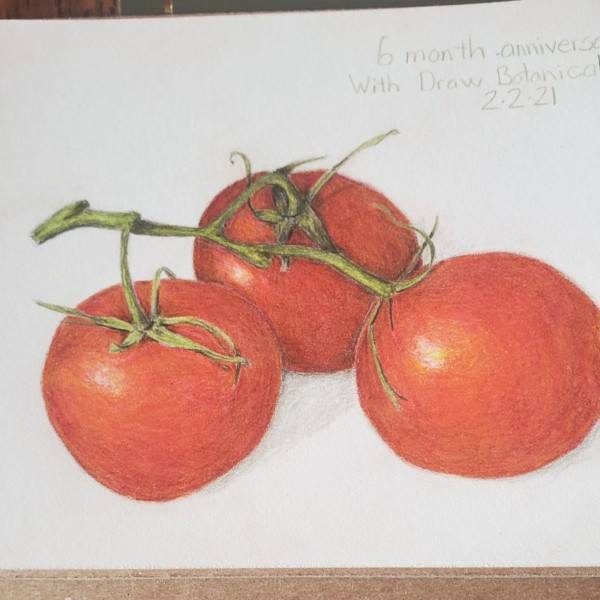
Doug Milne commented on sara stauffer's Photo 4 years, 3 months ago
Congratulations Sara!!!! You have obviously learned a lot and I am glad to hear you have enjoyed the process!!!!!! This grouping of tomatoes is looking really good!!! My suggestion would be to add more dark and mid-range tones which will really enhance their round forms. Red violet is a good choice when doing your darker tones on a red subject.…[Read more]
-
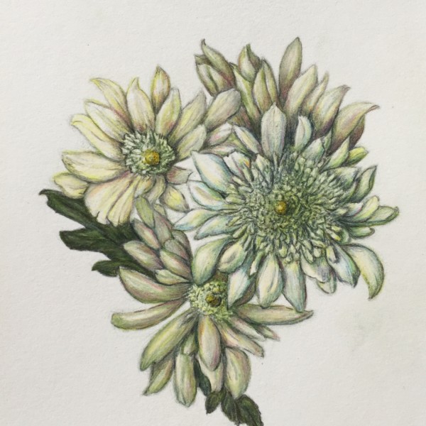
Doug Milne commented on Rita Haft's Photo 4 years, 3 months ago
Hi Rita- this is beautifully rendered! I love the center of the whitest flower on the right. I am curious why you changed the colors. Having more green leaves behind the flowers really helps when the flowers are white. The leaves have no variation in color even in the “v” areas where I would expect them to be darker.
-
Rita Haft commented on Rita Haft's Photo 4 years, 3 months ago
I took a lot of license on the colors- all 4 flowers are actually quite white with yellowish green petals on the inside- I am not sure how I feel about it
-
Rita Haft added a Photo 4 years, 3 months ago
-
I took a lot of license on the colors- all 4 flowers are actually quite white with yellowish green petals on the inside- I am not sure how I feel about it
-
Hi Rita- this is beautifully rendered! I love the center of the whitest flower on the right. I am curious why you changed the colors. Having more green leaves behind the flowers really helps when the flowers are white. The leaves have no variation in color even in the “v” areas where I would expect them to be darker.
-
Hi Doug- as usual, your feedback is really helpful- i have begun reworking the leaves and already it is a huge improvement- bringing more life to the picture- the actual colors were really just grey and yellow in the shadows- at least to my eye, and somehow it felt like i needed to add a little more warmth- I felt disappointed in general as I was…[Read more]
-
-

sara stauffer commented on sara stauffer's Photo 4 years, 3 months ago
1st tomato 6 months ago. Wrong paper, bad sharpener, no dedicated light source. Just equipment upgrades can improve the product!
-
sara stauffer commented on sara stauffer's Photo 4 years, 3 months ago
Today is my 6 month anniversary of learning about botanical drawing from these encouraging teachers, and inspiring community. I’ve learned a lot about pushing the darks a little darker, backing off that cast shadow, it’s not a crime scene. I didn’t know the vocab when I started, I didn’t have any drawing experience since my last art class in 1974.…[Read more]
-
-
1st tomato 6 months ago. Wrong paper, bad sharpener, no dedicated light source. Just equipment upgrades can improve the product!
-
-
-
Today is my 6 month anniversary of learning about botanical drawing from these encouraging teachers, and inspiring community. I’ve learned a lot about pushing the darks a little darker, backing off that cast shadow, it’s not a crime scene. I didn’t know the vocab when I started, I didn’t have any drawing experience since my last art class in 1974.…[Read more]
-
Congratulations Sara!!!! You have obviously learned a lot and I am glad to hear you have enjoyed the process!!!!!! This grouping of tomatoes is looking really good!!! My suggestion would be to add more dark and mid-range tones which will really enhance their round forms. Red violet is a good choice when doing your darker tones on a red subject.…[Read more]
-

Indeed you are excelling, and its so nice to know your origin story. 🙂 Thank you master gardener textbook.
-
-

sheila y. commented on sheila y.'s Photo 4 years, 3 months ago
Thanks, Jill! -
Carol Smasal added 2 Photos 4 years, 3 months ago
-
I think this needs to go darker, but am unsure which color or colors to use for the shadow areas.
-
Your tulip is beautifully rendered Carol! I love how you captured the curves and movement of the stem and leaves. I think you could saturate your colors more and I expect to see more toning especially on the flower. You are off to a good start!!!
-
Love, love the leaves.
-
Carol- the details you have achieved here are beautiful! At this stage I am finding it hard to tell what the main color of the tulip is. It looks like you have used purple for the toning on the pink and rose colored areas very effectively. Regarding the section on the right that is purple, is purple the predominate color of those petals or does…[Read more]
-
Hi, Doug, It is a pink tulip. I’ve used red violet in the shadow areas. I posted a photo reference for this earlier. It is on my portfolio page.
-
Exquisite!
-
I love this tulip, I can feel it’s velvety texture.
-
-
Katy Lyness commented on clotilde lambert's Photo 4 years, 3 months ago
I thought so. I have many pages of practice spheres with layered colors from my Colored Pencil class at NYBG. Such a good exercise!
-
Clo added 2 Photos 4 years, 3 months ago
-
Keep at it to get that true cylinder toning on each one.
-
I will, I find it tough on the smaller, thinner ones but I will keep trying. Thank you so much Sam!
-
Hi Clotilde, this is really coming along! The one thing I’d look for is to be more even in your toning of the dark side. I want to see a core shadow that runs the length of the cylinder in a consistent manner and the toning as it curves toward the highlight should also be consistent from top to bottom.
-
ok that sounds good, I’ll keep practicing with that in mind. Thank you Katy!
-
-

Lucille Alice commented on Lucille Alice's Photo 4 years, 3 months ago
Katy, Thank you for feedback. I was trying to get that upper left corner darker but couldn’t get there. Will try again.
-
Lucille Alice commented on Katy Lyness's Photo 4 years, 3 months ago
Superb!
- Load More