Activity
-

Sara Bronson added a Photo 2 years ago
-
Sara Bronson added a Photo 2 years ago
-
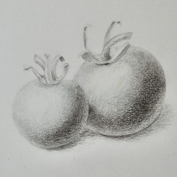
This is beautifully rendered Sara and you have achieved wonderful form. There is a lot of texture showing and I assume that is from the paper you are using. Fantastic job with the reflected light too! It has the organic shape you want to convey a glow! Bravo!
-
Thank you! Most of the drawing I’ve done in the past has been in graphite, so this part doesn’t seem to unfamiliar. I’m still having trouble making the jump to thinking about colour. Is it okay to go so dark if I were to add colour ontop, or is the graiselle stage meant to be more subtle?
-
-
Sara Bronson added a Photo 2 years ago
-
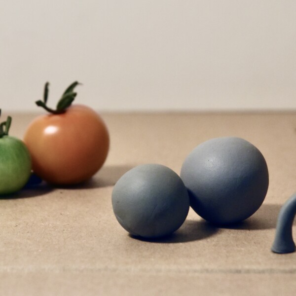
I really like Wendy’s wooden shapes she uses to demonstrate light sources. This was my makeshift solution using my kneaded erasesr!
-
You did an amazing job getting the kneaded erasers so smooth and round! Love your ingenuity!
-
Gotta Macgyver these things whenever possible!
-
-

sheila y. commented on sheila y.'s Photo 2 years ago
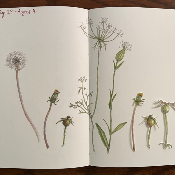
Those are great questions! Yes, easier composition with cutting out, fun, and the idea came because I had made a lot of fabric collage years back. Thanks for your enthusiasm! -
Sara Bronson commented on sheila y.'s Photo 2 years ago
The cut out additions you use in your work are so cool! What inspired it? Was it originally a way to play around with composition, or to take favourite bits and discard parts of drawings you weren’t happy with? Is it part of the perpetual journal technique, or something you came up with independently?
-
sheila y. added a Photo 2 years ago
-
The cut out additions you use in your work are so cool! What inspired it? Was it originally a way to play around with composition, or to take favourite bits and discard parts of drawings you weren’t happy with? Is it part of the perpetual journal technique, or something you came up with independently?
-
Those are great questions! Yes, easier composition with cutting out, fun, and the idea came because I had made a lot of fabric collage years back. Thanks for your enthusiasm!
-
So fun Sheila! And I love the title!
-
Thanks, Doug. My perpetual journal is fun for playing around, which I guess I do on regular pages, but it’s short and sweet until …next year’s week comes around.
-
-
Sara Bronson commented on Sara Bronson's Photo 2 years ago
Hi Doug, thanks for the feedback! I’ll go back and either try adding more dark tones to this one or try a whole new one. This one is Both watercolour and pencil. (Maybe only two washes in watercolour?) Most of my standalone practice has been watercolour so far, because I haven’t used it in the past and it’s the part of the process that I’m most…[Read more]
-
Maria Lynch commented on Pam's Photo 2 years ago
Yes, WOW!!
-
Maria Lynch commented on Maria Lynch's Photo 2 years ago
whoops on the grammar there…
-
Maria Lynch commented on Maria Lynch's Photo 2 years ago
Thanks for all these helpful suggestions. I knew I wasn’t getting “accurate.” but I am enjoyed a slightly less accurate process. I might try another one.
-
Doug Milne commented on Maria Lynch's Photo 2 years ago
I meant to mention that Pam recently posted a wonderful drawing of a cone flower and the seed heads are particularly amazing! You can clearly see the structure of the seed heads and it is a great reference.
-
Doug Milne commented on Maria Lynch's Photo 2 years ago
Hi Maria- nice job on the cone flower! They are deceivingly very hard to draw. Especially the seed heads, which have a definite structure to them. You have added toning to the petals which are behind other petals which is good! Remember that the seed head and the flower as a whole needs shadow toning on the side furthest from your light source to…[Read more]
-
Doug Milne commented on Maria Lynch's Photo 2 years ago
Welcome to the ArtFeed Maria! You are off to a good start. I am glad you realized that the color is off. I think of most poppy pods and stems to be a lighter green and many of them a blue/green. If a subject is very shiny then a white highlight helps to convey that. Less shiny subjects (like a poppy seed pod);are going to have a softer highlight…[Read more]
-
Doug Milne commented on Sara Bronson's Photo 2 years ago
Hi Sara- what a wonderful tool and reference page! Once you find something that you feel is successful keep practicing it until you feel comfortable with it. If you are going to work strictly in watercolor than it is more important than if you were to add color pencil on top of the watercolor. The advantage to adding the color pencil is that you…[Read more]
-
Doug Milne commented on Sara Bronson's Photo 2 years ago
Great job Sara! The colors are wonderful! As I mentioned on some of your previous posts, the pear would benefit by adding more dark and mid-range tones starting in the right edge to emphasize the form. It looks like you are working strictly in watercolor, which is fine. Wendy’s technique, which many of us follow, is applying color pencil on top o…[Read more]
-
Doug Milne commented on Sara Bronson's Photo 2 years ago
Hi Sara! Your radish is beautifully rendered! It has a wonderful soft quality to it, which I really like and I am having a conflict with myself as to if I suggest you to take it further. For arguments sake, you could add more shadow toning along the right side to emphasize the form. I would also lift some color to make a more distinct highlight,…[Read more]
-
Sara Bronson commented on Maria Lynch's Photo 2 years ago
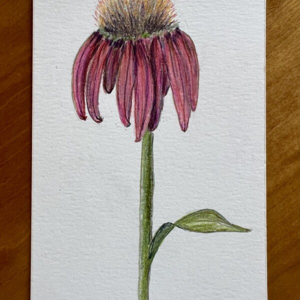
Nice! What great texture on the spiky center of the coneflower! I also like the richness of your colour choices.
-
Maria Lynch added a Photo 2 years ago
-
Nice! What great texture on the spiky center of the coneflower! I also like the richness of your colour choices.
-
Hi Maria- nice job on the cone flower! They are deceivingly very hard to draw. Especially the seed heads, which have a definite structure to them. You have added toning to the petals which are behind other petals which is good! Remember that the seed head and the flower as a whole needs shadow toning on the side furthest from your light source to…[Read more]
-
I meant to mention that Pam recently posted a wonderful drawing of a cone flower and the seed heads are particularly amazing! You can clearly see the structure of the seed heads and it is a great reference.
-
Thanks for all these helpful suggestions. I knew I wasn’t getting “accurate.” but I am enjoyed a slightly less accurate process. I might try another one.
-
whoops on the grammar there…
-
-
Maria Lynch commented on Maria Lynch's Photo 2 years ago
Yes, a poppy pod. I got carried away with the greens; in actuality it is a much lighter green.
-
Sara Bronson commented on Maria Lynch's Photo 2 years ago
This is nice! The greens are very rich. Is it a poppy pod? (I’m not great at IDing flowers/plants.)
- Load More
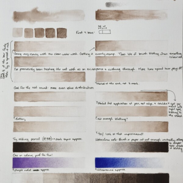
I was amazed at how much I was able to improve my control over the course of the afternoon just be repeating the same exercise. Look at those blotchy and streaky first attempts!
As they say – practice makes perfect! Or something like that! Nice job!