Activity
-

Sara Bronson commented on Sara Bronson's Photo 2 years ago
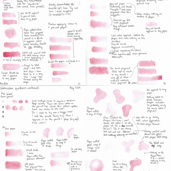
I’m starting to get a feel for consistent results when I only want one value. Still having trouble with getting a nice gradation, or at least one that starts and stops where I want it to at the values I want it to. Any tips welcome!
-
Sara Bronson commented on Sara Bronson's Photo 2 years ago
Thank you! I’ve been excited by the idea of adding watercolour to pencil. That’s new to me.
-
Sara Bronson added a Photo 2 years ago
-
I’m starting to get a feel for consistent results when I only want one value. Still having trouble with getting a nice gradation, or at least one that starts and stops where I want it to at the values I want it to. Any tips welcome!
-
Hi Sara- what a wonderful tool and reference page! Once you find something that you feel is successful keep practicing it until you feel comfortable with it. If you are going to work strictly in watercolor than it is more important than if you were to add color pencil on top of the watercolor. The advantage to adding the color pencil is that you…[Read more]
-
-
Sara Bronson added a Photo 2 years ago
-
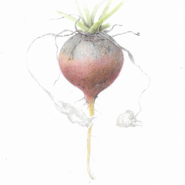
Hi Sara! Your radish is beautifully rendered! It has a wonderful soft quality to it, which I really like and I am having a conflict with myself as to if I suggest you to take it further. For arguments sake, you could add more shadow toning along the right side to emphasize the form. I would also lift some color to make a more distinct highlight,…[Read more]
-
Thank you for your feedback! I went back and tried changing it, and it does look better. Also, I belated realized that it’s a beet, not a radish, so I changed the title, but wanted other people to know that your comment made sense at the time!
-
-
Margaret Graham commented on Sara Bronson's Photo 2 years ago
Your work is truly remarkable. So lifelike! Well done.
-
Patricia Zuroski commented on Patricia Zuroski's Photo 2 years ago
Thanks, Sara. I appreciate your feedback.
-

sheila y. commented on sheila y.'s Photo 2 years ago
Thank you, Sara. -
Sara Bronson commented on Patricia Zuroski's Photo 2 years ago
I like these! Particularly the grape second from the right-it has a particularly nice texture and highlight.
-
Sara Bronson commented on Sara Bronson's Photo 2 years ago
@pgthompson Hi, I’m new to Draw Botanical. Do you have a recommendation for what to focus on improving next? (Colour, blending, lighting, watercolour application?) Any critique would be welcome.
I really like how you did the little dots on your pears.
-
Sara Bronson commented on sheila y.'s Photo 2 years ago
Love the whimsy of this one!
-
Sara Bronson added a Photo 2 years ago
-
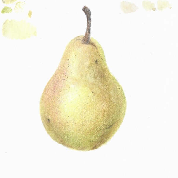
@pgthompson Hi, I’m new to Draw Botanical. Do you have a recommendation for what to focus on improving next? (Colour, blending, lighting, watercolour application?) Any critique would be welcome. I really like how you did the little dots on your pears.
-
Your work is truly remarkable. So lifelike! Well done.
-
Thank you! I’ve been excited by the idea of adding watercolour to pencil. That’s new to me.
-
Great job Sara! The colors are wonderful! As I mentioned on some of your previous posts, the pear would benefit by adding more dark and mid-range tones starting in the right edge to emphasize the form. It looks like you are working strictly in watercolor, which is fine. Wendy’s technique, which many of us follow, is applying color pencil on top o…[Read more]
-
Hi Doug, thanks for the feedback! I’ll go back and either try adding more dark tones to this one or try a whole new one. This one is Both watercolour and pencil. (Maybe only two washes in watercolour?) Most of my standalone practice has been watercolour so far, because I haven’t used it in the past and it’s the part of the process that I’m most…[Read more]
-
-
Maria Lynch added a Photo 2 years ago
-
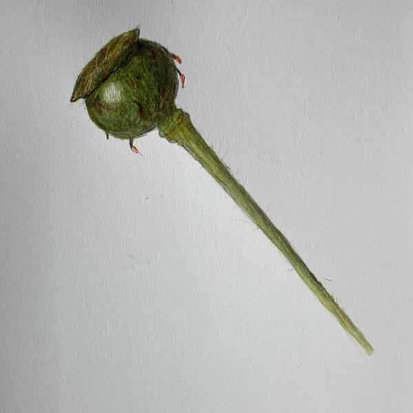
This is nice! The greens are very rich. Is it a poppy pod? (I’m not great at IDing flowers/plants.)
-
Yes, a poppy pod. I got carried away with the greens; in actuality it is a much lighter green.
-
Welcome to the ArtFeed Maria! You are off to a good start. I am glad you realized that the color is off. I think of most poppy pods and stems to be a lighter green and many of them a blue/green. If a subject is very shiny then a white highlight helps to convey that. Less shiny subjects (like a poppy seed pod);are going to have a softer highlight…[Read more]
-
-
Doug Milne commented on Marijke Maas-Overmars's Photo 2 years ago
Hi Marijke- Pam told me you were at the webinar and I am glad you were able to figure it out! I hope you enjoyed it!
-

Pam commented on Marijke Maas-Overmars's Photo 2 years ago
Marijke,
It was great to see you at the webinar! Let me know if you still need some help accessing the webinars. Best, Pam -
Sara Bronson commented on Pam's Photo 2 years ago
I don’t know what I like best! The texture of the watermelon? The way the leaves feel absolutely 3D? The delicate prickles on the vine? Or the little twirly do? (Would love to know what that bit is called!)
-
Sara Bronson commented on Ishbel Galloway's Photo 2 years ago
The texture and colours are so striking! -
Sara Bronson commented on Hayden McKay's Photo 2 years ago
The movement on the iris petals is so nice! Especially the petal at 7 o’clock. Love the way it curls.
-
Sara Bronson commented on Karye Hood's Photo 2 years ago
The overall composition on this is really nice. The way you have some of the leaves fading and others more prominent makes the picture more cohesive, opposed to five things sharing a page.
The bay laurel is my favourite!
-
Sara Bronson commented on Pam's Photo 2 years ago
The texture and the colours are incredible! I also love the seeds, both the way you’ve drawn the highlights and the way they sit so convincingly in the flesh of the watermelon.
-
Doug Milne commented on Denise Beach's Photo 2 years ago
Really nice page Denise! Nice smooth toning and the range of tones on these subjects is much better! The branch is looking good! It just needs dark shadow toning on the right side that will emphasize the branches cylindrical form. The spheres are great, but have one common area to revisit – the reflected light. The reflected light is not as white…[Read more]
- Load More