Activity
-

Kyra Saulnier commented on Kyra Saulnier's Photo 4 years, 6 months ago
I seem to go too dark on my spheres so I stopped myself on the tomato. Should I erase/lighten up the top or darken the lower right before proceeding?
-
Katy Lyness commented on Lucille Alice's Photo 4 years, 6 months ago
Hi Lucille. Nice brilliant yellows! I love drawing Star fruit. Try a cross section. Their shape is so striking! I have one I drew in my portfolio, if you want to check it out.
-
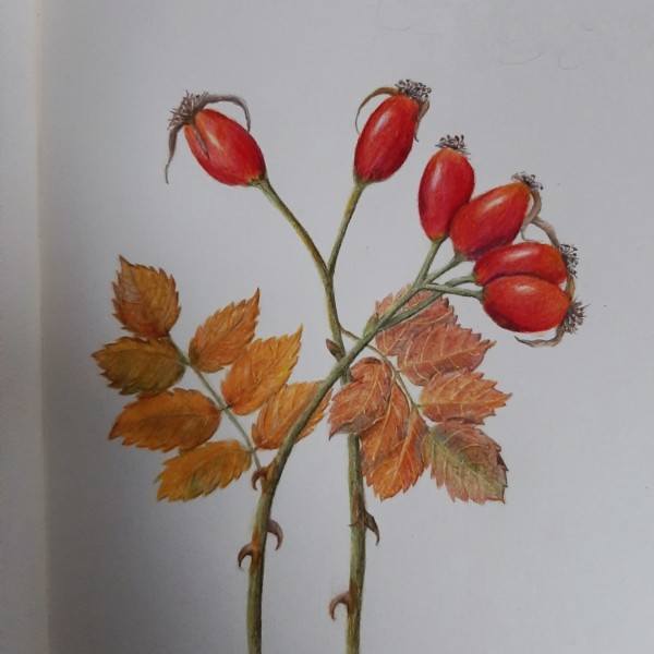
Ingrid Schenk added a Photo 4 years, 6 months ago
-

Beauty Ingrid! Perfect colours. You can darken some shaded areas of the sepals. And on your shaded overlap areas on the rosehips, make sure you graduate out the shading so that it doesn’t just mimic the curve of the one in front. I love the colours on the leaves, and those great thorns.
-
@sammcwilliams thank you so much for your helpful feedback. I find it rather difficult graduating out the shading on small objects, need more training …
-
Really interesting composition. I like the way I feel the heaviness of the fruit. I also like your coloration of the leaves, adding the greens and yellows. Quite nice!
-
Yes, cross section of a hip yes!
-

Oh I love this.
-
@vernfannin @sammcwilliams I think you want me to be a bit more challenged…phhh but why not 🙂 I am learning so much and your feedbacks and encouraging is so helpful, thank you!
-
@pam thank you so much 🙂
-
-

Jill Amadei commented on sara stauffer's Photo 4 years, 6 months ago
Beautiful work!
-
Jill Amadei commented on Elizabeth Simonson's Photo 4 years, 6 months ago
Beautiful!
-
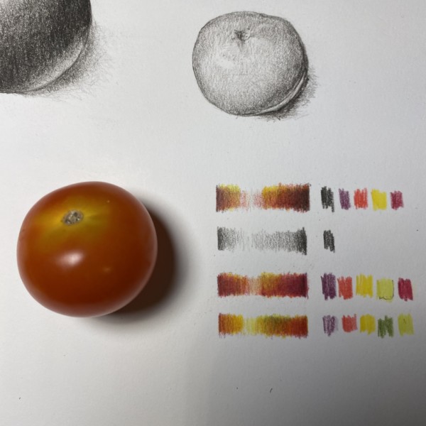
Kyra Saulnier added a Photo 4 years, 6 months ago
-
I seem to go too dark on my spheres so I stopped myself on the tomato. Should I erase/lighten up the top or darken the lower right before proceeding?
-
Looks good enough to eat
-
You could eat it; the tomato at the left is my real tomato subject!
-
Well you fooled me. Now you have a goal:)
-
Hi Kyra – I would darken the lower right first. And think of the rounding of your form as you draw and tone. Think about it curving away from the lighted highlight into its shaded sides. And you don’t want your cast shadow to be too prominent. It will never be as light as your highlight. Remember what Doug said, pick your highlight area and then a…[Read more]
-
-

sheila y. commented on sheila y.'s Photo 4 years, 6 months ago
Thanks, Katy. Then, I’ll leave the shadow as it is. -
Kyra Saulnier commented on Kyra Saulnier's Photo 4 years, 6 months ago
I have a hard time with the lighter tones. I run out of space for 2-3-4…
-
Katy Lyness commented on sheila y.'s Photo 4 years, 6 months ago
Yes, lovely composition. And I think you are wise with the cast shadow. It doesn’t need much and the composition is so nice, I think a more pronouced shadow would throw of the balance.
-
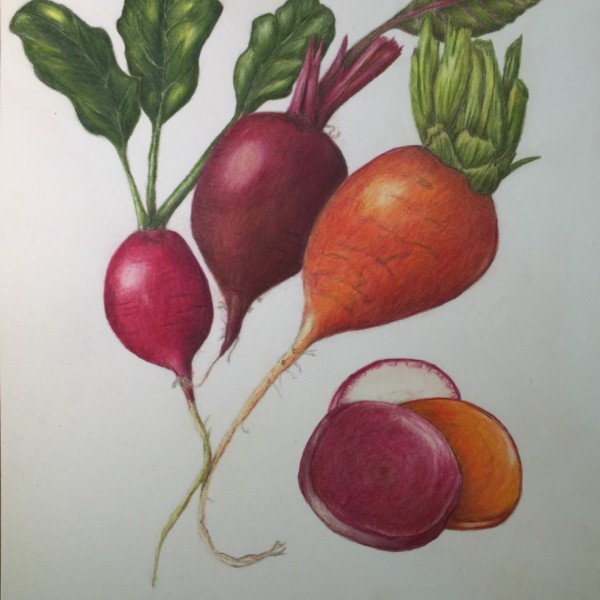
Katy Lyness commented on Rita Haft's Photo 4 years, 6 months ago
So beautiful. The warm colors you have used in the darker areas are so lovely. And nice composition. I really like the slices.
I would add some darks in the deep shadows of the orange beet’s leaves. Just where they meet and overlap. They look a bit flat.
-
-
So beautiful. The warm colors you have used in the darker areas are so lovely. And nice composition. I really like the slices. I would add some darks in the deep shadows of the orange beet’s leaves. Just where they meet and overlap. They look a bit flat.
-
Such rich colors! Did you use watercolor pencil in addition to colored pencil?
-
Thank you- I used watercolor from the watercolor pencils, as well as colored pencil
-
This one is ready for the cover of a cookbook too. 🙂 So lush, warm and inviting. Great drawing.
-
-
Teresa Goetz commented on Teresa Goetz's Photo 4 years, 6 months ago
Thanks Doug- I think they did but they were earlier attempts – I think before I felt confident enough to go to that level of detail.
-
sheila y. commented on Teresa Goetz's Photo 4 years, 6 months ago
Once again your color is glowing! Very inspiring! Can you share how you’re getting that brightness? Thanks.
-
sheila y. commented on sheila y.'s Photo 4 years, 6 months ago
Thanks, Doug. Not too many reds left around here, so I grabbed a few. I’m a little iffy about the cast shadow, but decided to go on the subtler side. -

Lucille Alice commented on Lucille Alice's Photo 4 years, 6 months ago
Thank you! I will try with olive-green-yellowish.
-
Doug Milne commented on Teresa Goetz's Photo 4 years, 6 months ago
Poinsettias do have very prominent veins, but they still do taper somewhat from the primary center vein out to the edges. Your veins on the top that are the secondary veins to the left of the primary vein seem wider than their counterparts on the right side of your center vein. In some areas you have the secondary vein going directly up to the…[Read more]
-
Doug Milne commented on Lucille Alice's Photo 4 years, 6 months ago
The colors are lovely Lucille! I think you could use more dark toning on the right side and the valleys. Experiment with a dark green for the toning so you don’t lose your beautiful colors that are really glowing!
-
Doug Milne commented on Kyra Saulnier's Photo 4 years, 6 months ago
These spheres have so much going for them Kyra! Nice even, smooth toning with well placed highlights. The one thing I would point out is the area surrounding the highlight is too dark and should be lightened. There should be a transition of light tones emanating from the highlight just as you have done in reverse with the darks transitioning in…[Read more]
-
Doug Milne commented on sheila y.'s Photo 4 years, 6 months ago
I love how you overlapped these leaves Sheila! The colors are gorgeous!
-
Doug Milne commented on Teresa Goetz's Photo 4 years, 6 months ago
You could have the cast shadows fade out even more than you have them. The pears are beautifully rendered!
- Load More