Activity
-

Doug Milne commented on Teresa Goetz's Photo 4 years, 6 months ago
Great color selection and saturation Teresa! I don’t see a lot of detail in these caps especially compared to your other acorn page. Maybe these caps did not have much detail.
-
Doug Milne commented on Teresa Goetz's Photo 4 years, 6 months ago
The mushrooms look great on the Kraft paper Teresa! You have really captured the textures! I feel like you could use a little more toning especially the areas under the caps and on the right side of the two outside subjects. Beautiful work!
-

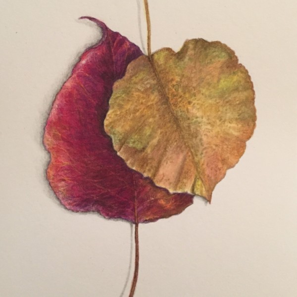
sheila y. added a Photo 4 years, 6 months ago
-
I love how you overlapped these leaves Sheila! The colors are gorgeous!
-
Thanks, Doug. Not too many reds left around here, so I grabbed a few. I’m a little iffy about the cast shadow, but decided to go on the subtler side.
-
Yes, lovely composition. And I think you are wise with the cast shadow. It doesn’t need much and the composition is so nice, I think a more pronouced shadow would throw of the balance.
-
Thanks, Katy. Then, I’ll leave the shadow as it is.
-

Beautiful composition, beautiful drawing. Lovely feel. Like 2 people who have been together a long time. 🙂
-
🙂 Thanks Sam, it’s getting dark early and cold and there’s a winter nesting in the air.
-
Thanks, Vern. I was definitely throwing in some pinks and purples. Nothing like fall leaves, as you know 🙂
-
-
Wendy Kleinman commented on Ishbel Galloway's Photo 4 years, 6 months ago
Extraordinarily beautiful, as is, for me.
-

Carol Smasal commented on Carol Smasal's Photo 4 years, 6 months ago
Hi, Pat,
This is a photograph. It is my photo reference for the little holly drawing I am working on. -
Pat Schiebold commented on Carol Smasal's Photo 4 years, 6 months ago
Is this a photograph ! Wow
-
Katy Lyness commented on Douglass Reitter's Photo 4 years, 6 months ago
You could also go further with the oranges in the leaves. Not so much that you dull the green, but to add depth to the shadows
-
Katy Lyness commented on Douglass Reitter's Photo 4 years, 6 months ago
Much nicer! More unified. You could even go darker in the leaves, especially where they meet each other at the base. Just the darkest darks where they touch each other or cast a shadow.
-
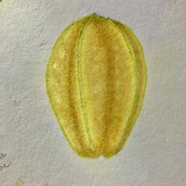
Katy Lyness commented on Katy Lyness's Photo 4 years, 6 months ago
Hi Teresa. So glad you like it!
I use mostly Prismacolors. I believe I used Canary Yellow, Yellow Ochre, Spanish Orange. I also used a Cadmium Yellow watercolor pencil wash. The one Wendy has in her list of materials. I think a key to getting brilliant colors is the under toning of white. I use Prismacolor white. It think it is a bit more opaque…[Read more] -

-
The colors are lovely Lucille! I think you could use more dark toning on the right side and the valleys. Experiment with a dark green for the toning so you don’t lose your beautiful colors that are really glowing!
-
Thank you! I will try with olive-green-yellowish.
-
Hi Lucille. Nice brilliant yellows! I love drawing Star fruit. Try a cross section. Their shape is so striking! I have one I drew in my portfolio, if you want to check it out.
-
Nice Lucille – yes cross section pretty please.
-
-
Douglass Reitter commented on Douglass Reitter's Photo 4 years, 6 months ago
Revised. Added orange and yellow to the green in the smaller leaf and made both leaves darker.
-
-
Revised. Added orange and yellow to the green in the smaller leaf and made both leaves darker.
-
Much nicer! More unified. You could even go darker in the leaves, especially where they meet each other at the base. Just the darkest darks where they touch each other or cast a shadow.
-
You could also go further with the oranges in the leaves. Not so much that you dull the green, but to add depth to the shadows
-
-
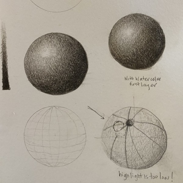
Kyra Saulnier added a Photo 4 years, 6 months ago
-
These spheres have so much going for them Kyra! Nice even, smooth toning with well placed highlights. The one thing I would point out is the area surrounding the highlight is too dark and should be lightened. There should be a transition of light tones emanating from the highlight just as you have done in reverse with the darks transitioning in…[Read more]
-
I have a hard time with the lighter tones. I run out of space for 2-3-4…
-
A little kneaded eraser can do wonders lifting when you get too dark.
-
-
Carol Smasal commented on Carol Smasal's Photo 4 years, 6 months ago
Thank you!
-
Linda TALLEY commented on Linda TALLEY's Photo 4 years, 6 months ago
Thank you for comments–you are absolutely right about the perspective being off. I measured to a fair-thee-well, but perhaps I wasn’t careful enough about my movement. I did some toning on the lower edge and it is better but still not what I would like. I have eaten my model now but will try another this winter and see if I can’t get it right.
-
Teresa Goetz commented on Teresa Goetz's Photo 4 years, 6 months ago
ok, thanks! I was afraid to do that, but I can do really light washes and layer so I don’t lose the highlights?
-
Teresa Goetz commented on Teresa Goetz's Photo 4 years, 6 months ago
Ok! thanks, Vern. Will do.
-
Teresa Goetz commented on Teresa Goetz's Photo 4 years, 6 months ago
thanks, Vern!
-
Teresa Goetz commented on Teresa Goetz's Photo 4 years, 6 months ago
I just used a blank copy of an assignment – blank outlines of curled paper, then toned them. I’m not even sure if they’re right! just working it out…thanks vern
-
Teresa Goetz commented on Ishbel Galloway's Photo 4 years, 6 months ago
this is just beautiful…I love it as is
- Load More