Activity
-

Jill Amadei commented on Jill Amadei's Photo 4 years, 7 months ago
Thank you for the positive and helpful feedback Doug! I appreciate it!
-

Ingrid Schenk added a Photo 4 years, 7 months ago
-
Used bad paper, the blending and to achieve a nice saturation was difficult. The colours are not as bright as I would have liked them. Important experience….
-
Hi Ingrid, Yes, the paper you use is important. Good lesson.
-
Yellow is a difficult color in any circumstance. I can see you are working toward a spheric shape, But the highlight could be more pronounced. And you need more of a core shadow. Also think more about the shading around where the stem emerges. There would be a highlight on the right side of the indentation. and your shadow should be more to the left.
-
Darkening the leaves would really help the yellows pop…if the paper lets you!
-
@katylyness thank you for your feedback, Katy! Will try to make some improvements, but I am afraid the paper will not stand it …
-
-

Sam McWilliams commented on sheila y.'s Photo 4 years, 7 months ago
Fantastic, Sheila.
-
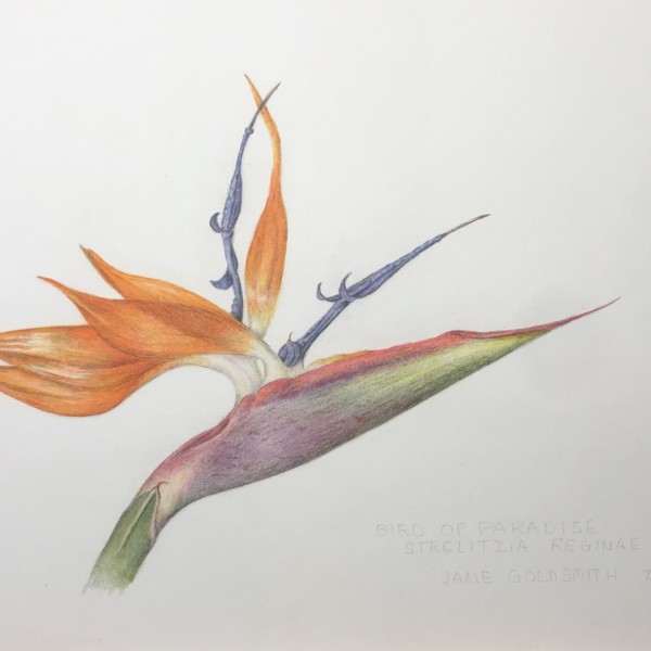
Janegold added a Photo 4 years, 7 months ago
-
Very pretty
-
Beautiful drawing! Such an interesting plant, with its odd coloration. I’d add a touch more darks in the orange areas. Especially the triangles where the petals meet.
-
Beautiful Jane! I like Katy’s idea of the darks to make it pop.
-
-
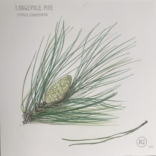
Doug Milne commented on Ishbel Galloway's Photo 4 years, 7 months ago
Wonderful job Ishbel! The area on the bottom where there are a lot of needles crossing over each other could easily be a problem spot, but it reads really well! I think the cone could use more toning to convey its form. I love the elegance of the upright needles! Beautiful!!!
-
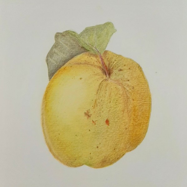
Doug Milne commented on Jill Amadei's Photo 4 years, 7 months ago
Sorry I had a glitch. As I was about to say the toning on the left near the highlight could be lightened somewhat. Your color selection and saturation are great as is your attention to the details. Wonderful job!
-
Doug Milne commented on Jill Amadei's Photo 4 years, 7 months ago
Beautiful Jill! Because of your toning the pear’s form reads so well! I would consider lightening the darker toning on the left that
-
Doug Milne commented on sheila y.'s Photo 4 years, 7 months ago
What a great addition Sheila! I love the positioning and the introduction of the gold colors! Great composition!
-
Doug Milne commented on Pat Schiebold's Photo 4 years, 7 months ago
Beautiful Pat! I admire your patience to do all those kernels! You are fortunate to have have such a great support system in your husband! A wise man indeed!
-

Ishbel Galloway added a Photo 4 years, 7 months ago
-
Wonderful job Ishbel! The area on the bottom where there are a lot of needles crossing over each other could easily be a problem spot, but it reads really well! I think the cone could use more toning to convey its form. I love the elegance of the upright needles! Beautiful!!!
-
Beautiful Ishbel! I have a few needles here too that I want to try to capture, your work is inspiring!
-
Thanks! Yes, I can see the cone could have more toning on the shadow side. At first I had identified it as a Western White pine thinking there were 5 needles a bunch but then I realized there were only 2 so there should have been way more precision at the stem end 😃
-
Love love love
-
-
Jill Amadei added a Photo 4 years, 7 months ago
-
Beautiful Jill! Because of your toning the pear’s form reads so well! I would consider lightening the darker toning on the left that
-
Sorry I had a glitch. As I was about to say the toning on the left near the highlight could be lightened somewhat. Your color selection and saturation are great as is your attention to the details. Wonderful job!
-
Thank you for the positive and helpful feedback Doug! I appreciate it!
-
Lovely, Jill. You describe the volume of this fruit so well – I can feel the weight of it. And the surface textures, light and colours are lovely too.
-
-

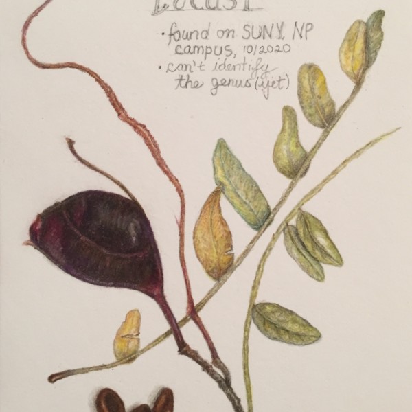
sheila y. commented on sheila y.'s Photo 4 years, 7 months ago
Sam, thanks for your question about the empty space. I had an additional branch and put it in. Originally I thought I’d leave the whole center open and hope there’d be flowers I could reach in the spring, but decided against it. This is just about fall and the unknown variety:) I’m still open to any suggestions, of course.
-
-
Sam, thanks for your question about the empty space. I had an additional branch and put it in. Originally I thought I’d leave the whole center open and hope there’d be flowers I could reach in the spring, but decided against it. This is just about fall and the unknown variety:) I’m still open to any suggestions, of course.
-
What a great addition Sheila! I love the positioning and the introduction of the gold colors! Great composition!
-
Fantastic, Sheila.
-
Yes those indents on the seeds are drawn so well.
-
-
Katy Lyness commented on sara stauffer's Photo 4 years, 7 months ago
Thanks for that, @sam-mcwilliams! Eased my election day jitters.
-
Ingrid Schenk commented on Ishbel Galloway's Photo 4 years, 7 months ago
Love it 👍
-
Mama Mia commented on Mama Mia's Photo 4 years, 7 months ago
Thank you! That is so nice to read. And for the advice. I will try it out for sure.
-
Ingrid Schenk commented on Ingrid Schenk's Photo 4 years, 7 months ago
@dougmilne thank you so much for your kind feedback, it’s so helpful to improve my drawing !
-
Ingrid Schenk commented on Ingrid Schenk's Photo 4 years, 7 months ago
@sammcwilliams thank you so much for your kind feedback. It was such a joy drawing these berries. And yes, I realized what you mean concerning the curling of the leaf. Thank you!
-
Sam McWilliams commented on Ingrid Schenk's Photo 4 years, 7 months ago
Just visiting again to say that I love this drawing. My eye dances across the berries back and forth like musical notes. Very graceful.
-
Sam McWilliams commented on sheila y.'s Photo 4 years, 7 months ago
Locusts are so cool. Love how prolific you are. Hmm, what’s going to enter into that V of negative space?
- Load More