Activity
-

Mama Mia added a Photo 4 years, 10 months ago
-
Mama Mia commented on Mama Mia's Photo 4 years, 10 months ago
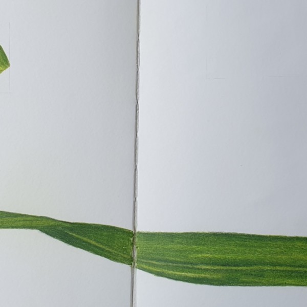
Trying to incorporate some overlaps.
-
Mama Mia added a Photo 4 years, 10 months ago
-
Trying to incorporate some overlaps.
-
Nice! Try a bit more shadow on the underside right as it overlaps.
-
Thank you Katy, I got my work cut out for me.
-

So fun how the gladiolus leaf traverses the page, Mia. 🙂
-
-
Mama Mia commented on Mama Mia's Photo 4 years, 10 months ago
The real deal
-
Mama Mia commented on Mama Mia's Photo 4 years, 10 months ago
-
Mama Mia commented on Mama Mia's Photo 4 years, 10 months ago
It is all so much much more difficult then it looks. My petals are far from good. I do not want to over criticise myself and will wait being overly harsh untill I finish my 100th petal. But constructive feedback is very welcome. Advice in colour, overlays and embossing for example would be great.
-
Mama Mia added a Photo 4 years, 10 months ago
-
It is all so much much more difficult then it looks. My petals are far from good. I do not want to over criticise myself and will wait being overly harsh untill I finish my 100th petal. But constructive feedback is very welcome. Advice in colour, overlays and embossing for example would be great.
-
-
The real deal
-
You are being too hard on yourself! That top petal is beautiful! The toning is very sensitive. I’d add more dark tones on both. Dark sepia perhaps. The embossing is the biggest problem. It seems all one weight and value. Keep practicing working with it. Maybe do a whole page of emboss practice.
-
Thank you Katy. Good idea’s I can work with.
-
Just keep practicing, Mia, and be nice to your self. Wendy has probably drawn 100,000 petals. Emboss very lightly, and sometimes come back in. with some watercolor to tone down the embossing. They are looking good; you are definitely improving. Practice going darker than you think in some places. #2 has a good highlight, and #1 is starting to…[Read more]
-
-
Mama Mia commented on Mama Mia's Photo 4 years, 10 months ago
The top one is getting there but still far off…. How can I improve??
-
Mama Mia added a Photo 4 years, 10 months ago
-
The top one is getting there but still far off…. How can I improve??
-
Hi Mama Mia, Looking good! Nice sensitive toning. Just need to hit those dark darks a bit more.
-
Try Dark sepia
-
👍thank you Katy, time to sharpen my dark sepia and get to it. So good to know in all my drawings I need to work on that. Always nice to know your general weakspot. Very happy you took the time to help me.
-
Yes Get that sharpened dark sepia out and shade and also make a clean line especially on the shadow side. Nice colour swatches.
-
-

Pam commented on Maureen Doram's Photo 4 years, 10 months ago
I love this composition.
-
Pat Schiebold commented on Maureen Doram's Photo 4 years, 10 months ago
The leaves are particularly gorgeous.
-
Pat Schiebold commented on Pam's Photo 4 years, 10 months ago
I could take a bite. Love your shading on the bottom leaf
-
Pat Schiebold commented on Elizabeth Simonson's Photo 4 years, 10 months ago
Very delicate and pretty
-
Pat Schiebold commented on Elizabeth Simonson's Photo 4 years, 10 months ago
Very pretty and delicate
-
Pat Schiebold commented on Jill Amadei's Photo 4 years, 10 months ago
Beautiful
-
Pat Schiebold commented on Pat Schiebold's Photo 4 years, 10 months ago
The reason I chose this view is twofold: 1) in this aerial view the cone looks like a flower 2) the spiral aspects of a pine cone are too advanced for me at this time. Maybe in another year things will be different……….
-
Jody Meese commented on Jody Meese's Photo 4 years, 10 months ago
Work from Vern & Sam’s composition workshop. Great class!
-
Jody Meese added a Photo 4 years, 10 months ago
-
Work from Vern & Sam’s composition workshop. Great class!
-
Ah it’s just lovely, Jody. What an inspiring artist you are. Your writing looks fantastic. Makes me miss my beloved Coast Live Oaks.
-
-
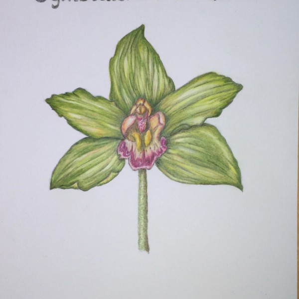
Rita Haft added a Photo 4 years, 10 months ago
-
Little boat! Okay I have to be a plant nerd here: Orchidaceae is the family. Do you know what the species is? Somebody got a very special bday card.
-
Nice observation on the “little boat”! I’d like to see just a few more areas of darker darks to really make it pop. More sense of a directional light. I like the way you have used the front-on angle. Many times that angle can seem static, but here it works. I think because the center is so interesting.
-
Although I find the rhythms of the outer petals/sepals charming. I might make them a bit less “busy”. Maybe a watercolor wash. Especially near the center. This would accentuate that middle part of the flower. Again keep the directional light in mind. And think of overlaps. BTW, I like the bits of warm color you have incorporated in those outer…[Read more]
-
-
Elizabeth Simonson commented on Elizabeth Simonson's Photo 4 years, 10 months ago
that is a great suggestion about smoothing out the lines on the skin. I did that and added more shadowing on the apple. any thanks!
- Load More
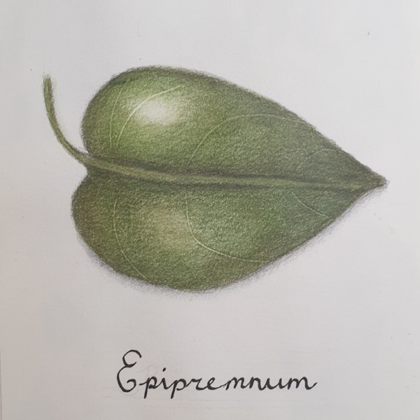

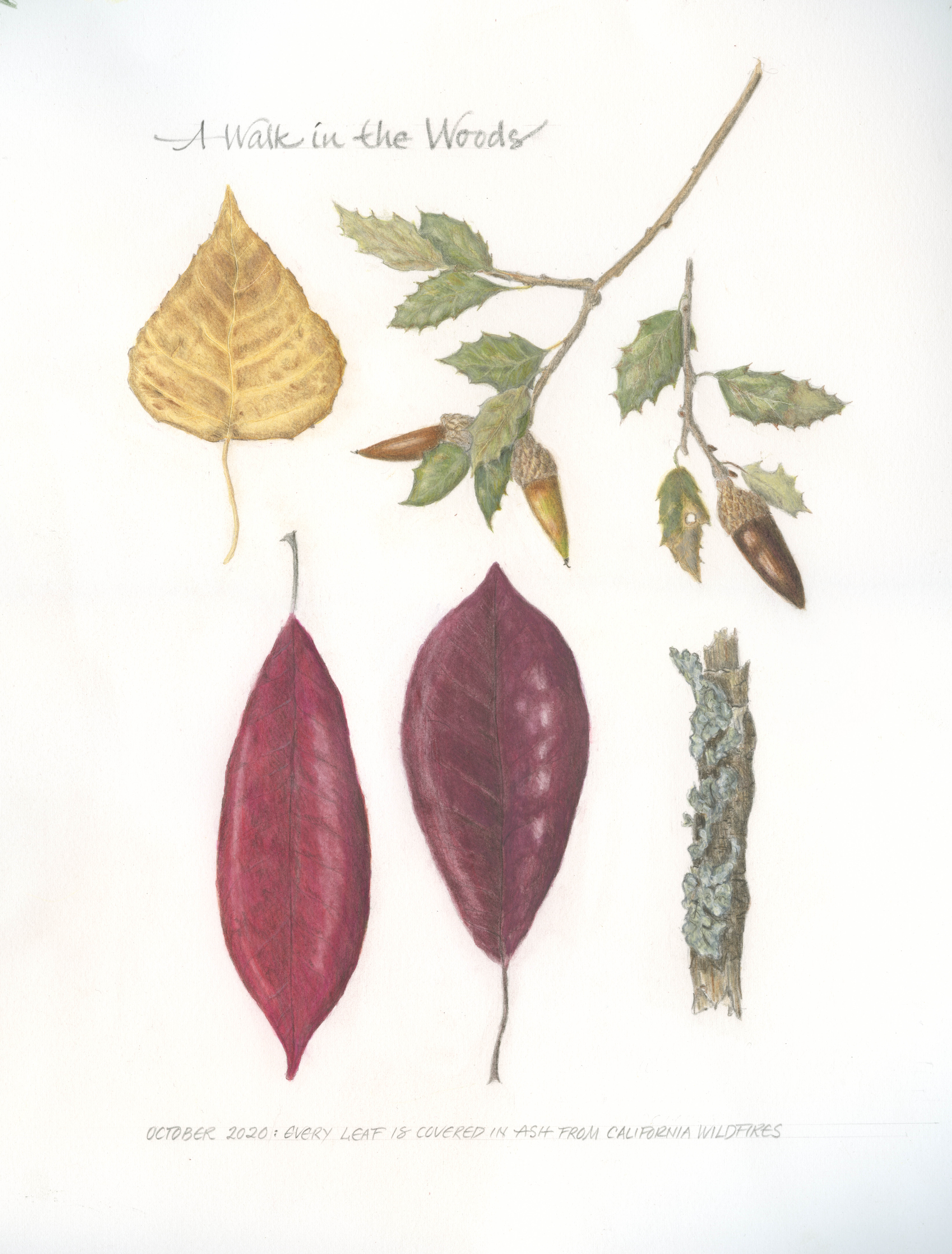
One of my better attempts, all though the embossed veining is mediocre at best.
Lovely leaf! You are really getting a nice shape with that toning. I might add a sharpish dark line on the underside of the mid rib. Make sure it tapers toward the tip. And if you add a little dark line next to the veins. That will help. Just keep it very subtle. Embossing is difficult. I still struggle with it. I don’t like the way one has to work blind.