Activity
-

Elizabeth Simonson commented on Elizabeth Simonson's Photo 4 years, 7 months ago
thanks although I could do a bit more practice on them -
Elizabeth Simonson commented on Elizabeth Simonson's Photo 4 years, 7 months ago
Indeed but after working a white flower on white paper I like this much better. -
Elizabeth Simonson commented on Elizabeth Simonson's Photo 4 years, 7 months ago
Hey Sam
Thanks for the feedback. I had to rework these several times. Sometimes not enough white, then too much. Geez. The one thing I realized is that I had to erase the center colors that I had originally drawn with pencil and first apply a light white wash and THEN lay in the color to get it the right saturation. Totally fun but like a whole… -

Jill Amadei commented on Elizabeth Simonson's Photo 4 years, 7 months ago
These are beautiful!
-
Katy Lyness commented on Elizabeth Simonson's Photo 4 years, 7 months ago
Oh, I also wanted to say nice job on those thin stems!
-
Katy Lyness commented on Elizabeth Simonson's Photo 4 years, 7 months ago
Hi Elizabeth, I watched a recording of the White flowers on Kraft paper class and attended the critiques. Then helped Wendy teach the Walk in the Woods class that featured working on Kraft paper, so I can appreciate the skill it takes to work this way. One has to think differently.
-
Katy Lyness commented on Rita Haft's Photo 4 years, 7 months ago
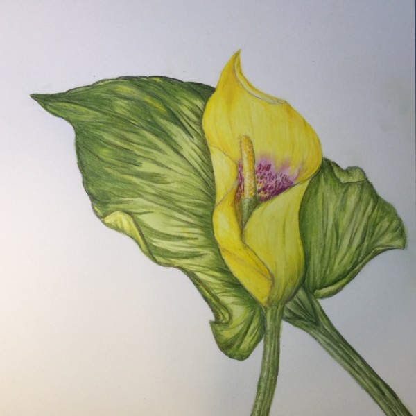
Nice composition with the flower being framed by the leaf. I love a calla lily! It’s beauty is in the simple shapes. I would try to simplify this drawing. Really look at the veining on the leaf. Go in with some darks and find the strong lines and strong shapes. It needs more darks anyway. Seems a bit flat. Figure out where your light source is coming from.
-
Katy Lyness commented on Jody Meese's Photo 4 years, 7 months ago
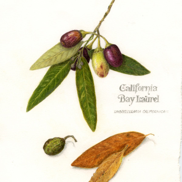
Hi Jody, I mentioned in your previous drawing of the Bay Laurel that I liked your heavy hand. It’s like mine. In this case however it may be a case of too much, too soon. Or it could be that whatever paper you are drawing on is not holding the wax or oil of the pencil. I wish I could see this drawing in person. It looks like you are trying to get…[Read more]
-
Katy Lyness commented on Jody Meese's Photo 4 years, 7 months ago
Hi Jody,
So beautiful! I love the rich colors. You draw like I do, with a bit of heavy hand. I’m not one for the paper showing through. That front yellow leaf is quite nice. The veining is perfect and I like the coloration and texture. However, you need to work on the shadow it casts on the other leaf. It looks like you have 2 light sources.…[Read more] -
Beatriz commented on Beatriz's Photo 4 years, 7 months ago
Thank you Vern, I follow your advice and much better!
-

sheila y. commented on sheila y.'s Photo 4 years, 7 months ago
@cburke Thanks, Carol. I’m just beginning lettering thanks to the lettering class last month. It was fun. Hope you’re well. -
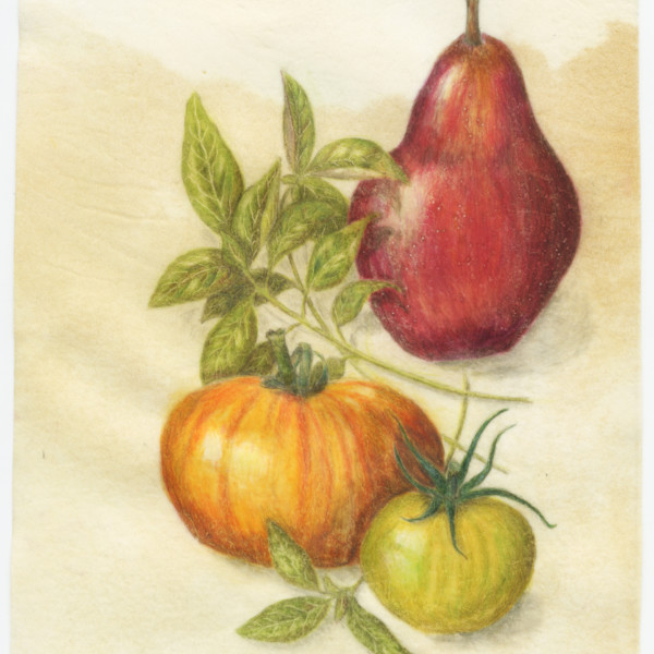
Cathie Moulton commented on Pam's Photo 4 years, 7 months ago
Love this apple. Beautiful Pam! As someone who has recently started Wendy’s classes it is wonderful to see the development in the comparison of your apples. Maybe one day…..??
-

Carol Burke commented on sheila y.'s Photo 4 years, 7 months ago
Really nice Sheila! Your lettering turned out really nicely!!
-
Rita Haft added a Photo 4 years, 7 months ago
-
Nice composition with the flower being framed by the leaf. I love a calla lily! It’s beauty is in the simple shapes. I would try to simplify this drawing. Really look at the veining on the leaf. Go in with some darks and find the strong lines and strong shapes. It needs more darks anyway. Seems a bit flat. Figure out where your light source is coming from.
-
-
Jody Meese added a Photo 4 years, 7 months ago
-
Hi Jody, I mentioned in your previous drawing of the Bay Laurel that I liked your heavy hand. It’s like mine. In this case however it may be a case of too much, too soon. Or it could be that whatever paper you are drawing on is not holding the wax or oil of the pencil. I wish I could see this drawing in person. It looks like you are trying to get…[Read more]
-
@katylyness thanks. This was an experiment using vellum parchment.
-
Wish I could give you advice, but I’ve never used colored pencil on velum.
-
But would seem to explain the difficulty getting the saturation of color.
-

Also cool lettering here! Also, leave me a bit more space to breathe in the lettering, ie between the Cap S, between the 2 words, and between Cap K and the i. Love the style of handwriting.
-
-
Jody Meese added a Photo 4 years, 7 months ago
-
Hi Jody, So beautiful! I love the rich colors. You draw like I do, with a bit of heavy hand. I’m not one for the paper showing through. That front yellow leaf is quite nice. The veining is perfect and I like the coloration and texture. However, you need to work on the shadow it casts on the other leaf. It looks like you have 2 light sources.…[Read more]
-
@katylyness thank you for your feedback!
-
Beautiful, Jody. I love your drawings so much. In your lettering – I’d give a bit ore space next time in between your letters so that our eye can move about and through he words easier and not get bunched up. I love the style of lettering. Nicely done. Also, I like how the stem fades out at the top – that supports me leading with my eye to the…[Read more]
-
@sam-mcwilliams Thanks Sam! Luckily I did the lettering in pencil in case I changed my mind!
-
-
sheila y. commented on sheila y.'s Photo 4 years, 7 months ago
@sam-mcwilliams. Wow, I love that image, thanks Sam. I think it’s the lettering! 🤔 -
sheila y. commented on sheila y.'s Photo 4 years, 7 months ago
@sam-mcwilliams Thanks, Sam! That is an inspiring image. I love books and bookstores. -
Sam McWilliams commented on Elizabeth Simonson's Photo 4 years, 7 months ago
Great job, Elizabeth. You employed all the techniques from class so well here. Beautiful.
-
Sam McWilliams commented on sheila y.'s Photo 4 years, 7 months ago
I could see this being used as the cover of a book – I’d pick it right up in the bookstore. 🙂
- Load More