Activity
-

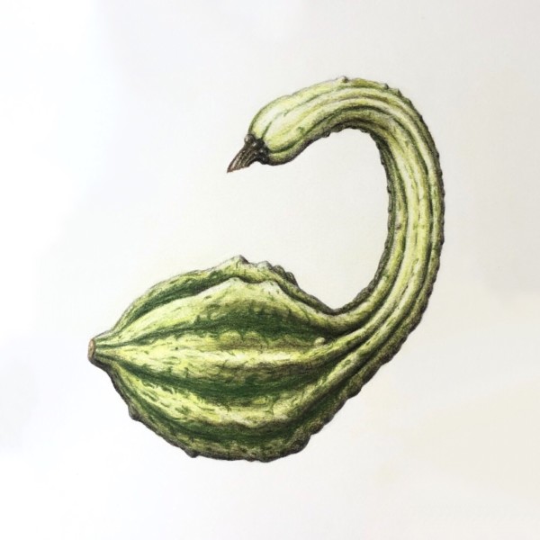
Sam McWilliams commented on Jill Amadei's Photo 4 years, 11 months ago
GORGEOUS SWAN GOURD! 🙂
-
Sam McWilliams commented on Katy Lyness's Photo 4 years, 11 months ago
Ooh Katy this is awesome. It is SO full of life. I adore it. Well done.
-
Sam McWilliams commented on Jody Meese's Photo 4 years, 11 months ago
Also cool lettering here! Also, leave me a bit more space to breathe in the lettering, ie between the Cap S, between the 2 words, and between Cap K and the i. Love the style of handwriting.
-
Sam McWilliams commented on Jody Meese's Photo 4 years, 11 months ago
Beautiful, Jody. I love your drawings so much. In your lettering – I’d give a bit ore space next time in between your letters so that our eye can move about and through he words easier and not get bunched up. I love the style of lettering. Nicely done. Also, I like how the stem fades out at the top – that supports me leading with my eye to the…[Read more]
-
Sam McWilliams commented on Elizabeth Simonson's Photo 4 years, 11 months ago
I agree – that whitewash technique is a revelation. It really is like applying gesso to a canvas, and we can apply it in different thicknesses and build on top of it with our pencils.
-

Wendy Hollender commented on Katy Lyness's Photo 4 years, 11 months ago
love how this turned out. The shadows are so much better making the apples pop but not trying to compete!
-

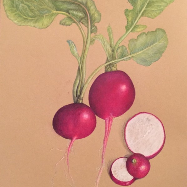
sheila y. commented on sheila y.'s Photo 4 years, 11 months ago
I’ve got some small spaces for some possible flowers, seeds and text, but looking for feedback before all my greens die.
-
sheila y. added a Photo 4 years, 11 months ago
-
I’ve got some small spaces for some possible flowers, seeds and text, but looking for feedback before all my greens die.
-
Stunner! You and Kraft paper are getting to be very good pals. It’s luminous. I’m excited to see flowers and seeds.
-
@sam-mcwilliams Thanks, Sam. I was wondering if the greens were too washed out looking, but they really are a variety of light greens. Also, the mid tone of the paper and how much saturation it can take is still something I’m learning about. I hope I can get my hands on some seeds and flowers this season or next.
-

So beautiful!
-
I think this is looking awesome Shelia, but I do think you can still get more contrast in your leaves so they don’t look boring by comparison to the amazing vibrancy elsewhere. Look at your stems on the leaves as they connect to the radish, there are good darks and contrast but they still appear to be light green. Push those leaves in the overlaps…[Read more]
-
@wendy Wendy, thanks for the feedback. I’m going back in for more varied greens, as you suggested- looking at what I’ve got and focusing on overlaps. Wish me luck 😎
-
Thanks, Maureen.
-
-
Linda TALLEY added a Photo 4 years, 11 months ago
-
This is lovely, Linda. I think you can still achieve some darker tones in your greens to show the cylinder-ness of those stems and more form in the okra. I like the lettering very much. Next time you could move it down a bit, perhaps leave a bit more space between the lettering and the plant.
-
-
Ingrid Schenk commented on Ingrid Schenk's Photo 4 years, 11 months ago
Thank you Katy for your helpful feedback! Just did the lesson about overlapping objects… still much to learn, so interesting and lot’s of joy.
-
Katy Lyness commented on Ingrid Schenk's Photo 4 years, 11 months ago
Hi Ingrid, I agree with Doug. Your toning is lovely, very sensitive. You just need to push the darks. You are half way there. Looks to me you have only made it to the 6 on the value scale. But be careful where you put those darks, don’t overwhelm the tomatoes. Think of the light source. Where is it coming from. What part of the plant would get…[Read more]
-
Katy Lyness commented on Jill Amadei's Photo 4 years, 11 months ago
Yes, lovely! You have a way with gourds. The ribbing is a thing of beauty.
-
Katy Lyness commented on Katy Lyness's Photo 4 years, 11 months ago
Thanks Doug! It’s supposed to look casually composed…but not really.
These are from a tree in my backyard that I might need to remove. So a bit of a eulogy. Ode to crabapple. -

Ishbel Galloway commented on Ishbel Galloway's Photo 4 years, 11 months ago
Thanks Katy. Yes, I agree the leaves need more work!
-
Ingrid Schenk commented on Ingrid Schenk's Photo 4 years, 11 months ago
Thank you so much for this very helpful feedback. Love this couse and enjoy learning 😊
-
Doug Milne commented on Linda TALLEY's Photo 4 years, 11 months ago
Nice job Linda! The texture reads well. I would make the highlight a little smaller. I would also saturate the color more. There are many areas that look like they have a milky glaze on them.
-
Doug Milne commented on Ingrid Schenk's Photo 4 years, 11 months ago
Beautiful Ingrid! The color selection is very good. I think you could saturate the color more. The tomato on the bottom is the most successful. It is more saturated and also looks shinier, which I expect from these tomatoes. That bottom tomato’s highlight is whiter than the others and that helps convey a shiny surface. I think the middle tomato o…[Read more]
-
Doug Milne commented on Katy Lyness's Photo 4 years, 11 months ago
Gorgeous Katy! It looks like I could pick the crabapples right off the page! I particularly love the leaf on the bottom right! The loose composition works so well too!
-
Doug Milne commented on Jill Amadei's Photo 4 years, 11 months ago
Beautiful Jill! The gourd is aptly named! You have really captured the twists and crevices. The subtle markings are very well done too! Great job!
-

Jill Amadei added a Photo 4 years, 11 months ago
-
Beautiful Jill! The gourd is aptly named! You have really captured the twists and crevices. The subtle markings are very well done too! Great job!
-
Yes, lovely! You have a way with gourds. The ribbing is a thing of beauty.
-
GORGEOUS SWAN GOURD! 🙂
-
Thanks so much for the positive feedback! I really enjoyed drawing this gourd 🙂 @doug-milne @katylyness @sam-mcwilliams
-
- Load More