Activity
-

Katy Lyness added a Photo 4 years, 11 months ago
-
Ingrid Schenk added a Photo 4 years, 11 months ago
-
Beautiful Ingrid! The color selection is very good. I think you could saturate the color more. The tomato on the bottom is the most successful. It is more saturated and also looks shinier, which I expect from these tomatoes. That bottom tomato’s highlight is whiter than the others and that helps convey a shiny surface. I think the middle tomato o…[Read more]
-
Thank you so much for this very helpful feedback. Love this couse and enjoy learning 😊
-
Hi Ingrid, I agree with Doug. Your toning is lovely, very sensitive. You just need to push the darks. You are half way there. Looks to me you have only made it to the 6 on the value scale. But be careful where you put those darks, don’t overwhelm the tomatoes. Think of the light source. Where is it coming from. What part of the plant would get the…[Read more]
-
Thank you Katy for your helpful feedback! Just did the lesson about overlapping objects… still much to learn, so interesting and lot’s of joy.
-
-
Linda TALLEY added a Photo 4 years, 11 months ago
-
Nice job Linda! The texture reads well. I would make the highlight a little smaller. I would also saturate the color more. There are many areas that look like they have a milky glaze on them.
-
-
Deborah Gillikin commented on Deborah Gillikin's Photo 4 years, 11 months ago
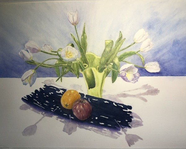
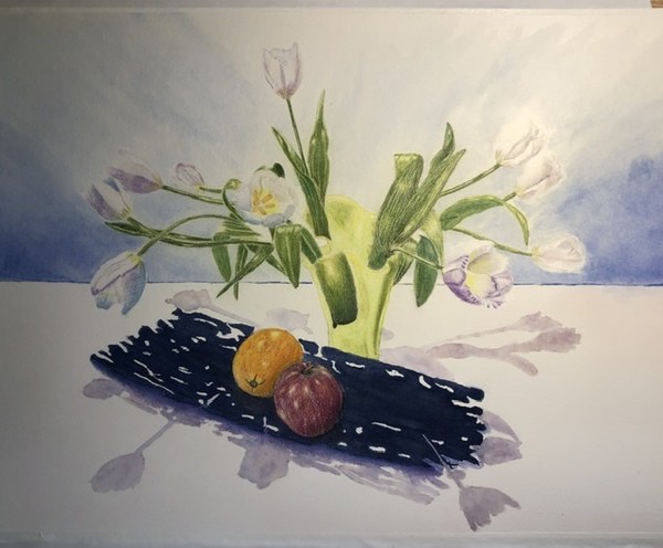
This is after Wendy have her suggestions on bringing out the flowers from the background and giving depth and demension to the vase. Thank you Wendy a world of different!
-
Deborah Gillikin commented on Deborah Gillikin's Photo 4 years, 11 months ago
This was before Wendy have her suggestions on improving the painting
-
-
This is after Wendy have her suggestions on bringing out the flowers from the background and giving depth and demension to the vase. Thank you Wendy a world of different!
-

You’ve created so much movement and drama on the page. 🙂
-
Thank you!
-
-
-
This was before Wendy have her suggestions on improving the painting
-
-
Katy Lyness commented on Jody Meese's Photo 4 years, 11 months ago
But would seem to explain the difficulty getting the saturation of color. -
Katy Lyness commented on Jody Meese's Photo 4 years, 11 months ago
Wish I could give you advice, but I’ve never used colored pencil on velum. -

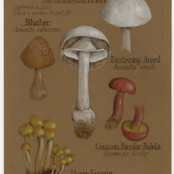
Wendy Hollender commented on Wendy Hollender's Photo 4 years, 11 months ago
Here is my Mushroom on Kraft Paper that I did to create the video for next week’s class on Drawing Mushrooms on Kraft paper. I really enjoyed doing this, starting with the foraging walk to collect the mushrooms, the drawing of the page, the attempt to identify the mushrooms, and adding the text!
-
Wendy Hollender added a Photo 4 years, 11 months ago
-
Here is my Mushroom on Kraft Paper that I did to create the video for next week’s class on Drawing Mushrooms on Kraft paper. I really enjoyed doing this, starting with the foraging walk to collect the mushrooms, the drawing of the page, the attempt to identify the mushrooms, and adding the text!
-
-
Jody Meese commented on Jody Meese's Photo 4 years, 11 months ago
@katylyness thanks. This was an experiment using vellum parchment.
-
Jody Meese commented on Jody Meese's Photo 4 years, 11 months ago
@katylyness thank you for your feedback!
-
Elizabeth Simonson commented on Elizabeth Simonson's Photo 4 years, 11 months ago
Thanks -
Elizabeth Simonson commented on Elizabeth Simonson's Photo 4 years, 11 months ago
thanks although I could do a bit more practice on them -
Elizabeth Simonson commented on Elizabeth Simonson's Photo 4 years, 11 months ago
Indeed but after working a white flower on white paper I like this much better. -
Elizabeth Simonson commented on Elizabeth Simonson's Photo 4 years, 11 months ago
Hey Sam
Thanks for the feedback. I had to rework these several times. Sometimes not enough white, then too much. Geez. The one thing I realized is that I had to erase the center colors that I had originally drawn with pencil and first apply a light white wash and THEN lay in the color to get it the right saturation. Totally fun but like a whole… -

Jill Amadei commented on Elizabeth Simonson's Photo 4 years, 11 months ago
These are beautiful!
-
Katy Lyness commented on Elizabeth Simonson's Photo 4 years, 11 months ago
Oh, I also wanted to say nice job on those thin stems!
-
Katy Lyness commented on Elizabeth Simonson's Photo 4 years, 11 months ago
Hi Elizabeth, I watched a recording of the White flowers on Kraft paper class and attended the critiques. Then helped Wendy teach the Walk in the Woods class that featured working on Kraft paper, so I can appreciate the skill it takes to work this way. One has to think differently.
- Load More
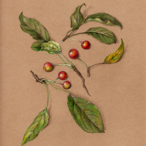

Gorgeous Katy! It looks like I could pick the crabapples right off the page! I particularly love the leaf on the bottom right! The loose composition works so well too!
Thanks Doug! It’s supposed to look casually composed…but not really. These are from a tree in my backyard that I might need to remove. So a bit of a eulogy. Ode to crabapple.
love how this turned out. The shadows are so much better making the apples pop but not trying to compete!
Ooh Katy this is awesome. It is SO full of life. I adore it. Well done.