Activity
-

Hélène Chiasson added a Photo 2 months, 3 weeks ago
-
Doug Milne commented on Denise Harris's Photo 3 months ago
Hi Denise- I love the varying colors and patterns! You have selected a wonderful subject to illustrate! I think your light source is coming from the right, but I would work on making that clearer. The benefits would be twofold because you also need more dark tones added to the shaded areas. It will help define some of the overlapping leaf parts,…[Read more]
-
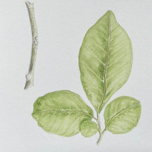
Doug Milne commented on Lee Gough's Photo 3 months ago
Welcome to the ArtFeed Lee! You are off to a great start! The colors are very pleasing and everything is well rendered! Now you need to add more saturation whether you do that with more layers of watercolor and/or layers of color pencil. Be sure to pay attention to the shadows and highlight. Judging from the large center leaf it appears the light…[Read more]
-
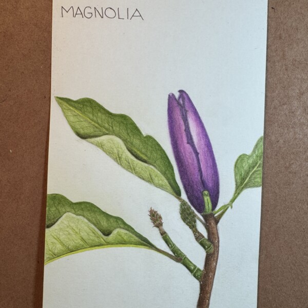
Doug Milne commented on Gale Foster's Photo 3 months ago
Hi Gale- nice representation on the different magnolia parts. Be careful to be consistent with your light source. The flower bud and stem seem to be receiving light from the right, but the leaves look like the light is coming from the left. Magnolia blossoms seemed to fare well this Spring without getting hit by frost.
-
Gale Foster added a Photo 3 months ago
-
Hi Gale- nice representation on the different magnolia parts. Be careful to be consistent with your light source. The flower bud and stem seem to be receiving light from the right, but the leaves look like the light is coming from the left. Magnolia blossoms seemed to fare well this Spring without getting hit by frost.
-
-
Lee Gough added a Photo 3 months ago
-
Welcome to the ArtFeed Lee! You are off to a great start! The colors are very pleasing and everything is well rendered! Now you need to add more saturation whether you do that with more layers of watercolor and/or layers of color pencil. Be sure to pay attention to the shadows and highlight. Judging from the large center leaf it appears the light…[Read more]
-
-
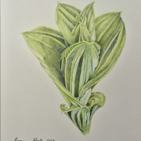
Denise Harris added a Photo 3 months, 1 week ago
-
Hi Denise- I love the varying colors and patterns! You have selected a wonderful subject to illustrate! I think your light source is coming from the right, but I would work on making that clearer. The benefits would be twofold because you also need more dark tones added to the shaded areas. It will help define some of the overlapping leaf parts,…[Read more]
-
-
Doug Milne commented on Margaret Hahn's Photo 3 months, 2 weeks ago
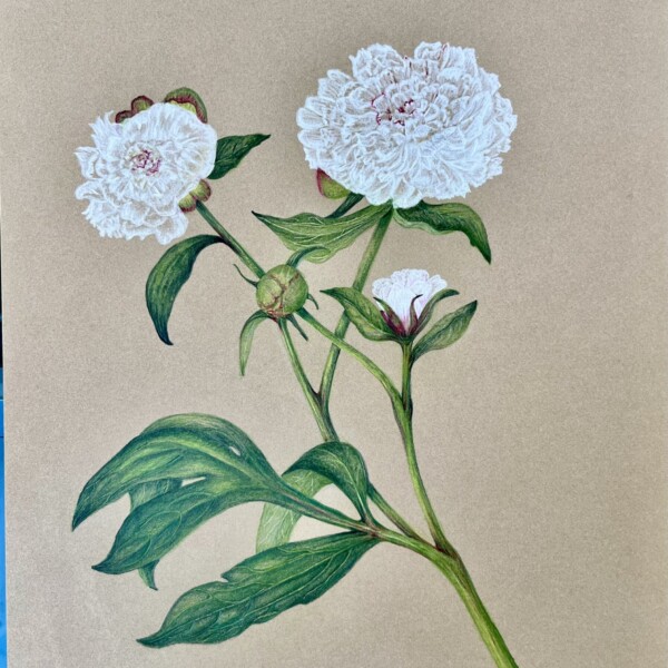
Hi Margaret- the stems and leaves are beautiful! It can be very effective to use the background color of colored paper as the mid-tone, but you can not rely only on it solely for the toning. The majority of the petals have a transparent quality and they lack definition. Other than using the background paper color for the mid-tone there is no…[Read more]
-
Doug Milne commented on Margaret Hahn's Photo 3 months, 2 weeks ago
Hi Margaret- you are off to a great start! The colors are beautiful and the stems and buds are looking wonderful. I understand your concern about the petals getting muddy, but you need more shading to give the flower dimension and form. Right now most of the petals appear very flat. Leave the highlight areas as white as possible and I would use…[Read more]
-
Margaret Hahn commented on Margaret Hahn's Photo 3 months, 2 weeks ago
This is my second attempt at capturing peonies – it’s not finished yet – have to do the colored pencil detail on the leaves and more detailed shading on the flowers which I find very challenging. Any suggestions? Should I add green leaves behind the main white flower to set them ff the white? I am afraid of getting a dirty look if I shade too h…[Read more]
-
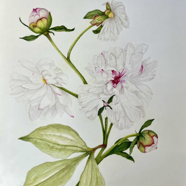
Margaret Hahn added a Photo 3 months, 2 weeks ago
-
This is my second attempt at capturing peonies – it’s not finished yet – have to do the colored pencil detail on the leaves and more detailed shading on the flowers which I find very challenging. Any suggestions? Should I add green leaves behind the main white flower to set them ff the white? I am afraid of getting a dirty look if I shade too h…[Read more]
-
Hi Margaret- you are off to a great start! The colors are beautiful and the stems and buds are looking wonderful. I understand your concern about the petals getting muddy, but you need more shading to give the flower dimension and form. Right now most of the petals appear very flat. Leave the highlight areas as white as possible and I would use…[Read more]
-
This was very helpful, Doug. I ended up using the deep fuchsia pink sporadically on the petals which worked great and also deepened the contrasts. I’ll post the final drawing.
-
-
Margaret Hahn commented on Margaret Hahn's Photo 3 months, 2 weeks ago
I have been trying to capture Peonies but could use some feedback on this drawing – my first attempt. What do you think it needs?
-
Margaret Hahn added a Photo 3 months, 2 weeks ago
-
I have been trying to capture Peonies but could use some feedback on this drawing – my first attempt. What do you think it needs?
-
Hi Margaret- the stems and leaves are beautiful! It can be very effective to use the background color of colored paper as the mid-tone, but you can not rely only on it solely for the toning. The majority of the petals have a transparent quality and they lack definition. Other than using the background paper color for the mid-tone there is no…[Read more]
-
-
Doug Milne commented on Ishbel Galloway's Photo 3 months, 3 weeks ago
Gorgeous Ishbel!
-
Doug Milne commented on Ishbel Galloway's Photo 3 months, 3 weeks ago
Nice Ishbel! I find stippling so meditative. There are some areas where I expect cast shadows from overlaying leaves. There are a couple of spots where it is missing – the two overlapping leaves stands out.
-

Ishbel Galloway commented on Ishbel Galloway's Photo 3 months, 3 weeks ago
Japanese Camellia in graphite. Part of the SBA Distance Diploma Assignment 2
-
Ishbel Galloway added a Photo 3 months, 3 weeks ago
-
Japanese Camellia in graphite. Part of the SBA Distance Diploma Assignment 2
-
Gorgeous Ishbel!
-
-
Ishbel Galloway added a Photo 3 months, 3 weeks ago
-
Nice Ishbel! I find stippling so meditative. There are some areas where I expect cast shadows from overlaying leaves. There are a couple of spots where it is missing – the two overlapping leaves stands out.
-
-
Doug Milne commented on Hélène Chiasson's Photo 4 months ago
Hi Helene- I know what you mean about the telephone pole. The flowers are gorgeous, but there is something about the angled second stem that bothers me and holds my attention. Partly because it is so straight. A curve to the stem (even at the base) I think would help. I would also try sketching on tracing paper having the the second stem emerge…[Read more]
-
Hélène Chiasson commented on Hélène Chiasson's Photo 4 months, 1 week ago
I added the leaves and second flowering stem to fill out the bottom of the page. Otherwise, the main stem looked like a telephone pole. What are your thought on these additions?
- Load More
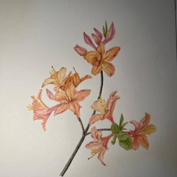

This azalea was amazing with its different hues of orange and pink on the same flower.
Wonderful colors Helene! I feel like it needs some sort of representation of leaves on the left side of the stem. I know you were drawing what you saw, but in the future try to avoid parts lining up. I am referring to how the bottom petals on the flower (on the right) lines up with the bottom of the leaf to it’s left. It would have been better f…[Read more]