Activity
-

Rita Haft commented on Rita Haft's Photo 5 years, 3 months ago
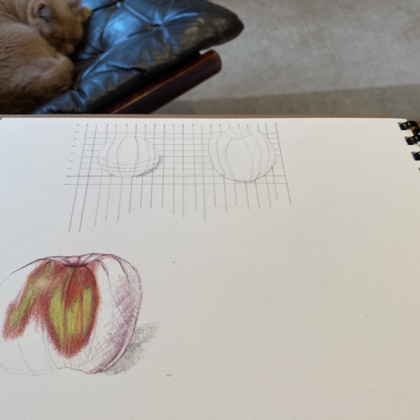
Hi Doug and Vern- Your input is so incredibly helpful- I think I have really improved the stem and I am working on an open flower in the background- I wish I had planned better and would have ideally liked some of the petals coming in front of the stem I have but too late now- anyway, for some reason without your encouragement I guess I was…[Read more]
-
Rita Haft added a Photo 5 years, 3 months ago
-
Hi Doug and Vern- Your input is so incredibly helpful- I think I have really improved the stem and I am working on an open flower in the background- I wish I had planned better and would have ideally liked some of the petals coming in front of the stem I have but too late now- anyway, for some reason without your encouragement I guess I was…[Read more]
-
Hi Rita- the stem is definitely looking better and I like how you positioned the bloom. Keep up the good work!
-
-
Doug Milne commented on Colleen Brannen's Photo 5 years, 3 months ago
Hi Colleen- the red violet was a good choice for the grissailes toning. I would use it to establish a lot more of the toning by laying down the dark and mid-ranges. Having the toning set up from the start you have a map to follow for the rest of your drawing. It looks like you have lost the main highlight and it is tricky to keep the highlight…[Read more]
-
Colleen Brannen added a Photo 5 years, 3 months ago
-
Hi Colleen- the red violet was a good choice for the grissailes toning. I would use it to establish a lot more of the toning by laying down the dark and mid-ranges. Having the toning set up from the start you have a map to follow for the rest of your drawing. It looks like you have lost the main highlight and it is tricky to keep the highlight…[Read more]
-
-

Pam commented on Pam's Photo 5 years, 3 months ago
Thanks Vern!
-
Pam commented on Wendy Hollender's Photo 5 years, 3 months ago
Very cool. So many overlaps!
-
Rita Haft commented on Rita Haft's Photo 5 years, 3 months ago
Thank you!!!
-
Pam Hancock commented on Pam Hancock's Photo 5 years, 3 months ago
Many thanks Doug, I had tried to darken this area but probably did’t go dark enough will add more shading. Used tan paper because white paper would not allow white to show plus no leaves yet on this plant to draw seed head against.
-

Wendy Hollender commented on Wendy Hollender's Photo 5 years, 3 months ago
I am enjoying documenting spring as it emerges in my garden. I am working on stonehenge kraft paper, and will be creating a new lesson soon on kraft paper for everyone to try!
-
Wendy Hollender commented on Wendy Hollender's Photo 5 years, 3 months ago
Thought you might all enjoy seeing this rare Palm that I have been working on for a while now, but hopefully it is finished!
-
Wendy Hollender added a Photo 5 years, 3 months ago
-
Thought you might all enjoy seeing this rare Palm that I have been working on for a while now, but hopefully it is finished!
-
Very cool. So many overlaps!
-
-
Wendy Hollender added a Photo 5 years, 3 months ago
-
I am enjoying documenting spring as it emerges in my garden. I am working on stonehenge kraft paper, and will be creating a new lesson soon on kraft paper for everyone to try!
-
-
Pam added a Photo 5 years, 3 months ago
-
Thanks Vern!
-
-
Doug Milne commented on Ayse Gilbert's Photo 5 years, 3 months ago
Hi Ayse- beautiful composition! Some of the leaves get lost because the color of the leaf behind is too similar to the one on top. Leaves often have a light and dark side especially along the center vein, which would also help give some variation to the leaves. Nice job!
-
Doug Milne commented on Ayse Gilbert's Photo 5 years, 3 months ago
Hi Ayse- love the detail views! I think the leaves would benefit from some toning where they cross each other and also where the stems cross over the leaves. Beautiful!
-
Doug Milne commented on Douglass Reitter's Photo 5 years, 3 months ago
Hi Douglass- Wendy recently posted a similar view of a daffodil which might give you some ideas for those last details.
-
Doug Milne commented on Rita Haft's Photo 5 years, 3 months ago
Hi Rita- I left a comment on your photo post about working on the leaves. After looking at the photo what I would like to see on your flower are some of those dark areas where some sections of the petals are recessed and overlap. In the photo I can also see each distinct petal and I am missing that on your drawing. A red or pink verithin pencil…[Read more]
-
Doug Milne commented on Rita Haft's Photo 5 years, 3 months ago
Hi Rita- thanks for sending the photo! Examining the photo you can get a lot of ideas on how to make your ice plant look more realistic. The first thing I noticed was that the leaves are darker at the base and get lighter as you look up to the top of the leaves. This condition exists and is very noticeable because the photo was taken outside.…[Read more]
-
Doug Milne commented on Pam Hancock's Photo 5 years, 3 months ago
This beautiful Pam! It looks really nice on the tan paper! I feel like I would like to see some dark toning where the yellow center meets the white petals. I would expect to see toning from the middle of the bottom around on the right toward the top in the area where the yellow meets the white.
-
Pam Hancock commented on Pam Hancock's Photo 5 years, 3 months ago
Coltsfoot seed head on Strathmore 400 toned tan paper. My attempt at this seed head!! Wasn’t quite sure how to tackle such a subject but here we go.
- Load More