Activity
-

Margaret Hahn added a Photo 7 months ago
-
-
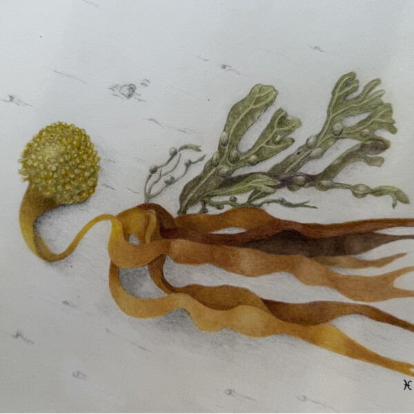
I like the addition to this drawing Helene. Such an unusual and interesting subject!
-
-

Karye Hood commented on Karye Hood's Photo 7 months, 1 week ago
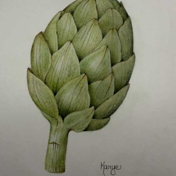
It’s on white paper, Stonehenge Aqua. I think my phone for some reason darkened the paper in this photo.
-
Erin Russek commented on Erin Russek's Photo 7 months, 1 week ago
Thank you Doug! That was a ton of fun.
-
Doug Milne commented on Karye Hood's Photo 7 months, 1 week ago
Beautifully drawn Karye! It looks like it is drawn on grey paper or the photograph is dark.
-
Doug Milne commented on Erin Russek's Photo 7 months, 1 week ago
It is hellebore season. We are still getting snow and my hellebores are blooming away! Wonderful study Erin! The colors and details are spot on! Beautifully drawn!
-
Doug Milne commented on Rita Haft's Photo 7 months, 1 week ago
Striking colors! Suggestion: since it is a vine, maybe think of bringing the main stem down further to run behind the vine of the pod.
-
Doug Milne commented on Rita Haft's Photo 7 months, 1 week ago
Beautiful Rita! Wonderful colors and details! Seems like the underside of the leaf would have some shadow toning.
-
Karye Hood added a Photo 7 months, 1 week ago
-
Beautifully drawn Karye! It looks like it is drawn on grey paper or the photograph is dark.
-
It’s on white paper, Stonehenge Aqua. I think my phone for some reason darkened the paper in this photo.
-
-
Erin Russek commented on Erin Russek's Photo 7 months, 2 weeks ago
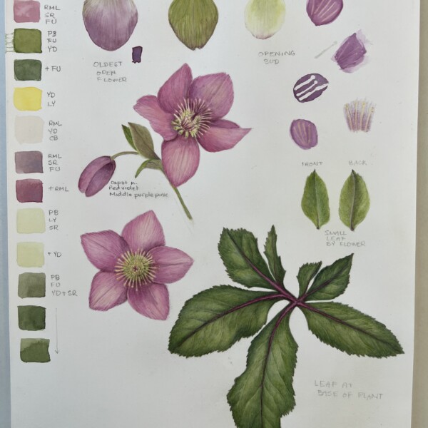
I took a break from my holly and orange drawing when I found Hellebores at the nursery.
-
Erin Russek added a Photo 7 months, 2 weeks ago
-
I took a break from my holly and orange drawing when I found Hellebores at the nursery.
-
It is hellebore season. We are still getting snow and my hellebores are blooming away! Wonderful study Erin! The colors and details are spot on! Beautifully drawn!
-
Thank you Doug! That was a ton of fun.
-
-
Rita Haft added a Photo 8 months, 1 week ago
-
Striking colors! Suggestion: since it is a vine, maybe think of bringing the main stem down further to run behind the vine of the pod.
-
-
Rita Haft added a Photo 8 months, 2 weeks ago
-
Beautiful Rita! Wonderful colors and details! Seems like the underside of the leaf would have some shadow toning.
-
-
Doug Milne commented on Machi's Photo 8 months, 2 weeks ago
Beautiful Machi! The drawing is wonderful as are the colors and details. I agree with you about the darks. I feel like the leave’s definitions in particular would benefit from the addition of more dark toning. But still beautiful nonetheless!
-
Doug Milne commented on Ishbel Galloway's Photo 8 months, 2 weeks ago
Superb Isabel! The colors and textures are wonderful! My one comment would be about the gourd on the right. It appears to me that the stem looks applied rather than being integrated with the gourd. The stem on the left gourd relates to the gourd so well. I think adding toning to both upper sides of the gourd would help integrate the stem and give…[Read more]
-
Machi commented on Machi's Photo 8 months, 3 weeks ago
This is homework drawing for a class I am taking at the North Carolina Botanical Garden. It was done after the Orchid drawing on-line workshop with Sam and Pam. What I learned from the orchid workshop really helped me. I had to do this in watercolor. I like the color saturation that the watercolor allows but I had problems with making the dark…[Read more]
-
Machi added a Photo 8 months, 3 weeks ago
-
This is homework drawing for a class I am taking at the North Carolina Botanical Garden. It was done after the Orchid drawing on-line workshop with Sam and Pam. What I learned from the orchid workshop really helped me. I had to do this in watercolor. I like the color saturation that the watercolor allows but I had problems with making the dark…[Read more]
-
Beautiful Machi! The drawing is wonderful as are the colors and details. I agree with you about the darks. I feel like the leave’s definitions in particular would benefit from the addition of more dark toning. But still beautiful nonetheless!
-
-

Ishbel Galloway added a Photo 8 months, 4 weeks ago
-
Superb Isabel! The colors and textures are wonderful! My one comment would be about the gourd on the right. It appears to me that the stem looks applied rather than being integrated with the gourd. The stem on the left gourd relates to the gourd so well. I think adding toning to both upper sides of the gourd would help integrate the stem and give…[Read more]
-
-
Ishbel Galloway commented on Ishbel Galloway's Photo 8 months, 4 weeks ago
Thanks Doug — yes, I’ve had some issues lately but I am finally getting back into drawing!
-
Doug Milne commented on Erin Russek's Photo 8 months, 4 weeks ago
Nice Erin! The orange (fruit) colors are very good and it has a fresh, juicy quality as you would expect.
- Load More
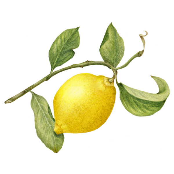



Created as part of a workshop with Ann Swan at her studio in England, fall 2024 and finished in my studio fall 2025. We were working on shading with yellows.
You are ready for a return trip to the Garden of Lemons!
Oh how I wish! But this May is impossible for me. Hoping there is a 2028!
This is so beautiful, Margaret What colors did you use for the toning on the lemon?
Laurie – sorry I lost track of this question – I used first Pablo golden ochre then Faber Castelle 183 and lastly Luminescence 034 for the shading. FC 105 and 107 were the base colors.