Activity
-

Glenn Kotnik commented on Glenn Kotnik's Photo 2 years, 5 months ago
The gradient of color and tone from bottom to top is somehow a photographic artifact of the lighting I used for this cell phone photo. I lit my drawing with two LED desk lamps. I can’t explain what happened but I like it anyway b
-
Doug Milne commented on Laurie McConnachie's Photo 2 years, 5 months ago
Hi Laurie- the image looked a little fuzzy and I figured it must be the quality of the photo because your work is always so nice and crisp! It also looks like you used a textured paper, which might add to it. You have a good range of tones and wonderful details.
-
Melissa Fimiani commented on Melissa Fimiani's Photo 2 years, 5 months ago
I was experimenting with watercolor paint and pencils! Not the greatest but it’s a start!
-
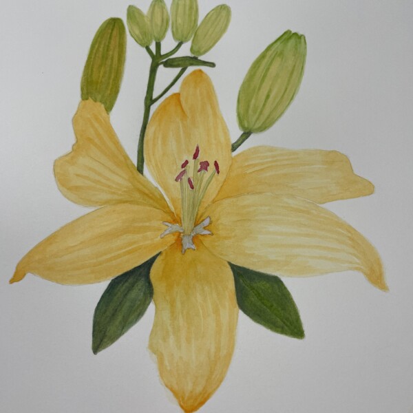
Melissa Fimiani added a Photo 2 years, 5 months ago
-
I was experimenting with watercolor paint and pencils! Not the greatest but it’s a start!
-
This is nicely rendered Melissa. If you want to keep experimenting I would work on adding highlights and a range of tones. That will give the flower and the buds the dimension and form they need to look realistic. Normally we keep the highlight and add the shadow tones first, before adding any color. That way they are established from the…[Read more]
-
-
Glenn Kotnik added a Photo 2 years, 5 months ago
-
The gradient of color and tone from bottom to top is somehow a photographic artifact of the lighting I used for this cell phone photo. I lit my drawing with two LED desk lamps. I can’t explain what happened but I like it anyway b
-
It looks like you used an ombré paper Glenn. This is a really nice drawing! Great colors and details and I love how the subject curves off the page!
-
-
-
Hi Glenn- this is a real gathering! As with the other drawing of this subject I think the paper is not too dark and compliments the subject very well! As we discussed on the other drawing I see more form on this page. I think you could push it even more. Often with colored papers you can use the color of the paper to represent various tones…[Read more]
-
-
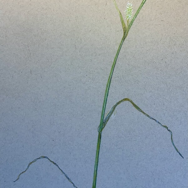
Laurie McConnachie commented on Laurie McConnachie's Photo 2 years, 5 months ago
@doug-milne
Thanks, Doug- it does look like that!I had trouble getting a photo that was in good focus for some reason
Do you have any suggestions on how to improve the drawing? Open to any feedback
Thanks!
Laurie -

Ishbel Galloway commented on Ishbel Galloway's Photo 2 years, 5 months ago
Thanks…in fact the petals are matte.
-
Doug Milne commented on Laurie McConnachie's Photo 2 years, 5 months ago
Great subject Laurie! The top makes me think of a fish mouth and eye.
-
Doug Milne commented on Glenn Kotnik's Photo 2 years, 5 months ago
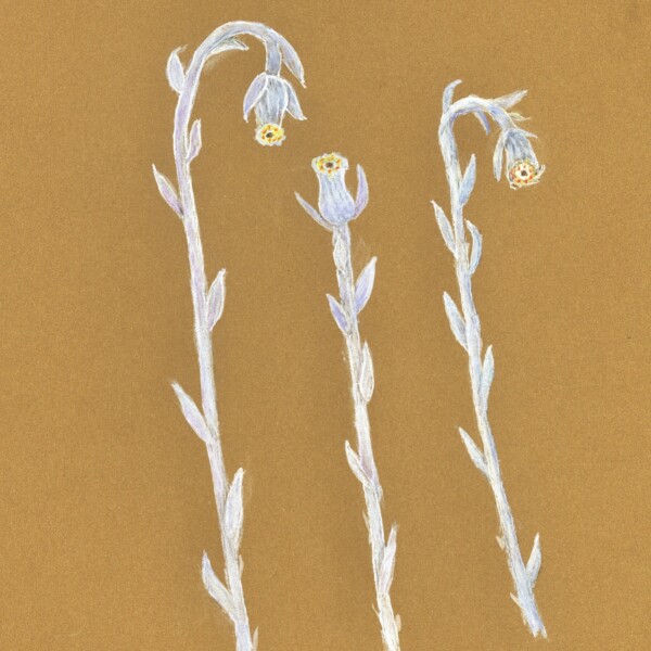
This trio looks looks great on the colored paper! So graphic! Wonderful job! Is there a color that would work to give the stems and buds more form?
-
Laurie McConnachie added a Photo 2 years, 5 months ago
-
Great subject Laurie! The top makes me think of a fish mouth and eye.
-
@doug-milne Thanks, Doug- it does look like that! I had trouble getting a photo that was in good focus for some reason Do you have any suggestions on how to improve the drawing? Open to any feedback Thanks! Laurie
-
Hi Laurie- the image looked a little fuzzy and I figured it must be the quality of the photo because your work is always so nice and crisp! It also looks like you used a textured paper, which might add to it. You have a good range of tones and wonderful details.
-
-
Hélène Chiasson commented on Hélène Chiasson's Photo 2 years, 5 months ago
Thank you Doug. Those are wonderful comments.
-
Doug Milne commented on Pat Schiebold's Photo 2 years, 5 months ago
Hi Pat- I tried googling the anatomy of a peony and could not find clear, concise information, so excuse me if my terminology is incorrect. It seems like you are off to a good start. Are you drawing this from the photo or did you bring a cut flower in to your studio? Remember if you are drawing based on this photo the flower being outside has many…[Read more]
-
Doug Milne commented on Maureen Doram's Photo 2 years, 5 months ago
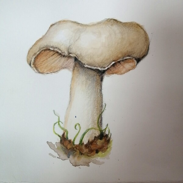
Love this Maureen! I particularly enjoy the texture and form of the cap! Also the loose, watercolor technique on the base! Great job!
-
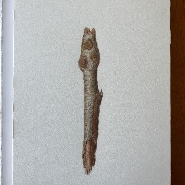
Doug Milne commented on Linda Welch's Photo 2 years, 5 months ago
Welcome back Linda! Nice job on the branch segment. You have beautiful smooth toning and a nice range of tones. The horizontal lines that are bark details should not be straight at each side edge, but curve to convey that the lines are on a curve. There are so many interesting branches out there and I would encourage you to explore some of the…[Read more]
-
Doug Milne commented on Hélène Chiasson's Photo 2 years, 5 months ago
Hi Helene- I don’t see the muddiness you are referring to on the darker Iris. Previously I thought the image strength of the two irises was not consistent and I think you have done a great job of correcting that. This is a gorgeous piece of art! Love it!
-
Glenn Kotnik commented on Pat Schiebold's Photo 2 years, 5 months ago
Beautiful job! You are much more skilled than I am so I’m not the one to advise you but I can’t help but give you my ideas. I think that traditionally the light toned stamens would be on a darker background since they are in front. . Looking at the flower photo however you could ignore tradition and have the background lighter in tone than the sta…[Read more]
-
Glenn Kotnik commented on Maureen Doram's Photo 2 years, 5 months ago
Really excellent mushroom drawing!
It’s always difficult to find a viewpoint where you can see the cap, gills and stem all at once. -
Maureen Doram added a Photo 2 years, 5 months ago
-
Really excellent mushroom drawing! It’s always difficult to find a viewpoint where you can see the cap, gills and stem all at once.
-
Love this Maureen! I particularly enjoy the texture and form of the cap! Also the loose, watercolor technique on the base! Great job!
-
-
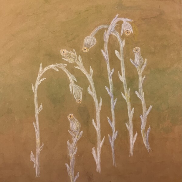
Glenn Kotnik added a Photo 2 years, 5 months ago
-
This trio looks looks great on the colored paper! So graphic! Wonderful job! Is there a color that would work to give the stems and buds more form?
-
@doug-milne. You’re right, Doug, I haven’t really figured out how to draw these with good form. I’ve done a lot of experimenting but in the end they come out flat looking. Is my paper too dark? In the forest understory they are difficult to see because they don’t have much contrast. Some people call them ghost pipes, and they really are like tr…[Read more]
-
- Load More