Activity
-

Doug Milne commented on Hélène Chiasson's Photo 2 years, 1 month ago
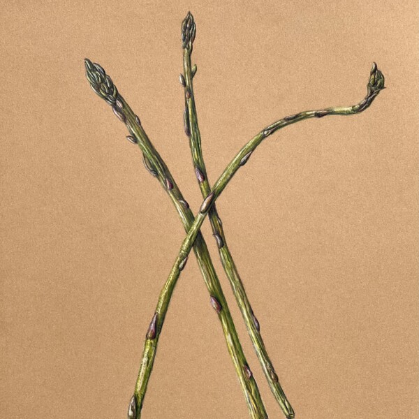
This is beautifully drawn Helene! The leaves in particular are wonderful! The problem is the lack of contrast and the natural lighting explains why that is. Bringing subjects inside to draw under the proper lighting will help you achieve more appropriate highlights and shadows which will give you the contrast this wonderful drawing needs.
-
Doug Milne commented on Tara Dougherty's Photo 2 years, 1 month ago
Hi Tara- this lesson is more challenging when done on the Kraft paper. You are getting a range of tones, but there isn’t the same smooth transition of tones around the highlight because the highlight is applied rather than being the color of white paper. On the cylinder the left edge should not be that dark. It will be #3 to 4 because it is c…[Read more]
-
Doug Milne commented on Bonny Hart's Photo 2 years, 1 month ago
Hi Bonny- The location of the main highlight and dark toning are good but the sphere is very pale and it needs more saturation of tone. It also has a limited range of tones. This is where you want to apply the range of tones from black to the color of the paper that you worked on the tone bar scale on your previous post. I am confused by the two…[Read more]
-
Doug Milne commented on Rita Haft's Photo 2 years, 1 month ago
I love the simplicity of the composition Rita and it looks wonderful on the Kraft paper! Great job!
-
Doug Milne commented on Bonny Hart's Photo 2 years, 1 month ago
Hi Bonny- you are off to a good start! The #9’s are nice and dark. The #8’s could be a little darker and of course that will require more tone to be added along the line. The graphite line is the best, but it could still be revised some. For example #’s 3and 4 look too similar on all three lines. As I mentioned, once you change one then you have…[Read more]
-
Doug Milne commented on Maureen Doram's Photo 2 years, 1 month ago
Love the colors and composition Maureen! Beautiful!
-
-
I love the simplicity of the composition Rita and it looks wonderful on the Kraft paper! Great job!
-
Beautiful, elegant.
-
You’ve inspired me to draw asparagus on Kraft paper!
-
-

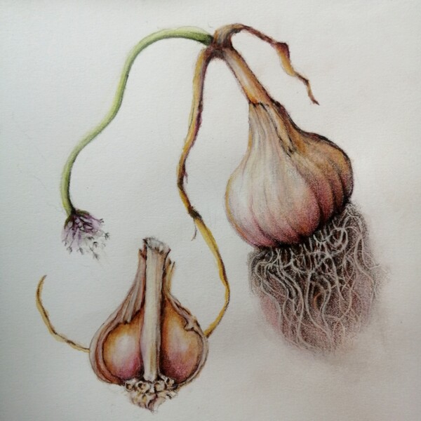
Pam commented on Maureen Doram's Photo 2 years, 1 month ago
This is so beautiful Maureen. Those colors are great. I really like how you have the different elements interacting. It’s really lovely. One little suggestion – you could play around with your roots a little bit more to make it clear which roots are overlapping which. Great work!
-
Tara Dougherty added a Photo 2 years, 1 month ago
-
Hi Tara- this lesson is more challenging when done on the Kraft paper. You are getting a range of tones, but there isn’t the same smooth transition of tones around the highlight because the highlight is applied rather than being the color of white paper. On the cylinder the left edge should not be that dark. It will be #3 to 4 because it is c…[Read more]
-
Thanks for the advice David. I am still working on my toning skills. Trying to practice at staying extremely light strokes when the pencil hits paper and getting the layering look. I did upload the lesson starting branch toning but the image did not render correctly. I did view the image that did not render correctly and could see so much of my…[Read more]
-
-
Rita Haft commented on Rita Haft's Photo 2 years, 1 month ago
@pam Thank you Pam, I will take your suggestions and continue to work on this
-
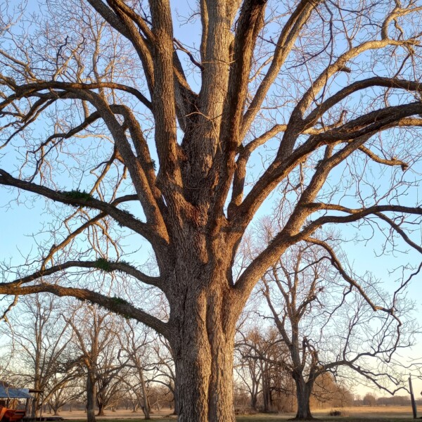
Hélène Chiasson commented on Renata's Photo 2 years, 1 month ago
That is very lovely Renata. I have been thinking of using trees as subjects and your drawings are motivating!
-
Hélène Chiasson commented on Hélène Chiasson's Photo 2 years, 1 month ago
This plant was under natural light with light coming from above. I tried to adjust the drawing as if the light was coming from the left. I would like to do this drawing again and bring in a specimen inside with the correct lighting. What other things can be improved upon?
-
-
This plant was under natural light with light coming from above. I tried to adjust the drawing as if the light was coming from the left. I would like to do this drawing again and bring in a specimen inside with the correct lighting. What other things can be improved upon?
-
This is beautifully drawn Helene! The leaves in particular are wonderful! The problem is the lack of contrast and the natural lighting explains why that is. Bringing subjects inside to draw under the proper lighting will help you achieve more appropriate highlights and shadows which will give you the contrast this wonderful drawing needs.
-
-
Renata added a Photo 2 years, 1 month ago
-
Renata commented on Renata's Photo 2 years, 1 month ago
Hi Pam, thank you so much for all the tips! I do have a reference photo that I loosely follow. This is a tree I saw in Louisiania a few months ago during fieldwork. It was a pretty eery landscape but maybe I have exagerated. I hadn’t noticed the twin branches on the left, they do look weird! I am thinking also that the trunk bark texture looks a…[Read more]
-
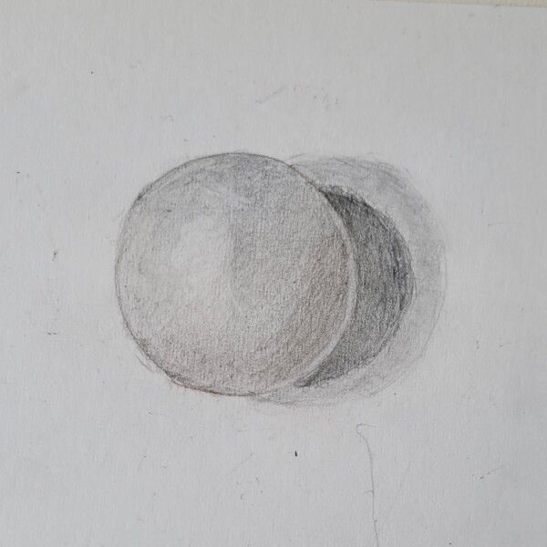
Bonny Hart commented on Bonny Hart's Photo 2 years, 1 month ago
Value scales, upside down, but in order that I acquired the pencils. Prismacolor Verithin, Graphite, and Faber-Castell (which is an entirely different animal.)
-
Bonny Hart commented on Bonny Hart's Photo 2 years, 1 month ago
I continue to experiment with Spheres!
-
Bonny Hart added a Photo 2 years, 1 month ago
-
I continue to experiment with Spheres!
-
Hi Bonny- The location of the main highlight and dark toning are good but the sphere is very pale and it needs more saturation of tone. It also has a limited range of tones. This is where you want to apply the range of tones from black to the color of the paper that you worked on the tone bar scale on your previous post. I am confused by the two…[Read more]
-
Thanks. I need to practice and just doodle around with the Faber Castell pencils. To me it seems like I’m laying too much down, not too little and each stroke feels like A COMMITMENT. I’m not ready for tomatoes!
-
-
Bonny Hart added a Photo 2 years, 1 month ago
-
Value scales, upside down, but in order that I acquired the pencils. Prismacolor Verithin, Graphite, and Faber-Castell (which is an entirely different animal.)
-
Hi Bonny- you are off to a good start! The #9’s are nice and dark. The #8’s could be a little darker and of course that will require more tone to be added along the line. The graphite line is the best, but it could still be revised some. For example #’s 3and 4 look too similar on all three lines. As I mentioned, once you change one then you have…[Read more]
-
-
Maureen Doram added a Photo 2 years, 1 month ago
-
This is so beautiful Maureen. Those colors are great. I really like how you have the different elements interacting. It’s really lovely. One little suggestion – you could play around with your roots a little bit more to make it clear which roots are overlapping which. Great work!
-
Love the colors and composition Maureen! Beautiful!
-
- Load More