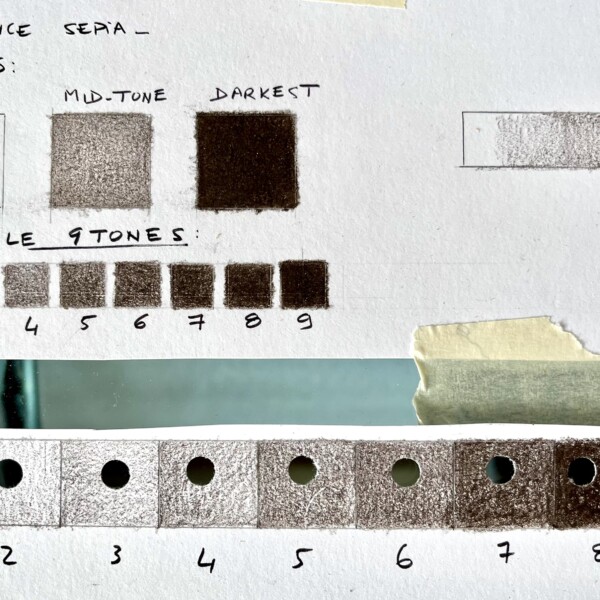
Welcome to the ArtFeed Claire! Nice job on the these tone squares! I would point out a couple of things. The thing to remember is that the middle square (in your 3 squares at the top) should be half the strength of the darkest square. The #5 square in the 9 squares below looks darker and I think more accurate. #5 in the larger squares on the bottom could also be darker as the #5 above it. The #2’s could both be a little lighter and you may have to adjust the #6 on the bottom once you adjust the #5. You are almost there and just needs a couple of tweaks.
Another good page Claire! You are achieving a nice range of tones. With the wider cylinder on the top, the areas flanking the highlight could be lighter.
Thank you so much for all the advise, I will correct. Also, I have a question…I am using Luminance pencils, and my pencil is Sepia. It seems darker than the one demonstrated on the course. Would you have any advise on which luminance pencil I could use ? I already have a good collection of Pablo and Luminance pencils from Caran D ache and I would like to continue with these 🙂 Thanks again

Welcome to the ArtFeed Claire! Nice job on the these tone squares! I would point out a couple of things. The thing to remember is that the middle square (in your 3 squares at the top) should be half the strength of the darkest square. The #5 square in the 9 squares below looks darker and I think more accurate. #5 in the larger squares on the bottom could also be darker as the #5 above it. The #2’s could both be a little lighter and you may have to adjust the #6 on the bottom once you adjust the #5. You are almost there and just needs a couple of tweaks.
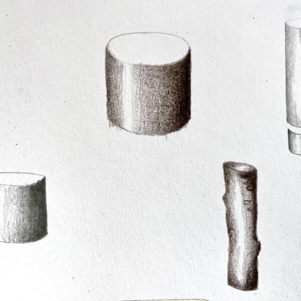
Another good page Claire! You are achieving a nice range of tones. With the wider cylinder on the top, the areas flanking the highlight could be lighter.
Thank you very much for your help. I had to put on pause my trial but I want to come back, this course is amazing
Thank you so much for all the advise, I will correct. Also, I have a question…I am using Luminance pencils, and my pencil is Sepia. It seems darker than the one demonstrated on the course. Would you have any advise on which luminance pencil I could use ? I already have a good collection of Pablo and Luminance pencils from Caran D ache and I would like to continue with these 🙂 Thanks again