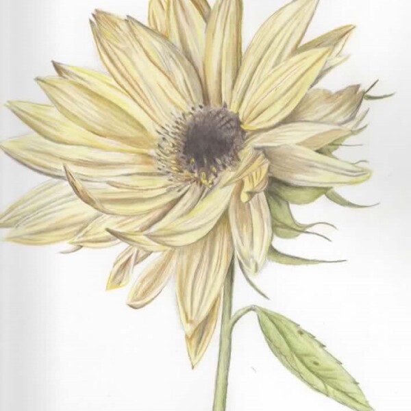
I did this mostly from a photo reference- grown in my Alaska garden this summer. Was struggling with some of the 3D form aspects, particularly on the left side of the bloom. Would love some feedback on how to do that best with light-colored petals, @sam-mcwilliams.
Hi Katie- welcome to the ArtFeed! This is beautifully rendered! Darkening the areas that are in shadow (in the “v” where petals overlap) and especially the sepals and petals on the right side, which is furthest from the light source the image will start to have more contrast and pop! Remember too that the stamen cluster in the center will cast a shadow and by adding that it will also create contrast and make the center pop and have more dimension. It is tricky working from a photo because the light sources can be many and varied and it can wash out the contrasts in the photo. You are almost there!
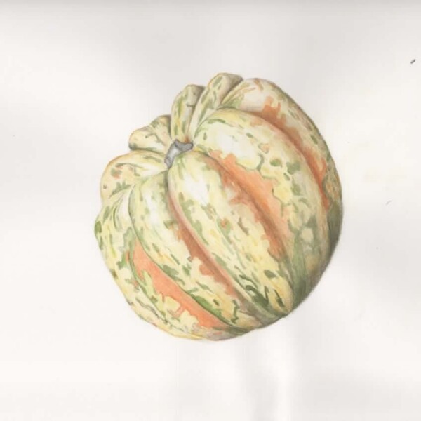
Great job on the patterning Katie! As I commented on your pomegranate and I notice on some of your other posts, I would work on getting more saturation on your subjects. The drawing and toning is great! Just stronger, more saturated color!
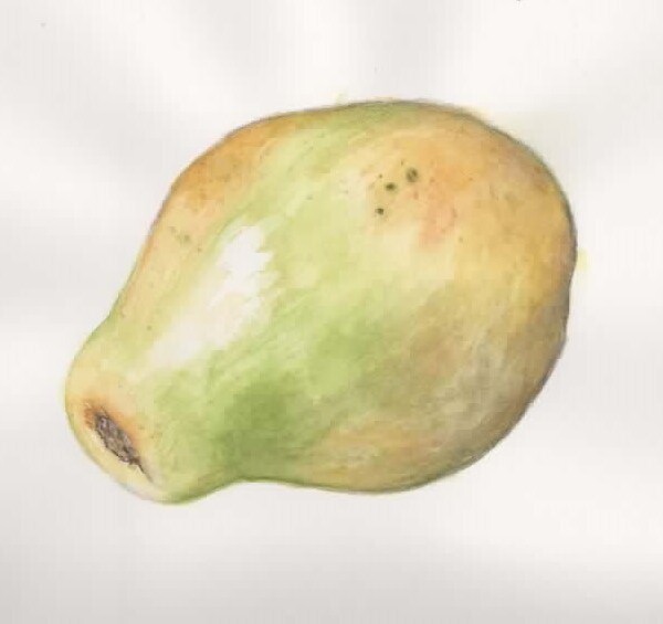
Hi Katie- as with your other pieces, the papaya is beautifully rendered and great color selections. It just needs more color saturation. The great thing with color pencil is that if you think you have gone too far it is usually easy to lift some of the layers of pencil with a kneaded eraser or even take more of it off with an eraser. Be sure as you add more saturation to not lose your highlight or range of tones that give the papaya it’s form. It helps to keep adjusting it as you add layers, but you can also do it at the end when you think you are fully saturated.


I did this mostly from a photo reference- grown in my Alaska garden this summer. Was struggling with some of the 3D form aspects, particularly on the left side of the bloom. Would love some feedback on how to do that best with light-colored petals, @sam-mcwilliams.
Hi Katie- welcome to the ArtFeed! This is beautifully rendered! Darkening the areas that are in shadow (in the “v” where petals overlap) and especially the sepals and petals on the right side, which is furthest from the light source the image will start to have more contrast and pop! Remember too that the stamen cluster in the center will cast a shadow and by adding that it will also create contrast and make the center pop and have more dimension. It is tricky working from a photo because the light sources can be many and varied and it can wash out the contrasts in the photo. You are almost there!
This is beautifully drawn Katie! I expect a pomegranate to be more saturated with color. The toning and reflected light are wonderful!
Great job on the patterning Katie! As I commented on your pomegranate and I notice on some of your other posts, I would work on getting more saturation on your subjects. The drawing and toning is great! Just stronger, more saturated color!
Hi Katie- as with your other pieces, the papaya is beautifully rendered and great color selections. It just needs more color saturation. The great thing with color pencil is that if you think you have gone too far it is usually easy to lift some of the layers of pencil with a kneaded eraser or even take more of it off with an eraser. Be sure as you add more saturation to not lose your highlight or range of tones that give the papaya it’s form. It helps to keep adjusting it as you add layers, but you can also do it at the end when you think you are fully saturated.