Beautiful image and colors Sarah! One thing to consider is darkening the fruits that are in the background. It emphasizes which are in front, in back, etc and it makes the fruits in front pop visually!
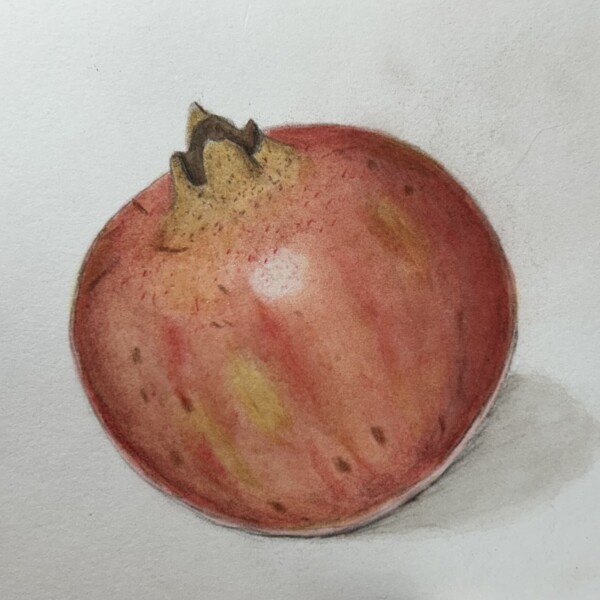
Gorgeous colors Sarah! Keep in mind that the main highlight is too centered. It should be over to the left more. I think you could use a little more dark and mid-range tones to enhance the pomegranate’s form. As I mentioned on an other post, the reflected light should not be as white as the Mai highlight. I would add some color to tone it down. Also, as it is a reflection, it should not be a controlled line. It depends on the color of the subject, but often using an ivory pencil in that area to blend the colors more (and add more color on top of the ivory if necessary). This helps to soften the area and convey that it is a glow from light bouncing off the surface the subject is sitting on or next to. You are almost there!
You have a great collection of wonderful pieces Sarah! I won’t comment on them all as my comments on some of the posts (outlining, vein width, reflected light, etc) could pertain to many of them. They are small things to change if you so desire. I look forward to seeing more of your work. I am in the middle of a big move, so my apologies for my delay. I will hopefully be back to a more regulated schedule soon.
I appreciate your feedback and agree that many of the points you made will pertain to multiple pieces. I just got started with this process, so I uploaded everything I did in the past 2 months all at once. I have learned so much from the book, the course videos, and the ZOOM winter card class. Best wishes to you with your move!

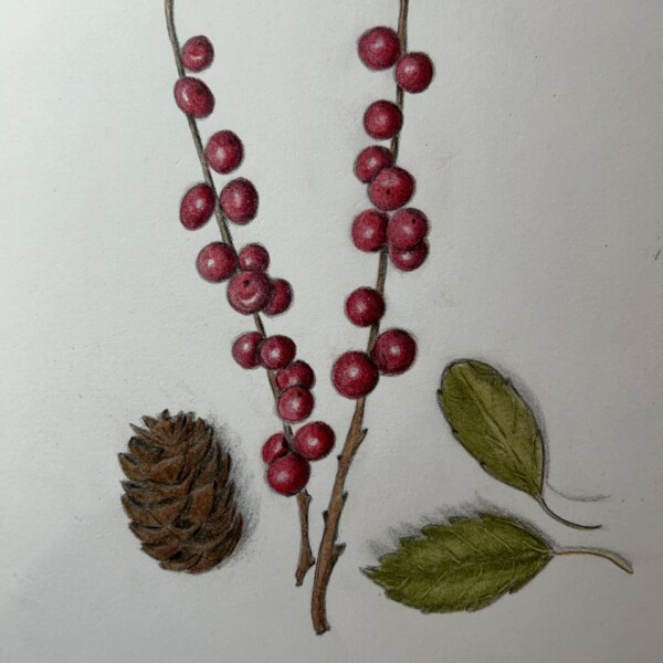
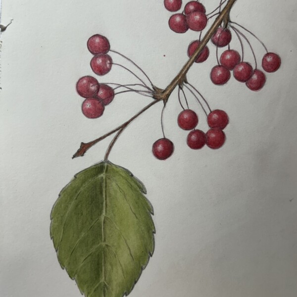
Beautiful image and colors Sarah! One thing to consider is darkening the fruits that are in the background. It emphasizes which are in front, in back, etc and it makes the fruits in front pop visually!
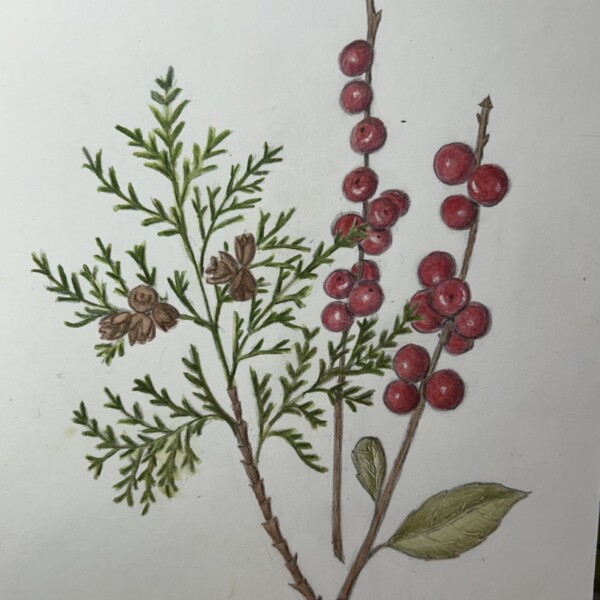
Great composition Sarah! This would make a lovely Holiday card!
Gorgeous colors Sarah! Keep in mind that the main highlight is too centered. It should be over to the left more. I think you could use a little more dark and mid-range tones to enhance the pomegranate’s form. As I mentioned on an other post, the reflected light should not be as white as the Mai highlight. I would add some color to tone it down. Also, as it is a reflection, it should not be a controlled line. It depends on the color of the subject, but often using an ivory pencil in that area to blend the colors more (and add more color on top of the ivory if necessary). This helps to soften the area and convey that it is a glow from light bouncing off the surface the subject is sitting on or next to. You are almost there!
You have a great collection of wonderful pieces Sarah! I won’t comment on them all as my comments on some of the posts (outlining, vein width, reflected light, etc) could pertain to many of them. They are small things to change if you so desire. I look forward to seeing more of your work. I am in the middle of a big move, so my apologies for my delay. I will hopefully be back to a more regulated schedule soon.
Thanks very much for your comments, Pomegranates are so beautiful and I look forward to spending more time drawing and painting them!
Much appreciated.
Oh, good to know! I can see how that would enhance the drawing.
I appreciate your feedback and agree that many of the points you made will pertain to multiple pieces. I just got started with this process, so I uploaded everything I did in the past 2 months all at once. I have learned so much from the book, the course videos, and the ZOOM winter card class. Best wishes to you with your move!