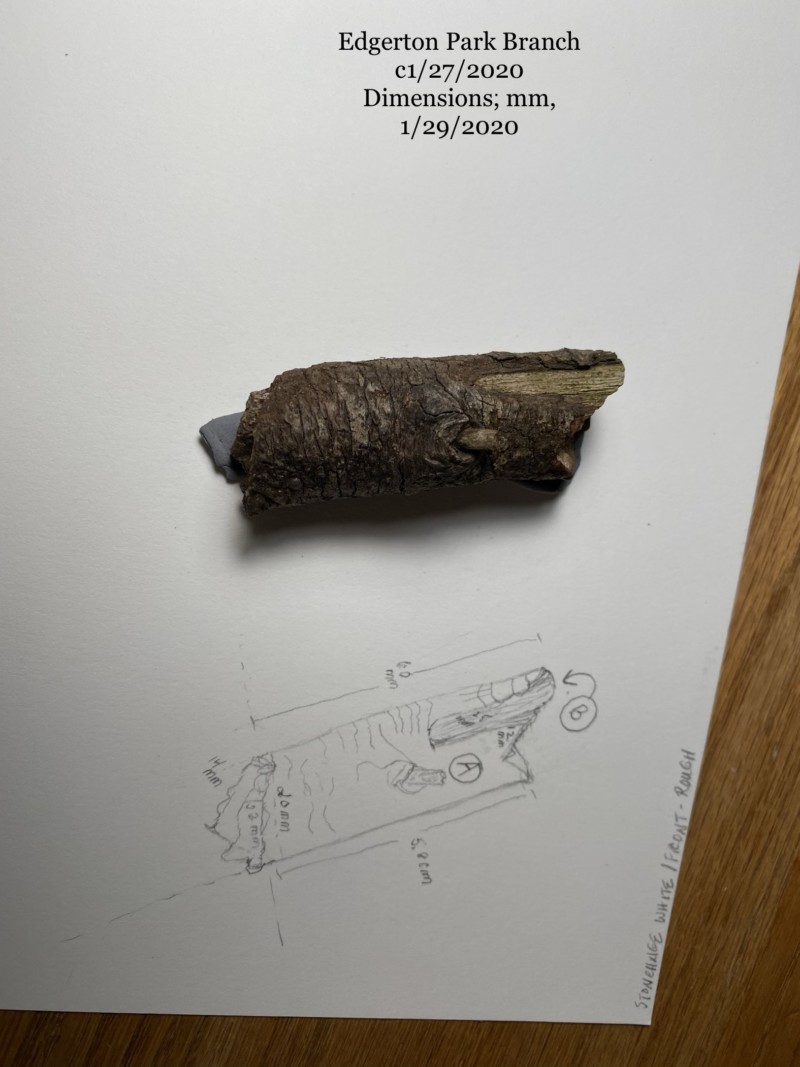
I’m in the very initial stages of completing this branch drawing. I really like this branch, plus it’s size makes it a good choice for the surface being used in the course. I’ve done the measurements, in mm, as noted. But I would really appreciate input on how to tackle this drawing using watercolor pencils and colored pencils, when working in a very small space that has two very different colors and textures, and where the majority of the background is dark, and also — knowing that none of my lights show up well on dark backgrounds. I’ve learned the latter over the past week, with extensive testing. Thanks for your help.
PS If you zoom in a bit, you’ll get get a better idea of the contrast between the two different areas of the branch, labelled A and B. This gives a better idea of what I actually see and am tackling this drawing. Texture and color are quite different in these areas. I’ll be glad for your input because this is something I have struggled with a great deal in the past. Thanks so much.
Hi Mary-this is a really nice subject with a lot of great texture and details. It is helpful to see the photo and the first thing I noticed is that the branch that you sketched looks thinner that the actual branch. Double check that your dimensions are correct on your drawing. At this stage you do not need to draw the lines that go from side to side or other details. Once you have drawn the outline of the branch I would include the area you labeled B and the twig remnant you labeled A. The texture and other details will be added later. The next step will be adding the toning with your dark sepia color pencil. As you did on the tone arc bar lessons you will tone your branch from dark to mid ranges to highlight to mid range as it goes from left to right. You are then ready for the watercolor pencils and use a brown watercolor pencil that is closest to the color of the branch. You can use one color pencil but, apply it heavier and lighter like you did with the dark sepia color pencil. Do not put any watercolor pencil in the area that is your highlight or in the B area, since that is lighter than the rest of the branch and it is also close to your highlight. Since you have established the toning with the dark sepia color pencil use that as your guide when applying the watercolor pencil. You can put more watercolor pencil in the darkest area and transition over with less watercolor pencil in the mid-range area and no watercolor pencil in the highlight area, etc. I would leave a wider swath of area untouched where your highlight area is. It is easier to add color later with color pencil than to try to make it lighter. After you have wet the areas where you applied watercolor pencil and you have retained your range of toning let it thoroughly dry before moving to the color pencils. This is where you will probably use a couple of different brown shades and the dark sepia. Even dark objects have to have a range of toning from dark to light otherwise it will not read as the cylinder your branch is. You can see that range of tones on the branch in your photo. Again refer to the tone arc bar exercises you have done. By building up layers of color pencil you will work towards achieving the right colors and establishing the texture and details. There are always exceptions to the rule, bit it is easier to keep the light areas and the highlight the color of the paper and add color pencil as needed than trying to add white or a light color pencil on to an area that you have all ready applied a dark color pencil. You can always lift color with your kneaded eraser (or erase more with an eraser) to lighten areas or as a technique for creating texture. Play around trying different techniques. It’s fun! You will see on many artists submissions on the ArtFeed that they practice the colors and textures before they start and also put a tone bar on the page as reference. I know this is wordy but I hope in conjunction with revisiting some of the course lessons it will be of some help.
Thank you so much, Doug, your information is so very helpful, can’t say that enough. In terms of the measurements, now that I look at the photo, there does seem to be a marked difference between the size of the branch and the sketch, especially in terms of width/diameter. I’ll recheck my measurements; they were done with a digital caliper, so very exact. I’m just wondering if the size issue may be in the the angle at which I was holding the camera. But for sure, I’ll definitely recheck, and I’ll also watch for this problem in the future. The process steps you outline are extremely helpful. In terms of practicing some of the steps, e.g., arc tone bars and texture, I do those daily, and have made good progress on tone bars that include watercolor. But I can’t even come close to reproducing the varied texture that is in this branch, and by the time I’m through trying, I’ve ruined the drawing with lots of amateurish overworking. Ugh. Maybe I’ll limit the texture to what I can achieve with a stylette and toning alone, for now anyway. Thank you again.
04 February 2020
Mary, two ideas for you: 1. Try using some tones that appear a little lighter than the actual branch, especially in the midtone/highlight range. This way you have some more room to play with texture without it all reading very dark. Be sure that your shadow side shows those deep dark tones, but you can “fudge” it a little bit in the mid and light tones. 2. Use the highlight to your advantage. The highlight is where we see most of the texture most clearly. Use this to your advantage and focus on the detail in texture there in the highlight, and less in the darker places. OK, three things… 3. Try several different subjects with varied textures just to practice this a few times. 🙂
Thanks so much, this is very helpful, especially since I find this branch so non-reflective that it’s hard to really ‘see’ the highlight. At the same time, I just love it, the texture and shape of this branch, esp. when seen in person, make it seem almost paleolithic. Thanks again.
I’m in the very initial stages of completing this branch drawing. I really like this branch, plus it’s size makes it a good choice for the surface being used in the course. I’ve done the measurements, in mm, as noted. But I would really appreciate input on how to tackle this drawing using watercolor pencils and colored pencils, when working in a very small space that has two very different colors and textures, and where the majority of the background is dark, and also — knowing that none of my lights show up well on dark backgrounds. I’ve learned the latter over the past week, with extensive testing. Thanks for your help.
PS If you zoom in a bit, you’ll get get a better idea of the contrast between the two different areas of the branch, labelled A and B. This gives a better idea of what I actually see and am tackling this drawing. Texture and color are quite different in these areas. I’ll be glad for your input because this is something I have struggled with a great deal in the past. Thanks so much.
Hi Mary-this is a really nice subject with a lot of great texture and details. It is helpful to see the photo and the first thing I noticed is that the branch that you sketched looks thinner that the actual branch. Double check that your dimensions are correct on your drawing. At this stage you do not need to draw the lines that go from side to side or other details. Once you have drawn the outline of the branch I would include the area you labeled B and the twig remnant you labeled A. The texture and other details will be added later. The next step will be adding the toning with your dark sepia color pencil. As you did on the tone arc bar lessons you will tone your branch from dark to mid ranges to highlight to mid range as it goes from left to right. You are then ready for the watercolor pencils and use a brown watercolor pencil that is closest to the color of the branch. You can use one color pencil but, apply it heavier and lighter like you did with the dark sepia color pencil. Do not put any watercolor pencil in the area that is your highlight or in the B area, since that is lighter than the rest of the branch and it is also close to your highlight. Since you have established the toning with the dark sepia color pencil use that as your guide when applying the watercolor pencil. You can put more watercolor pencil in the darkest area and transition over with less watercolor pencil in the mid-range area and no watercolor pencil in the highlight area, etc. I would leave a wider swath of area untouched where your highlight area is. It is easier to add color later with color pencil than to try to make it lighter. After you have wet the areas where you applied watercolor pencil and you have retained your range of toning let it thoroughly dry before moving to the color pencils. This is where you will probably use a couple of different brown shades and the dark sepia. Even dark objects have to have a range of toning from dark to light otherwise it will not read as the cylinder your branch is. You can see that range of tones on the branch in your photo. Again refer to the tone arc bar exercises you have done. By building up layers of color pencil you will work towards achieving the right colors and establishing the texture and details. There are always exceptions to the rule, bit it is easier to keep the light areas and the highlight the color of the paper and add color pencil as needed than trying to add white or a light color pencil on to an area that you have all ready applied a dark color pencil. You can always lift color with your kneaded eraser (or erase more with an eraser) to lighten areas or as a technique for creating texture. Play around trying different techniques. It’s fun! You will see on many artists submissions on the ArtFeed that they practice the colors and textures before they start and also put a tone bar on the page as reference. I know this is wordy but I hope in conjunction with revisiting some of the course lessons it will be of some help.
Thank you so much, Doug, your information is so very helpful, can’t say that enough. In terms of the measurements, now that I look at the photo, there does seem to be a marked difference between the size of the branch and the sketch, especially in terms of width/diameter. I’ll recheck my measurements; they were done with a digital caliper, so very exact. I’m just wondering if the size issue may be in the the angle at which I was holding the camera. But for sure, I’ll definitely recheck, and I’ll also watch for this problem in the future. The process steps you outline are extremely helpful. In terms of practicing some of the steps, e.g., arc tone bars and texture, I do those daily, and have made good progress on tone bars that include watercolor. But I can’t even come close to reproducing the varied texture that is in this branch, and by the time I’m through trying, I’ve ruined the drawing with lots of amateurish overworking. Ugh. Maybe I’ll limit the texture to what I can achieve with a stylette and toning alone, for now anyway. Thank you again.
Mary, two ideas for you: 1. Try using some tones that appear a little lighter than the actual branch, especially in the midtone/highlight range. This way you have some more room to play with texture without it all reading very dark. Be sure that your shadow side shows those deep dark tones, but you can “fudge” it a little bit in the mid and light tones. 2. Use the highlight to your advantage. The highlight is where we see most of the texture most clearly. Use this to your advantage and focus on the detail in texture there in the highlight, and less in the darker places. OK, three things… 3. Try several different subjects with varied textures just to practice this a few times. 🙂
Thanks so much, this is very helpful, especially since I find this branch so non-reflective that it’s hard to really ‘see’ the highlight. At the same time, I just love it, the texture and shape of this branch, esp. when seen in person, make it seem almost paleolithic. Thanks again.