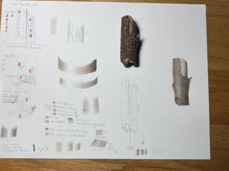
Sorry about the rotation being off, it didn’t save as I’d hoped. If I did this over again, I’d blow it up, per your suggestion on webinar, and consider using a heavier HP WC paper, perhaps one that’s 600 gms instead of approximately 300 gms, and not as soft as the Aqua. That might give me a better shot at both texture and color, especially darks and lights. But for now, this paper is about as worked as it can be, even though my branch is nowhere near as dark as it should be, and the drawing doesn’t do justice to the texture. But as my first attempt at this type of thing, I certainly learned a lot. Thanks for any additional input you may have, and for all your help along the way.
PS I left the shadow out because the paper used for right side of the branch, especially, is totally overworked, and not conducive to further work when attempting a shadow. Thanks.
Hi Mary- This is a really good effort and it has a lot of positive qualities! I like your highlight and shading, which give it good form. I know you don’t think you can add more layers, but it looks like you could saturate the color more. This is also a point you could start to add the details. I would keep working on this drawing just for the experience of it if nothing else. We all get scared of messing up a drawing, but this is a good time to experiment. I am glad to hear you learned a lot with this lesson and I am looking forward to seeing more of your work!
Hi Doug, Thanks so much for your comment and input. One thing I learned is that, for something both very dark and very textured, get the darks nailed in place first, then tackle texture. I lost a lot of the texture I created when I had to go back over the rendering to try to get it darker. But I’ll give some thought to trying to achieve at least more of the darks, like in the darkest part of the tonal arc, just to see what I come up with, before working further on texture. Thanks again.
07 March 2020
Way to go, Mary! (I tried to rotate your image for you. Let me know if it worked.) Yes, when you work on something as textured as this, it can be helpful to define the form first and then add a lot of the details later. The only thing to remember is if there are LIGHT details, you want to map those out in the beginning. Dark details are easy to add later. I think you could get that one more level of darkness on the shadow side with a really sharp Dark Sepia pencil. That sharp Sepia pencil is also great for adding details at the end. I find that sometimes when I feel like my paper is fully saturated and I’ve gone as dark as I can get, if I let it sit overnight, somehow the pencil soaks in, and there’s a little more room to add some more punches of dark the next day! (Don’t ask me how; I just have experienced this myself) 🙂 Great job. Can’t wait to see what you draw next!
Thanks so much, Vern! Yes, your rotation worked nicely, so much easier to assess. I’ll give the ‘wait overnight for additional layering to open up’ a try, that is news to me. Initially, I had a lot of detailed texture that I liked and that I thought was on its way toward being accurate. Then I lost it all when I used additional watercolor to darken it up more, using latter approach to try to save surface of paper. lesson learned. But many thanks for your input, more really great help from you and Doug.
Sorry about the rotation being off, it didn’t save as I’d hoped. If I did this over again, I’d blow it up, per your suggestion on webinar, and consider using a heavier HP WC paper, perhaps one that’s 600 gms instead of approximately 300 gms, and not as soft as the Aqua. That might give me a better shot at both texture and color, especially darks and lights. But for now, this paper is about as worked as it can be, even though my branch is nowhere near as dark as it should be, and the drawing doesn’t do justice to the texture. But as my first attempt at this type of thing, I certainly learned a lot. Thanks for any additional input you may have, and for all your help along the way.
PS I left the shadow out because the paper used for right side of the branch, especially, is totally overworked, and not conducive to further work when attempting a shadow. Thanks.
Hi Mary- This is a really good effort and it has a lot of positive qualities! I like your highlight and shading, which give it good form. I know you don’t think you can add more layers, but it looks like you could saturate the color more. This is also a point you could start to add the details. I would keep working on this drawing just for the experience of it if nothing else. We all get scared of messing up a drawing, but this is a good time to experiment. I am glad to hear you learned a lot with this lesson and I am looking forward to seeing more of your work!
Hi Doug, Thanks so much for your comment and input. One thing I learned is that, for something both very dark and very textured, get the darks nailed in place first, then tackle texture. I lost a lot of the texture I created when I had to go back over the rendering to try to get it darker. But I’ll give some thought to trying to achieve at least more of the darks, like in the darkest part of the tonal arc, just to see what I come up with, before working further on texture. Thanks again.
Way to go, Mary! (I tried to rotate your image for you. Let me know if it worked.) Yes, when you work on something as textured as this, it can be helpful to define the form first and then add a lot of the details later. The only thing to remember is if there are LIGHT details, you want to map those out in the beginning. Dark details are easy to add later. I think you could get that one more level of darkness on the shadow side with a really sharp Dark Sepia pencil. That sharp Sepia pencil is also great for adding details at the end. I find that sometimes when I feel like my paper is fully saturated and I’ve gone as dark as I can get, if I let it sit overnight, somehow the pencil soaks in, and there’s a little more room to add some more punches of dark the next day! (Don’t ask me how; I just have experienced this myself) 🙂 Great job. Can’t wait to see what you draw next!
Thanks so much, Vern! Yes, your rotation worked nicely, so much easier to assess. I’ll give the ‘wait overnight for additional layering to open up’ a try, that is news to me. Initially, I had a lot of detailed texture that I liked and that I thought was on its way toward being accurate. Then I lost it all when I used additional watercolor to darken it up more, using latter approach to try to save surface of paper. lesson learned. But many thanks for your input, more really great help from you and Doug.