Beautiful Ingrid! The color selection is very good. I think you could saturate the color more. The tomato on the bottom is the most successful. It is more saturated and also looks shinier, which I expect from these tomatoes. That bottom tomato’s highlight is whiter than the others and that helps convey a shiny surface. I think the middle tomato on the left could use a little more dark toning on it’s left side. Finally I would use a verithin pencil around the edges of the tomatoes to crisp up the outside edges. Look at the stems again. There are many areas that need toning and shading. Even though the stems are thin, they still need a range of tones to convey they are rounded. There are spots, like where the stem emerges into view from behind the middle, left tomato that should be shaded. Great job! You are almost there!£
Hi Ingrid, I agree with Doug. Your toning is lovely, very sensitive. You just need to push the darks. You are half way there. Looks to me you have only made it to the 6 on the value scale. But be careful where you put those darks, don’t overwhelm the tomatoes. Think of the light source. Where is it coming from. What part of the plant would get the least amount of light. There is where you make it dark. I can see you have the idea with your toning of the back tomato. Just push it darker
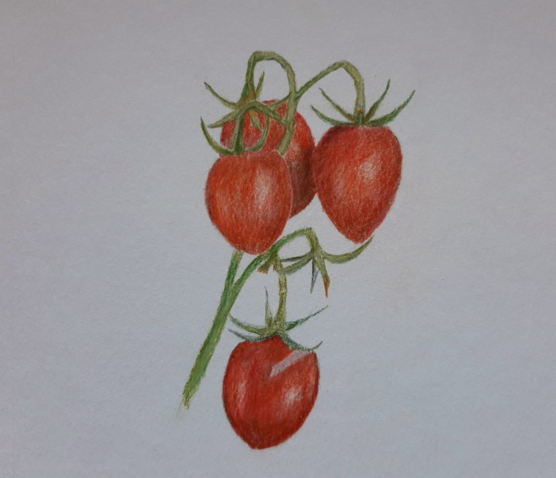
Beautiful Ingrid! The color selection is very good. I think you could saturate the color more. The tomato on the bottom is the most successful. It is more saturated and also looks shinier, which I expect from these tomatoes. That bottom tomato’s highlight is whiter than the others and that helps convey a shiny surface. I think the middle tomato on the left could use a little more dark toning on it’s left side. Finally I would use a verithin pencil around the edges of the tomatoes to crisp up the outside edges. Look at the stems again. There are many areas that need toning and shading. Even though the stems are thin, they still need a range of tones to convey they are rounded. There are spots, like where the stem emerges into view from behind the middle, left tomato that should be shaded. Great job! You are almost there!£
Thank you so much for this very helpful feedback. Love this couse and enjoy learning 😊
Hi Ingrid, I agree with Doug. Your toning is lovely, very sensitive. You just need to push the darks. You are half way there. Looks to me you have only made it to the 6 on the value scale. But be careful where you put those darks, don’t overwhelm the tomatoes. Think of the light source. Where is it coming from. What part of the plant would get the least amount of light. There is where you make it dark. I can see you have the idea with your toning of the back tomato. Just push it darker
Thank you Katy for your helpful feedback! Just did the lesson about overlapping objects… still much to learn, so interesting and lot’s of joy.