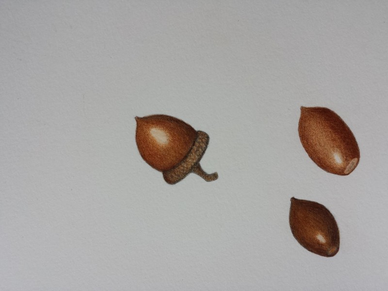
Carol, lovely saturation and tones here! I think you can work on your highlights just a bit more, but these are looking great! The highlight on the acorn on the left is a bit large and is very much in the center of the form. Push it to the left or right (depending on where your light source is coming from) and add some more light tones and create an irregular shape so the transition to the highlight is more gradual and creates less of a circle (this helps make it “shimmer” and look more realistic.) But I’ll say again, BEAUTIFUL saturation, crisp edges, and texture detail here. Great work.
very nice gradation of value to lightest highlight!
beautiful!
Ooooo! These are pretty!
Gorgeous!
Nice deep color and great highlight.
Carol, lovely saturation and tones here! I think you can work on your highlights just a bit more, but these are looking great! The highlight on the acorn on the left is a bit large and is very much in the center of the form. Push it to the left or right (depending on where your light source is coming from) and add some more light tones and create an irregular shape so the transition to the highlight is more gradual and creates less of a circle (this helps make it “shimmer” and look more realistic.) But I’ll say again, BEAUTIFUL saturation, crisp edges, and texture detail here. Great work.