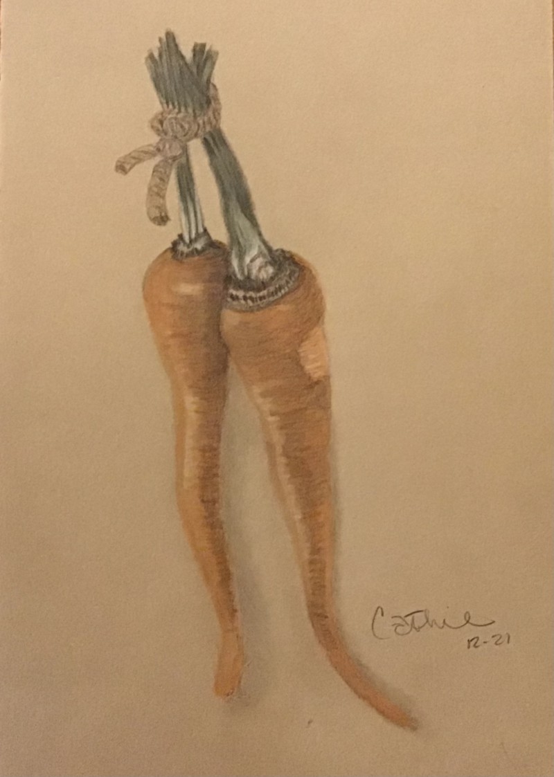
Nice drawing Cathie! It has a whimsical feel. I see a personality in these carrots. I don’t know if it is the photo, but it seems desaturated, too gray. Try bringing in some more vibrant oranges, especially in the midtowns.
I agree! I seem to be stuck in muddy colors lately – not sure why😞
16 December 2021
Cathie, try using some other colors for your grisaille layer, and wait until the end to pop in that Dark Sepia, especially on subjects that are orange, red, or yellow. (For example, on these carrots, you could try toning first with Burnt Ochre or even Venetian Red.) That might help you keep your colors bright. You can also work to saturate those colors more and burnish with some yellow, or even try a glaze of yellow watercolor to brighten the mood. Also, on Kraft paper, you really have to work to pump up the colors and tones–push the darks to their darkest and bring the lights up as much as you can to stand out on this midtone paper. Your drawing itself is looking great here, just work on saturating those colors and tones… practice on a scrap piece of Kraft paper and just let yourself experiment with colors and the pressure of your pencil a bit. 😉 You’re doing great.
Nice drawing Cathie! It has a whimsical feel. I see a personality in these carrots. I don’t know if it is the photo, but it seems desaturated, too gray. Try bringing in some more vibrant oranges, especially in the midtowns.
I agree! I seem to be stuck in muddy colors lately – not sure why😞
Cathie, try using some other colors for your grisaille layer, and wait until the end to pop in that Dark Sepia, especially on subjects that are orange, red, or yellow. (For example, on these carrots, you could try toning first with Burnt Ochre or even Venetian Red.) That might help you keep your colors bright. You can also work to saturate those colors more and burnish with some yellow, or even try a glaze of yellow watercolor to brighten the mood. Also, on Kraft paper, you really have to work to pump up the colors and tones–push the darks to their darkest and bring the lights up as much as you can to stand out on this midtone paper. Your drawing itself is looking great here, just work on saturating those colors and tones… practice on a scrap piece of Kraft paper and just let yourself experiment with colors and the pressure of your pencil a bit. 😉 You’re doing great.